
Just A Fight Between Two Friends — Reviewing ‘Captain America: Symbol Of Truth’ #13
by Scott Redmond
Overview
Picking up right where the last issue of Steve Rogers’ title left them, ‘Captain America: Symbol Of Truth’ makes the Cold War a lot more personal as lines are drawn between heroes. An action-packed issue from start to finish, but one that hinges completely on the emotions and depth of its title characters.
Overall
9.5/10O Captain! My Captain! The fearful trip is done, a deadly trap sprung. Captain versus captain, the battle has begun.

Sam Wilson and Steve Rogers are long-time partners but also mainly long-time friends. Sometimes though friends fight and when those friends are superheroes, it can get a bit messy. Much like how comic book events, even the small ones often get messy. Not this one though. So far Captain America: Cold War is a very tightly confined personal type of mini-event.
Basically, all the plotlines from Captain America: Symbol of Truth and Captain America: Sentinel of Liberty are ending. Just in time for the books to end, they collide in a 750th-anniversary issue, and see a relaunched Captain America in September from a familiar creative team. A rather sudden end to a series normally would mean a scramble to wrap things up. Not so much in this case.
So far, the two series converging and culminating their plots have been smooth. While Tochi Onyebuchi has a different writing style than Jackson Lanzing and Collin Kelly, they mesh well. Each of the books is somewhat from the perspective of the Captain of that book but mainly tells one overall story. This picks up where the last left off and gives Sam some powerful moments as he confronts Steve.

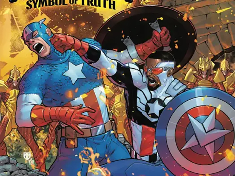
Pretty much their argument and fight take up most of the issue (with a few bits featuring White Wolf, Bucky, Ian, Black Widow). It’s a truly well-written argument/fight because it’s based upon a deep understanding of their positions and history together. We fully understand why Steve is doing what he does, but we can also see how Sam is right about calling him out. Painful emotions are all over the place and we the audience can fully feel them, and it makes for a swift but lingering read.
Currently, there isn’t full word on whether Sam Wilson’s book is ending (seems highly likely though). If it does end though, I’m going to fully miss watching R.B. Silva and Jesus Aburtov doing amazing things together. There is just such a powerful energy to their work. Every one of the issues feels like it is in constant motion, both in discussion and action scenes.

Silva has a great paneling eye that really captures the emotions and motion, with closeups and distance shots mixed amongst each other. The first page is just four panels on top of a full-page panel. Those four show Misty’s bionic arm, Sam’s shield, a struggling Sharon, and Steve walking away. The bottom of the full panel shows a distant Steve and Misty’s unconscious body. All the panels are full of snow and flames.
We’re told so much here without having to be told anything about what the aftermath of White Wolf’s bomb trap ends up being. Every page continues from there shifting from bigger to smaller panels, allowing things to be framed in ways that give great weight and depth. This feels like a lived-in world and the perspective feels so right in how characters are placed.

Color-wise, Aburtov fits right into that sweet spot where vivid bright colors and toned-down grounded colors coexist perfectly. All the flames are bright and various spots of the costumes/shields of the Captains pop out with vibrancy. Being a frozen wasteland, the rest of the setting and other elements are more natural, closer to the colors we see in our every day. Sparse backgrounds with flames or white in them focus our attention right on the action, where it should be.
All that matters at the moment are the character, their actions, and their feelings. Silva and Aburtov nail that in a way that could leap off the page into reality at any moment.
Adding to all the power of the moment is the always stunning lettering work provided by Joe Caramagna. Were the lettering less creative, the overall emotion and pointed nature of the pages would still be clear. Adding creativity and power, though, makes everything so much better. Letterers deserve so much more credit than they get. Their contributions are equally important.

Big colorful SFX hammering home what we should be hearing as these titans clash. Dialogue fonts growing or shrinking or just changing to match the rising tones/volumes. Captain boxes dart through the panels with a more even-keeled neutral tone. It all brings a lot of fun that makes comic books a delight to the forefront. It’s hard not to feel like a kid grinning broadly with every clang/klung, whoooom, or twok/twomp/pwok on the page.
Captain America: Symbol Of Truth #13 is now available from Marvel Comics.
