
Building A Better Tomorrow: Reviewing ‘Steelworks’ #1
by Scott Redmond
Overview
The Dawn of DC continues as John Henry & Natasha Irons leap from ‘Action Comics’ into their very own series. A colorful, bright, hopeful, and jam-packed first issue gets ‘Steelworks’ off on the right foot for this new super era for the Super-family of characters.
Overall
9/10Once upon a time, Superman died. Four more would rise to replace him. Two of them were true actual heroes. One of those two was a teenage super clone. The other was a powerless but brilliant Black man, paying it forward.
This is that man’s story.

Full stop. Probably shocking no one, but John Henry Irons/Steel is one of my favorite characters. As a biracial child, finding good representation for one half of my heritage was far harder than the other. Any time a really good Black character came along, you better believe I kept up with them. Not only was this a Black man taking up Superman’s mantle just to do good he was a genius engineer to boot.
Essentially a Batman type (powerless) that’s super-smart “doing good just to do good,” like the Superman that saved him. How could I or anyone else not love such a character?
So, when it was announced that we were finally getting another Steel series, I was all over that. My metaphorical hand (an email to my EIC) shot up so fast to volunteer it would have made heads spin. Oh, and there might have been another reason to volunteer as tribute. This series just happens to be written by one Michael Dorn. Yes, Commander Worf himself, also the voice of Steel in Superman: The Animated Series, is writing this book.
Superheroes deciding to step out of their usual superhero realms is not a new story. I mean nothing really is, but there are still fun unique things to do with it. Steel being a genius engineer using his mind to help make Metropolis better, that’s a juicy hook. A bright shiny hopeful type of hook.

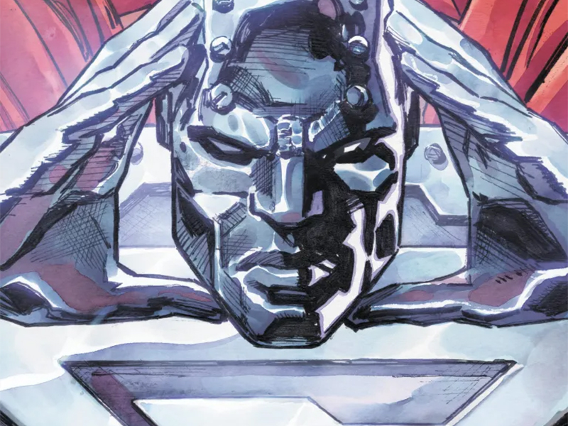
That’s what we get here, as Sami Basri and Andrew Dalhouse pull out all the stops visually. Metropolis is naturally a brighter, more hopeful place, to counter Gotham, but feels even more so here. Things are wide, huge, vivid, bright, and feel like they have weight and depth. There is a bit of a static feel to some of the panels and action, but overall things are smooth. Plenty of great emotional work alongside posing heroes and establishing shots that flesh the world out.
Basri really gives each character a distinct look, where faces feel unique, with a dose of animated reality. By that I mean they look almost photogenic but still have that feeling of being a fantastic unrealistic fun world. It’s not trying to capture supreme realism but isn’t going for something more stylized. A nice middle ground.
Dalhouse’s colors are thick and powerful, with a good shininess to them. They also have plenty of shadow and darker elements to balance, adding to the overall depth that is on display. Part of that comes also from the fact that the light, or lack of, is different in each space. As it should be. From sunlight to different types of artificial light, there is a realness to how everything is lit here. Which I always appreciate.
As hard as it might be to believe after reading the issue, this is officially Dorn’s first comic and first writing credit. Someone not in the know about him, but familiar with comics would probably swear he’d been doing this all along. It’s pretty darn solid for a first outing, as the characters all feel accurate, and the pacing is pretty good. Everything John Henry and Natasha say in the issue is spot on and is built upon their histories, without rehashing those histories.

My favorite comics these days have something in common. That thing is that they pack in a ton of things (exposition, development, plot, etc.) which makes a standard-size issue feel doubled. And not a double-sized one that feels bloated or off-putting. Instead, it’s in a way that gives the reader more bang for their buck and feel even more satisfied. Leaves you ready for that next issue to see what else could possibly be happening.
Packing an issue with all that stuff means plenty of room for some great lettering work to be done. Rob Leigh never disappoints in that field. All the usual things are great about the dialogue with flairs to set the tone, volume, and personality perfectly. Alongside that are all the little touches that just make it all flow smoothly while adding reality/fun to the proceedings.
Shifting the balloons for the new antagonist to play into his being drunk. Plenty of big bold SFX litter the page and deepens every moment. There is even one of my favorites, someone’s codename being shouted, and the lettering becomes their logo. I’m a sucker for comic book goodies like that and devour them any time someone goes that route. It’s all part of what makes comics unique as a medium, and the great creators know how to play into that well.
Steelworks #1 is now available from DC Comics.


