Life’s Thin Line: Reviewing ‘The Hunger And The Dusk’ #3
by Scott Redmond
Overview
The Hunger And The Dusk #3 continues to slowly weave the fabric of this immense, personal, and highly emotional fantasy world allowing the reader to really enjoy every beat. Sweeping majestic and deep artwork makes sure that every single bit of the world is felt as one moves through the issue. A series that takes familiar fantasy aspects and breathes entirely new exciting life into them.
Overall
9.5/10Death is a final situation for those unluckily struck by its sharp blade, but a plague upon those left behind. What ifs, guilt, and more are what remain. One cannot dwell upon those, though, when war and death remain hidden around every corner.

Human and Orc alike must wade through these waters as The Hunger And The Dusk #3 elevates the threat they face with a grounding revelation. Another fine story from G. Willow Wilson, Chris Wildgoose, Msassyk, Diana Sousa, and Simon Bowland.
One of the greatest marks for a series is achieving high levels of character depth in quick order. Creating a fleshed-out world full of tangible, real, and feeling beings. Bonus marks come from making them so compelling that readers are bonding to them instantly, for causing us to feel for them as they struggle, root for their wins, mourn their losses and want to do whatever we can to protect them.
Shocking no one, this is a series that has surely achieved those marks.

Wilson is one of those writers who juggles all the fine aspects of storytelling with ease. Might as well be juggling geese, balls, a few tables and chairs, and maybe a chainsaw or two as if they are nothing. We’re only three issues in, and I know that I’m fully invested in these characters and what comes next. Imagine announcing a comic hinged on romance, and in this day and age creating a story where the true slow build to romance isn’t dreaded, but welcomed.
Fantasy stories are everywhere. They share a ton of DNA, which makes them feel quite similar more often than not. What sets them apart is often the focus or the way that they make us feel. Letting the lore exist but not making it the focus over characters. Wilson is drip-feeding us lore here so that it’s not a blank slate but also isn’t taking away from the personal element.
Rather than racing our way through this world and its history, we’re taking a pretty casual (but intense) stroll. That’s just the kind of pace that I’m here for.

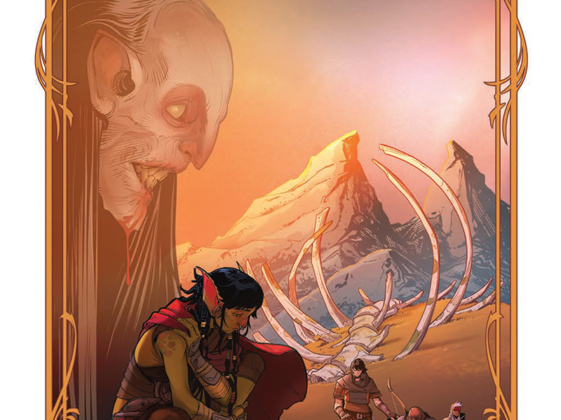
Much of the worldbuilding comes down to the visuals that Wildgoose and Msassyk, with assistance from Sousa, are crafting. If the characters feel authentic, deep, and real half of that comes from what’s on the pages for us to spy with our little eye.
Sometimes there are worlds created in any medium that instantly feel so intrinsically real that one could swear they might fall right in if they’re not careful. Well, if you picked up a copy of this issue, you’re holding one of those worlds in your very hands (unless it’s on your desk or bed or something I guess).
Depth can often mean a few things with art. The surrounding area can feel full around the characters, the depictions of the characters have tons of detail and emotion, and the world itself feels really immersive. All three boxes are checked here. On top of that, as real and grounded as things feel it also has a very whimsical feeling mixed in there. Dire heaviness meets fantastical lightness, a pretty perfect dynamic.

Colors match this beat for beat. Swirling mixes of very middle-of-the-road/neutral tones alongside heavier shadows and splashes of far more vibrant bits. It creates a bit of naturalness for the most part. Those more toned-down elements allow the world to feel familiar and similar to how we see the world around us. Dire emotions radiate because of those darker tones that create deep shadows or help enhance/highlight the world in interesting ways. Lastly, the flashes of brighter colors remind us that this is a magical fantasy world full of beings and elements far beyond our own.
Nailing the right color palette very much can determine how we the reader come into and regard the story. Some stories need far more vibrant bold colors while others would skew far more toward the heavier darker ones. Either of those would still work with this series, it would just change overall what one is meant to feel. What Msassyk and Sousa pull out of their bag for this series is just what it needs and complements every other element so effortlessly.
As noted at the beginning this is a character-heavy type of series. We feel the emotions that Wilson writes into the script thanks to the pencils that Wildgoose offers and the colors that Msassyk smoothly pours upon the pages. Hearing that emotion is just as important for a comic, even without us actually being able to truly hear anything.

This falls to Bowland, who has such a solid lettering style. All the dialogue and other bits do what they need to do when it comes to flowing across the page, never overwhelming or tripping over one another. It would be just enough to deliver that, but what takes it to the next level are the so-called little things.
A shift of the font here or there, either in style or size or changes to bubbles is small but does so much. With just those changes what we see on the page changes and what we therefore create in our head as we read changes. It helps to make sure that a character’s voice begins to form in a way that the creators want us to hear. Personality and emotions become clearer with every single letter, furthering that connection between the reader and the characters.
The Hunger And The Dusk #3 is now available from IDW Publishing.