
There’s New Sheriffs In Town — Reviewing ‘Guardians Of The Galaxy Vol 1: Grootfall’
by Scott Redmond
Overview
‘Guardians Of The Galaxy Vol 1′ kicks off the space team’s latest volume in dusty action-packed Western fashion, throwing the characters into a chaotic space full of questions and few answers. All of the heavy emotions and character development that have become synonymous with the Guardians are on full display in a darkly rough and gorgeous series.
Overall
9/10The galaxy’s biggest heroes are at their lowest. A devastating personal tragedy birthed a galaxy-consuming threat they must stop. Strap in as this rag-tag team of former guardians puts everything on the line to protect the galaxy once more.

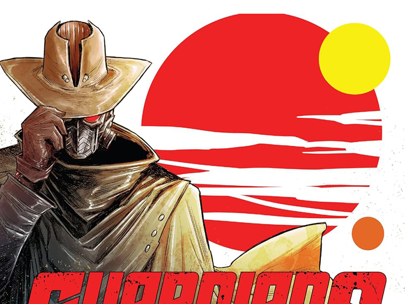
Guardians Of The Galaxy Vol 1: Gootfall brings a sci-fi western tone to play, as Jackson Lanzing, Collin Kelly, Kev Walker, Matt Hollingsworth, and Cory Petit kick off a new series for the beloved space heroes.
Truth be told, I wasn’t sure what to make of this volume of Guardians at first. I knew that I liked the creative team and loved the characters, so that’s not what I’m referring to. What I mean is the overall format. It was said to be a space western, which it is, following this crew. I wasn’t expecting there to be mostly solo-focused one-shot-style stories.
I wasn’t expecting it, but I really love it.

While I used the words solo and one-shot above, these stories are about the group as a whole and their story. Grootfall, their fallen friend and possible antagonist, and the missing year are part of the overarching story. Each issue though feels like a chapter in that story and stands somewhat on its own, with different focal characters at times, while being part of the same story.
Kelly and Lanzing always do an amazing job at understanding and mining characters for every available emotional or character morsel.
Right away, I was picking up big-time Firefly-like vibes from this debut issue. Whether that was an influence or not is not something that I can say at this point. Lanzing and Kelly have mentioned things like the film Unforgiven as well as the early mid-2000s comic series Nextwave as things to compare their series to.

I throw out Firefly as a comparison because of the whole space western vibe, with a crew of varying personalities and proclivities for violence and other ‘crimes’, while still having hearts of gold and trying to help when they can in a situation that matches up in various ways. In many aspects, it feels like how the modern-era Guardians first formed. A bunch of prisoners brought together during Annihilation: Conquest to fight the Phalanx.
It’s a natural fit for the duo of writers and likely scratches another space-related itch that is quite different from the one they are scratching with their fantastic work over on the new Star Trek series.
Everything about the work of Walker and Hollingsworth sells the Western vibe. Just enough roughness is present throughout every bit of the artwork. It’s got a heaviness and plenty of detail and visible emotion, cutting panels in the best way to capture the moment. From big action-packed wide shots to more intimate close-ups that showcase those emotional moments. We feel each character’s pain, weariness, anger, and more as we journey through the panels/pages.

We’ve visited quite a few different settings in these issues, and they all are fantastic. There are elements to them that of course feel familiar, but they are also very alien in design to remind us that we’re far from Earth. Personally, I like it when the Guardians are as far from Earth as possible, and this series plays well in that regard.
For all the roughness and heaviness of the artwork, it’s the colors that help lighten things up. Hollingsworth brings a mixed color palette that slides between the various sides of the spectrum. Bold bright heroic colors for various sci-fi or action moments. With plenty of shadows and heavier darker colors surrounding them to set the tone. It’s a space where plenty of eye-catching colors pop up to bring those vistas and settings to life, while also feeling heavy. Encroaching darkness reminds us of the ever-present threat.
We can see all the emotion on the page through the figures and moments. To fully experience them though we have to be able to accurately hear them. That’s where lettering comes in. Petit is one of the best at this sort of thing. All the little bits here or there that he brings to the page make every voice so authentic and powerful.

We can hear the difference between voices, such as Quill and Rocket, thanks to the way that the bubbles and fonts are very different. All the caps get even bigger in puffed-up bubbles for characters like Mantis when their anger comes out. Every single letter is just bursting to let us be able to hear authentic voices in our head which makes everything hit harder.
Also, very unique and playful in a visual sense, with changes to bubbles or fonts. Even things like the simple choice to have transparent caption boxes add so much to the overall presentation. These narration captions are literally part of the overall goings on shown on the page, colored and embraced by them.
Guardians Of The Galaxy Vol 1: Grootfall is now available from Marvel Comics.


