
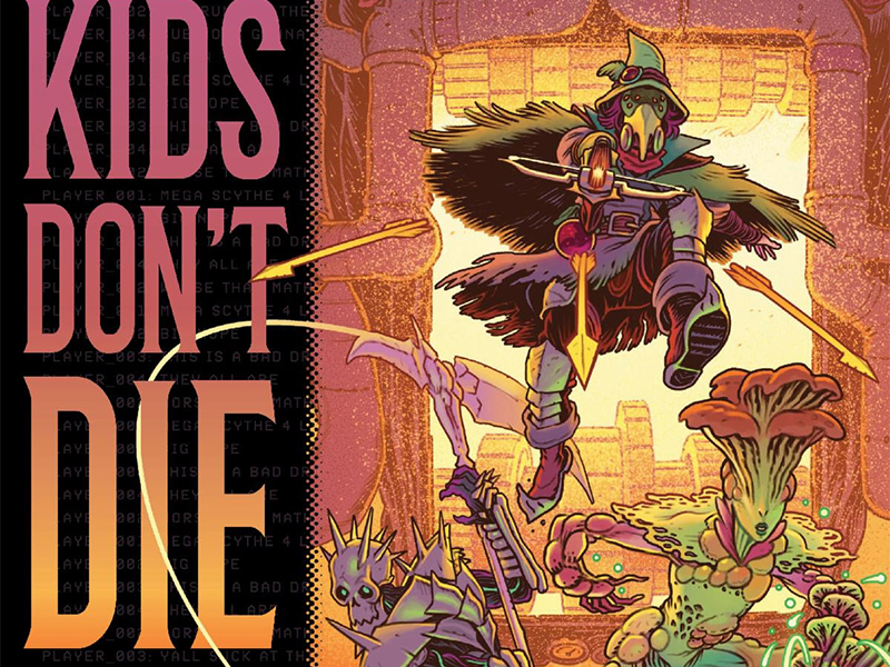
Press Start To Play: Reviewing ‘Cemetery Kids Don’t Die’ #2
by Scott Redmond
Overview
Reality and fantasy continue to blend in the most emotionally charged and dangerous way as Cemetery Kids Don’t Die #2 ups the game from the first compelling issue. Trauma and guilt resonate strongly through both the narrative and the moodily stylish artwork creating the perfect combination.
Overall
9.5/10Video games often provide an avenue for escape. What happens though when the games become just as rough as reality? Nothing good, that’s for sure.

Fantasy becomes even more terrifying in Cemetery Kids Don’t Die #2 a trauma filled second chapter from Zac Thompson, Daniel Irizarri, Brittany Peer, and Andworld Design.
Tackling the issues of two worlds isn’t an easy juggle. You have to make sure that both worlds get an equal amount of spotlight, but have enough depth to lock the audience in. It would be easy to have the real world be a backdrop so that the video game fantasy world would take precedence. Taking things further and delving through all the levels is more Thompson’s speed.
In this issue, we get a deeper look at the traumatic family life of Birdie and Pik, stemming from the devastating loss of their mother we learned about previously. A solid spotlight is placed upon all the emotional and character-relevant beats, finding all the relatable corners to explore. Nothing is thrown out there just because each moment and character beat has a reason to be and has an effect on what comes next.

Depression, grief, emotional abuse, withdrawal, substance abuse and more are heavily hinted at or specifically mentioned. Dealing or not dealing with those issues is at the core of why characters are where they are here. All of it is wrapped up in the trappings of horror fantasy within the game sphere, which is just utterly terrifying.
Irizarri and Peer strike the mood perfectly.
All of the emotion is very clear in every single panel. A rough darkness touches each space, fitting well with the overall whimsical fantastical style that is put into play. This lets us slip between lighter and heavier moments easily. Body horror hits hard without going into full gore or overly graphic imagery. That final scene with Enid was horrifying, without crossing the line to disgusting.

Peer’s colors are mostly toned down, in a more natural sort of state. Mixing that with heavier shadows and some sprinkles of vibrancy (for game, hair, fashions, etc.) is the perfect formula. It keeps the darker vibe needed and makes us feel a bit trapped, while also being entirely free.
A story of this type opens the avenues for a lot of creative choices to be made, beyond standard. We feel that in every single space, including the lettering. Which it’s a given things will be big and visually unique when Andworld Design is behind the work. Volume and tone are right off the bat clear, as are other visual cues that let the emotion become even more clear. Colors and bubble shapes shift as other embellishing features allow the words to strike quickly and hard.
Cemetery Kids Don’t Die #2 is now available from Oni Press.

