
Just A Small Town Girl — Reviewing ‘Supergirl’ #1
by Scott Redmond
Overview
A bit of old school meets the new school in a dense character rich spectacular debut issue for one of DC’s mightiest heroes. Very flashy yet humble in approach, the issue showcases why Supergirl is such a compelling character and deserves all the spotlight she can be given.
Overall
10/10They say that you cannot go home again. That’s especially true for Supergirl and other displaced survivors of Krypton’s destruction.
At least she has Midvale and the Danvers. Except…maybe she doesn’t.

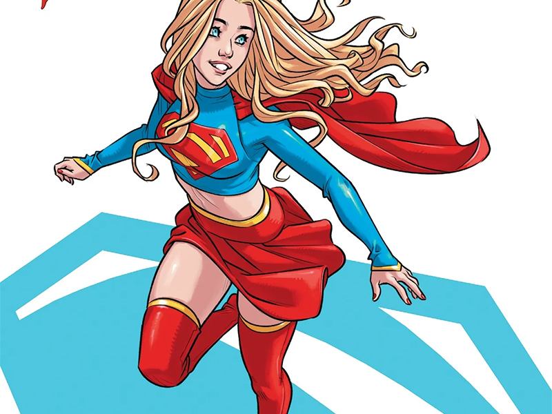
A bold new era and mystery begins for DC Comics’ Maid of Might as Supergirl #1 rockets onto comic book store shelves. Courtesy of the super creative team of Sophie Campbell, Tamra Bonvillain, and Becca Carey.
What a beginning!
A hallmark of Campbell’s work is the depth of character development carefully placed within the larger story. She mines every single moment to get the most out of these colorful iconic nuanced fictional beings. We feel that here as we witness a day in Supergirl’s life, and gain so much information about her situation and feelings. None of it feels bogged down or forced though- just smoothly (as smooth as a heroes’ life can be) flowing from start to finish.

So much has been going down in the Super side of things, and it’s natural for Kara to find herself kind of at a loss. She’s always (through no fault of his) in the shadow of her cousin, while standing on her own; a mighty hero trying to find her place in an ever-changing world.
We feel that through the artwork as well because Campbell really dips into the whimsical fantasy of it all. Textures that fluctuate between smoother and rougher depending on the given moment. She fills the pages with dense details, allowing the action and quieter sequence to breathe equally, adding such dynamic energy to every single moment. It causes the whole story to accurately feel larger than life.
Despite being a hero above all things, Kara feels authentic and approachable at all times, just like anyone in the Super Family should be. They are the ones trying to make a go of being among the people, even when lost, and Campbell taps into that feeling, as well as the overall awe that follows anyone who wears that S shaped shield.
Even when doing down to Earth things, Supergirl feels as Super as her name implies.

There is a kind of saturated color feeling here which plays well with the overall artistic style. Bonvillain is no stranger to working with super characters or their dynamic boldness and usually smooth flashy color schemes. We see plenty of vibrant flashy, the character is decked out in light blue and stunning red after all, but there are some differences.
Much of the backdrops and spaces have a more natural color focus, but with some of the colors turned up a bit filter wise. The overall colors have a slightly rougher texture and are not so innately bright on every level compared to say her work in Batman/Superman: World’s Finest, nor in a heavy darker realm such as the work done in Once & Future.
This exists somewhere in the middle, and I’m digging it.
Each sequence or space feels unique as the filters and color styles shift just a bit. From greener pages to bluer to an almost yellow/orange when Supergirl arrives in Midvale.

Thought balloons, a staple of comic books of yesteryear, before the streamlined and often smoother caption boxes became pretty much standard. Sort of puffy looking balloons of inner thoughts floating right next to the myriad of more solid dialogue bubbles on the page. Some writers used them sparingly, others wanted to have the pages filled with them, characters just flooding the audience with a monologue’s worth of thoughts.
Personally, I’ve never really been a fan of them.
Numerous creators have tried to bring them back, make them a thing like “fetch,” in the modern era. Most often it’s a one-time thing where they eventually fade back into the annals of comic book history. Each time I’ve shrugged and done a “Still don’t like them or see the point.”
Until now that is.

I’d follow Campbell as a writer and artist anywhere. From Teenage Mutant Ninja Turtles to Mothra to here. At first glance my brain went “Ehh” at the use of thought balloons, but quickly that changed. Something felt right here. It fit the overall tone of the book and my implicit trust of Campbell as a creator likely boosted their rightness, how Carey places them and incorporates them helps too.
There isn’t a flood of them. The thoughts within, even the longer ones, feel concise. Carey gives them that just off enough appearance to keep them distanced from the dialogue bubbles, yet, close enough that they feel related and connected to one another. Caption boxes, and the sense of stability they bring, will always be my favorite, but I’m not against this endeavor one bit.
A tip of the cap.

Overall, Carey’s work with the lettering is top notch as usual. Really playing with the shapes, styles, and overall feeling of the lettering, creating distinctive voices and tones throughout the issue. Anyone who reads these reviews (hello there!) might know that I’m a sucker for character’s shouting names and the font being shaped like their title logo. Just such a delicious comic book thing.
Supergirl #1 is now available from DC Comics.
