
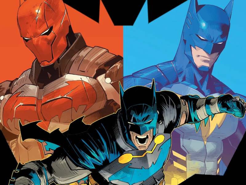
Fighting Fire With Heart — Reviewing ‘DC K.O.: Knightfight’ #3
by Scott Redmond
Overview
It’s not such a wonderful life after all as Batman’s potential future hopping continues amidst DC Comics’ tournament style event. Everything about this series gels smoothly and really highlights the depths of Batman that don’t get used as much as they should be on a regular basis. A+ style work that can and should be read at any time.
Overall
9.5/10Batman is known to be ten-or-more steps ahead of others. Like the Boy Scouts motto, he’s always prepared. Unfortunately, that preparedness has backfired as the Heart of Apokolips continues to punish the vigilante for his tournament-cheating ways.
It’s time to fight another of his children as DC K.O.: Knightfight #3 throws him against the best of all the Robins: Tim Drake. It’s go-time from Joshua Williamson, Dan Mora, Tríona Farrell, and Tom Napolitano.

Full stop, I loved this.
And not just because Tim Drake is my favorite (as if the previous lines didn’t give that away). Williamson just writes a really damn good Bat-family, and each of the projections of the family playing as Batman rings true … even if they have no desire to be Batman in the reality we know, their shadow future versions are still them.
Seeing Tim solve a Clue-like mystery was hilarious, but also so really good. I miss seeing him get the spotlight. There needs to be a new Tim series, one where he actually gets to do things like this: be a greater detective that even Bruce says and know that he is, truly. I would read that book or, hell, a Williamson-written Bat-family-focused book in a heartbeat.

Speaking of hearts, the interaction between the Apokolips Heart and Bruce is also so so good. From the anger of the Heart, to its taunting, to Bruce pushing back against what it wants. All of it just works and feels rich in character and emotional foundations. That final page — and the way the Heart is twisting the knife in Batman to punish him — is chef kiss fabulous.
For a series that was built to seem like it would be all fist fights, Williamson has crafted a far more intricate and smarter tale than I expected from an event tie-in miniseries. Batman using his love for, and knowledge of, his sons to win rather than his fists really tugs those heartstrings.
It also compliments the amazing, indescribable talents of Mora as an artist. It gives him so much space and depth to really cut loose and show off on all the levels. Everything — whether it’s big fight moments or smaller intimate ones — feels so grand.

Mora is one of the truly phenomenal modern artists with a style supremely suited for superheroes and anything else he desires. Big, loud, slick and complex as possible. Each moment receives the room to breathe and dig into the viewers eyes and mind before flicking to the next one. Kinetic energy is brimming out of every proverbial pore and splashes into our glee-filled eyes.
Achieving that soft-yet-hard-at-the-same-time-contrasting balance feels so simple in Mora’s work. Features of characters shifting and matching the setting’s tone with ease, while also keeping everyone unique. Facial expressions and body language are clear to read and impactful at all times.
Having the right colors makes it all go even further. Much like the previous issue, the palette shifts and grows throughout as we move to new places with new energy. It’s so light and delicate, but also hefty and dark when it needs to be. Each Bat-suit, or other character’s attire, is unique in the color and lighting choices. Jason Todd’s darker world makes way for the much more brightly lit world of Tim and the even more hopeful and sunny world of Damian.

Rich features pop as the colors settle into every nook and cranny. It allows the characters to really stand tall on the page while the artwork invites us to stand amongst these giants at all times.
Oh and the lettering! Another chef-kiss gif would go here. I’ve loved seeing Napolitano’s work for years and this is one of those situations where he’s just going all out. The way that the lettering and box from Clayface-Batman morphs and shifts like his body is so damn cool. All the choices for the Heart’s dialogue to the captions to SFX are just top-notch, utilizing the world and the rest of the artwork to design bold visual trappings that make the words even more meaningful and memorable.
DC K.O.: Knightfight #3 is now available from DC Comics.