Review: ‘Exploit’ #2 Uses A Modern Communication Method
by Benjamin Hall
Summary
Summary: The news company RIOT is about down and out. So they are celebrating their last article’s publishing with a party. Unfortunately, this story going viral turns things from celebratory to chaotic. With dangers arising can new reporter Kirby Kuo protect herself?
Overall
7.4/10Writers Tim Leong and Laura Hudson come up with a lot of intriguing plot twists. They also do some great character moments, particularly the more casual moments. The character interactions are also logical and believable. Not to mention that Leong and Hudson write several bits of good commentary about social issues about the very time period this is seeing publishing in. If there is one problem with the script is that the plot may be speeding up too much for certain readers to be able to follow clearly.

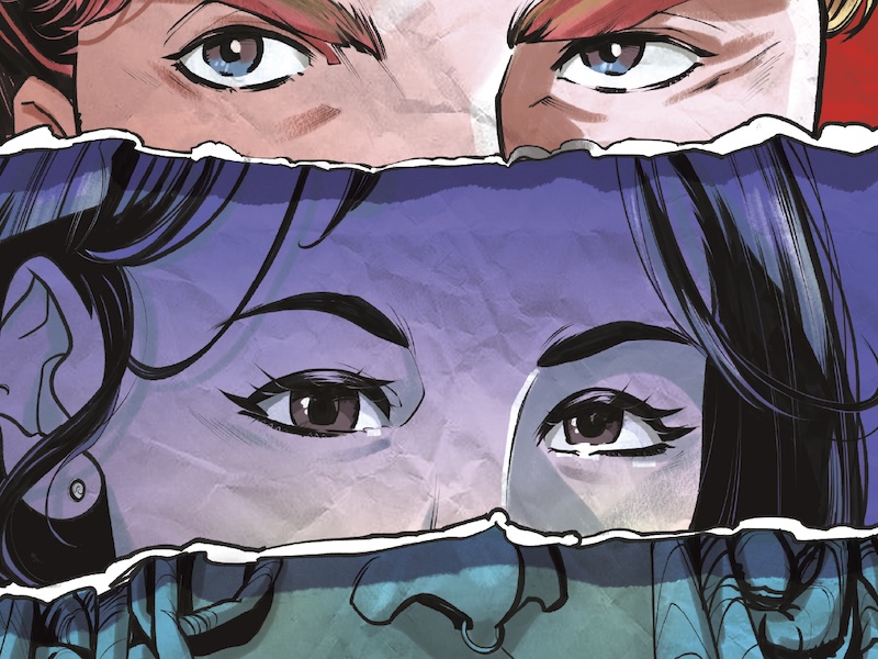
The visuals for the cover and the narrative are the creations of artist Emiliana Pinna and colorist Rebecca Good. Debatably, the cover is a bit higher in overall quality than the interiors. However, Pinna still is drawing some great dynamic sequences, as well as an okay horizontal double page scene. Pinna also does a very nice job by including small details, such as what appears to this reviewer to be a combination of fishnets and jeans with tears. As for the coloring, Good gets the chance to be a little experimental on a few panels. Some of these attempts by Good may work for readers while others might not. Still, most of the art getting enhancement from the color palette is in a typical manner so the majority of readers should enjoy it.

Letterer Frank Cvetkovic is doing a larger than average amount of lettering work on quite a few pages. The main problem with the additional text is positioning it all so as not to disrupt the narrative flow. Luckily, Cvetkovic displays the compatibility to accomplish this task. Cvetkovic also does a great job with properly sizing all the text elements. This part of the lettering job is arguably on display the most times because of the additions. One last good thing about Cvetkovic’s lettering of this issue is how colors help differentiate speakers in certain moments.
Exploit #2 sees release from Mad Cave Studios on April 29th.