
Digging An Even Deeper Hole: Reviewing ‘Specs’ #2
by Scott Redmond
Overview
‘Specs’ #2 places its focus correctly on the human element of story allowing the supernatural horror element to exist but not be the main driving force of the story. Exploring these young men and the world they live in and the domino effect these glasses are having on their lives is powerful, emotional, and often painful. A story set in the 80s that still speaks powerfully about elements we’re still dealing with to this day.
Overall
10/10What began as a simple but scary situation with wish-granting glasses from a comic book has taken a turn. Be careful what you wish for meets the bigotry of small-town America in the ’80s, as the second issue of BOOM! Studios’ Specs #2 brings tragedy down harder on its two protagonists.

As I mentioned in the previous issue review, I jumped on this book right away because of the amazing work that David M. Booher has been doing over in All-New Firefly. Over there he’s been able to take one of the more flat and often despised, for good reason, characters and not only flesh him out but make him relatable and sympathetic in just ten issues. There is a lot of that same sort of character energy on display here as in just these two issues we have a solid view of who Kenny and Ted are as well as the basics of their town and how life goes in this place. In this issue, though the horror of the glasses is still there, as they scramble to deal with the fallout of wishing away bully Skunk, Booher hits on something even more horrific: that aforementioned bigotry.
We saw references in the first issue from Ted about being a black kid in this pretty much fully white town, and we saw how he was treated differently in the school by the admin when dealing with Skunk. That comes rushing back as the duo tries to wish their way out of the Skunk situation and the police decide to focus on Ted as a suspect, and Kenny’s last wish seemingly leads them to move forward and arrest the young man for murder with no real evidence.
One of the things that is done so well here is just how oblivious Kenny is overall to what Ted goes through compared to him, blinded by his love for his best friend. It speaks to the idea that while Kenny is hiding the fact that he is gay, for fear of blowback from the town, he is still a young white male in a smaller town where his amount of privilege is pretty high. Despite his obvious nerves when speaking to the sheriff about Skunk’s disappearance, it’s brushed off as they don’t see him as a suspect because of who he is. While Ted is always a suspect just because he’s Black.

This hits so hard on so many levels and brings depth to the story beyond just the glasses and being careful what you wish for. Often stories like this set in a period of time try to brush over the reality of how it would be for some characters, but Booher puts the spotlight on what the real terror of everyday life is for marginalized people. There is no monster or supernatural being hanging around the periphery that we can see, it’s just the naked true horror that comes from humans themselves which is truly the scariest thing out there.
Great depth and energy is found in the work of Chris Shehan and Roman Stevens who truly set the mood/tone of this story. All of the people and spaces that Shehan populates the pages with are fleshed out, detailed, and feel like they are real and have a weight and presence within this world. No matter if they are right in the shot or in the distance, it creates a feeling of this small town and that it’s populated and average/normal in many respects. There is a good kinetic energy that permeates the pages, making it feel like it’s always moving which is what the story is asking for.
There are spaces where Shehan uses the same panel framing, like the same point of view focused on a character, but each of the subsequent panels has slight movements and changes to them that lead to that aforementioned movement.

I love the amount of close-ups and tighter framed shots we’re given because it keeps most of our focus on our core duo of characters, and the emotions that they are going through. Outside of the sheriff or Ted’s parents, we don’t get this much from others which makes sense because this is a flashback told by Kenny and he would only be mostly aware of his and Ted’s side of things and then those they directly interacted with. It’s a small thing in a way but it’s also important because it keeps the story tight and focused on the characters, this is their story that is being told through future Kenny.
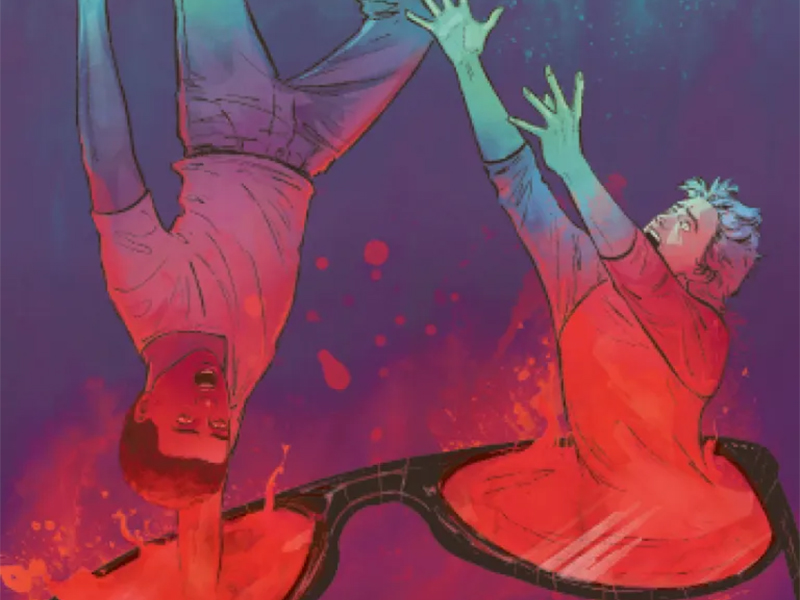
Setting the tone falls onto the shoulders of the colors here quite a bit and Stevens delivers. We get plenty of outside scenes or the school scenes where everything is a pretty normal palette of colors, not too bright and not too toned-down, because again the idea is that things are seemingly normal (or too normal following the second Skunk related wish they made). They are used to stand in tonal opposition to the other pages such as the opening scenes with the duo freaking out, bathed in an unnatural sort of green hue around them or the pages of complete darkness around Kenny as the phone rings later in an almost jump scare like moment.

We’re in the middle of Kenny and Ted’s personal story and their emotions and personality are felt everywhere, and heard thanks to the great work that Jim Campbell does with lettering. All the captions and dialogue are well-structured and flow around the page in the easiest way to follow while maximizing their impact in any given moment. When people are speaking in real life there is much that can be done to showcase their tone or change the volume of their speaking, and the same exists for dialogue in a comic. Campbell does that very well especially with stuff like whispering, the faded sort of quality to those words and bubbles is perfect because instantly it registers that it’s meant to be quieter than the rest of the dialogue of the issue.
Specs #2 is now available from BOOM! Studios.

