
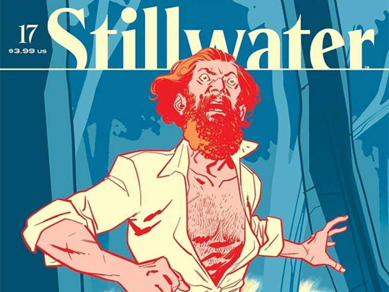
It All Falls Apart: Reviewing ‘Stillwater’ #17
by Scott Redmond
Overview
‘Stillwater’ #17 enters the endgame as the series roller coaster rides towards its concluding chapter, paying off tensions and horrors that have been festering for numerous issues. Everything about this series has just gotten better and better, creating a world and characters with such depth and complexity that it’s hard to believe we’ve only just met them in the recent past.
Overall
9/10All the proverbial cards are on the table as Stillwater ramps up for the big finale in a jam-packed penultimate issue. Daniel and his allies might have found the cause (person) behind the town’s immortality, but it’s come a bit too late as the Coldwater situation has reached its tipping point. Faced with the horror of immortality that cursed Stillwater, the residents of Coldwater have nothing to lose as rebellion begins.

Since the series began over two years ago, it’s one that has been able to keep the audience on their toes because there is no telling what will happen in any given issue and what type of story we’ll get. From small, isolated town horror to body horror to religious overtones to a Civil War era flashback all topped off with a full-on war. What hasn’t changed though is the theme that the true horror isn’t immortality per se, but what humans are willing to do to themselves and others. All that jazz about the true monster being humans all along is something that continues to bear fruit both in fiction as well as reality.
Chip Zdarsky has woven such an intriguing tale through these seventeen, plus a one-shot, issues built upon the foundation of creating engaging fleshed-out characters. We only saw some of them for a short time, but many of them have been here since early on and we’ve seen the changes in them. We’ve seen who embraced the horror/terror and who stood against it. We’ve witnessed the losses and the gains, and we feel something because it’s so real and these characters feel real.

It’s a foundation that Ramón K Perez and Mike Spicer built upon month after month, creating a deep world with weight and power to it. All that horror weaves through their artwork, always present even if it’s just looming, keeping us on our toes. Perez is masterful at creating visuals that capture pure emotion from the characters and body language that tells us so much without actually telling us. As noted, there is body horror and just overly painful elements to this world, which is rendered effectively without needing to go to a place where it’s overly graphic or gory. Just enough to hit home how terrible this thing is and how much these characters are put through.
It’s not that this series is just shadowy and dark to fit the tone, but it’s so accurately dark and shadowy in various ways. Spicer has a color palate that inherently mixes in shadows, often letting those darker colors mix with colorful backgrounds, but also one that respects and recreates realistic lighting elements. Most of this issue is at night and it feels like night, but also different types of night. There are the cooler out-in-the-open forest scenes, next to the darker but artificially lit city street scenes, or the ones where Daniel and his friends are hiding out in an almost pitch-black space lit only by the natural moonlight from outside.
All of the colors are this way, feeling grounded and real with their toned-down quality, which allows great distinctive colors but keeps them closer to the levels we would see in reality. There aren’t tons of out-of-the-box vibrant colors like you might find in something to do with a hero book or sci-fi or even bigger brighter horror stories. This is an intimate smaller scale human horror story, and the colors match and elevate that every time.

All of that same sort of realistic grounded energy can be found in all the lettering too that Rus Wooten is behind. It all flows through the pages well and fits around the artwork in complementary ways as it should, but there is more that is being put into it all. These characters have distinctive voices built through the number of issues we’ve seen them, and that can be heard and felt in the way Wooten presents the letters. Volume, tone, and intention are clear in the words, dripping out of them with every bubble or caption box on the page. Little emphasizers are dropped in to create pauses and gaps in the speech that we pick up on or to really hit on a particular note that needs to be soaked in and heard stronger than others.
What this creative team does together with every issue is just fantastic, and never misses. Even with the changing landscape and character positions throughout the series, the overall tone and quality keep hitting the same notes from beginning to end. This is one of those types of series that started strong and every subsequent entry is just as strong or actually stronger than what came before, never dipping or waning at any point. They had a mission with this series and with the next issue that mission will come to a highly successful conclusion. I don’t doubt that for a moment.

Stillwater #17 is now available from Image Comics.


