
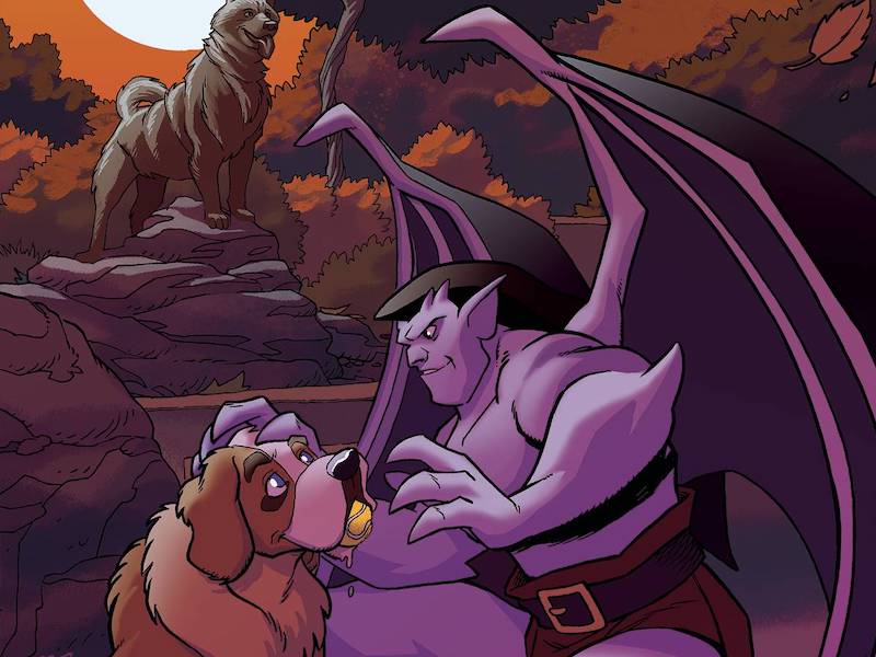
Review: ‘Gargoyles’ #3 Is Somewhat Of A Success
by Benjamin Hall
Summary
Jumping to conclusions some of the Manhattan Clan of Gargoyles assault David Xanatos at his home. Meanwhile a new protocol becomes active. What is the Great Minds Protocol? Also what does it mean to the Gargoyles and Xanatos?
Overall
6/10Writer Greg Weisman creates an opening page that will probably confuse some young readers, and those newer to comics. This is due to how it acts as a recap while referencing a particular character-centric episode (Gargoyles Season 02, Ep. 6 ‘The Silver Falcon’). Weisman also seems to be writing for the trade due to how this issue is reliant on the past two. This is observable due to the main plot line taking a break for another plot line in an abrupt manner. Despite these two problems Weisman does provide some good characterization. Not to mention the ending of this issue presents an interesting mystery that could have a number of resolutions.
Illustrator George Kambadais provides the art and colors for the interiors. He also provides the visual for covers G, K, and ZA. In comparison the interiors are definitely better in terms of proportions since Kambadais goes too animation-type fluid on the cover visual. Kambadais does a fine enough job overall, but there are still some expressions, and sequencing that could be better. Case in point there are some action sequences with facial expressions that don’t fully relate to the situation.
Letterer Jeff Eckleberry does well enough on positioning the text elements. However, Eckleberry could improve on using sizing to suggest differing vocal volumes.

Artist David Nakayama creates the visual for covers A, I, S, and T. Nakayama does an arguably good job with the proportions. Though the size of the baby definitely throws off the depth. On the plus side, the color palette on covers A, S, and T feature a fantastic range. However, the facial expressions seemingly look less horrific or odd on the black and white cover I.
Covers V, W, and ZC feature a visual image that artist Ken Haeser is referencing a certain Marvel comic (Incredible Hulk #1 [1962]). While Ken Haeser does fine with the execution of the art on all three versions Haeser fails with the reference on cover ZC. This is due to the lack of the text that clearly homages the first cover showing the Hulk. Though cover ZC is possibly more appealing due to being less visually busy. Not to mention that the lightning bolt being clear to see on cover ZC allows for a more dramatic visual.
The visual for covers F, M, and X is by artists Tony Fleecs and Trish Forstner. This visual is a simple all-ages design that has excellent line work and hues (with the exception of the black and white cover X).

Covers B, H, J, N, O, U, are creations of artist Amanda Conner. B, J, O, and U feature one visual by Conner while H and N feature a different one. She does a great job making both images look and feel dramatic. However, Conner does an arguably better job with the colors for B, J, and U versus those for H and N. While the black and white look of cover O may appeal more to certain buyers than the purple line art of cover J.
The singular variant cover L is the work of artist Brent Schoonover and colorist Alberto Silva. While it is a nice looking image the limitation on the number of copies make it a rather obvious cash grab.
Artist Jae Lee gets help from colorist Jose Villarubia for covers E and R. Yet, Lee goes without coloring assistance for covers Y and ZD. Each of these variants displays confident line work. However, the virgin art of E and ZD is possibly more appealing since they have no text disrupting the emotional atmosphere. Nevertheless, the text helps sell this as something by Disney whereas the art and color palette do not.

The variant covers C, P, and Z are by artist Lucio Parrillo. While the visual is attention-grabbing on all three covers Parrillo arguably goes too realistic, and thus, the differing interiors will jar certain readers
Covers D, Q, and ZB feature an image by artist Lesley “Leirix” Li. This image strides between realistic and cartoon fantasy. It is debatable which version of the image works best. Meaning that some (like this reviewer) may prefer D and ZB having the text and others will not. Unfortunately, while the overall execution is great the gargoyle Angela’s fingers look inconsistent in proportion.
Gargoyles #3 is out now from Dynamite.