
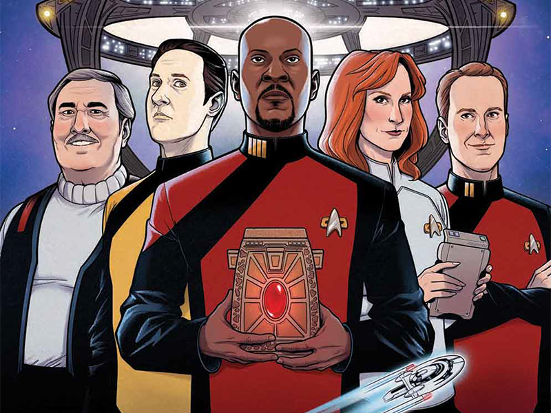
Back To The Start, Where It All Began: Reviewing ‘Star Trek’ #7
by Scott Redmond
Overview
Sometimes you truly can go home again, as ‘Star Trek’ #7 bounces the intrepid crew of the Theseus off the familiar spaces of Deep Space Nine and sends them onto their next adventure in their mission to stop the God-Killer Kahless. A truly fun and powerfully emotional issue that does great work to keep building the solid character work and foundation the first arc was building. Nostalgia with a purpose in order to move things forward is the best kind.
Overall
10/10The God-Killer Kahless has (momentarily) retreated. Captain Sisko is home with his family. A moment to reunite & regroup. Familiar faces are seen once more as the Theseus crew heads to DS9, but another part of Captain Sisko’s past will present the crew with a whole new deadly challenge on top of their already dire mission.

Through the six issues of this series so far, there has been a great amount of time devoted to the characters’ development and relationships. There is all the great stuff with the mission and space and action, but Collin Kelly and Jackson Lanzing know and love this franchise and continue the trend of really exploring these characters and bouncing all these various new and old characters off one another perfectly. There is just instantly a very comfy wholesome sort of energy radiating off this issue as we start off at DS9 with a family reunion and it keeps spinning from there with familiar sights and rekindling of relationships but in new ways.
Sisko getting to actually meet his daughter has been a long time coming, and the Sisko family as a unit is so awesome. I missed the dynamic of Ben and Cassidy, and I wish we could get so much more of this. All this gushy feeling about the issue is probably because Star Trek: Deep Space Nine has always been my favorite of the Trek shows but also because I’m in the middle of a series rewatch currently. So seeing Sisko return to the station and all these faces and references to moments (oh that montage with baseball and Vic’s, all so good) feels really good. Especially since the new issue that arises in this issue stems from one area that we haven’t seen addressed since the end of the show: what happened to Cardassia after the war Dominion War ended.
What I fully love here is that everyone has their moments, and we get to really dive into how many of these characters feel right now. Tom Paris doesn’t want to go out bar hopping anymore, he misses his wife, a great continuation of the growth that we saw through Voyager. Cassidy is happy to have Ben back but doesn’t inherently fully believe his words about being done with the Prophets after this mission is over. Kira has to deal with issues of faith knowing how cruel the Prophets are being. Sisko is confronted by the “sins” of his past, after being one of the most decorated officers during the war.

We also get the introduction of the ship’s newest officer, one Lieutenant (J.G.) Shaxs, who of course is from the animated series Star Trek: Lower Decks. When this crossover of sorts was announced a while back, I saw comments wondering how the often-brash adult humor aspect of that show could work with this comic. Turns out easily. This is a Shaxs that is tough and very opinionated as we know that slips easily into the energy and tone of this series, and he’s the perfect choice to fill the role left by Worf (who is over in Defiant) with how many Bajoran connections there are in the series currently.
While Ramon Rosanas has been the main artist of the series so far there were a handful of others that jumped on board to help bring some of those first six issues to life. With the seventh issue, a new artist has come on board to pick up this arc, with Rosanas set to come back around for the upcoming Day Of Blood crossover event. Mike Feehan is the new artist for this issue and this is my first time seeing Feehan’s artwork, and I’m liking what I see. There is a lot of great depth to this work creating spaces that really feel lived in and real, capturing the energy and feel of Deep Space Nine as a space so perfectly, while also having a more whimsical fun sort of energy woven in there.
Much like I mentioned with Rosanas, Feehan also is really great at capturing that sweet spot of creating visually recognizable versions of these characters without getting into that photorealistic just like the actor sort of space we see in some adaptations. There is nothing inherently wrong with going with spot-on depictions of the actors, but these characters are bigger in many ways than the actor at this point and it’s great to see them having a life and bit of themselves that is just for them.

I’ve become enamored with taking in the different ways that artists treat panels, and Feehan does some swell stuff here. Panels of varying sizes and shapes are my new jam these days because it makes each page unique but also creates a different flow for moments and keeps things from always seeming too similar. Also, when a character or item breaches the borders of their panel to overlap another or interacts with things within another panel I’m so down for that stuff. Comics are a visual medium that can do things that you can’t do with other visual mediums and when an artist taps into that sort of stuff it’s powerful.
Colors are still being spread through the issue by Lee Loughridge who so easily can maintain a style while allowing that style to shift and change with whoever is doing the artwork. Feehan and Rosanas have a lot in common with their styles therefore the color choices that Loughridge employs are very similar, a lot of bright vivid pops of color here or there against darker more shadowed backdrops. I love the use of bright filter-like colors for various spaces like Quark’s or Kira’s office that give those spaces a distinct look from other spaces in the station. No two pages are exactly the same in how they approach the color palette, also because the shift of lighting is done immaculately giving it that realistic feel.
Cardassia being so overly yellow in color and bright light just feels so right for that planet and those people, further setting it apart from other places we’ve seen in the issue. Just like the continued use of a green filter coloring in the Theseus bridge just feel so right for that space. It makes it stand out from depictions of bridges we’ve seen before, giving them their own little thing.

Characters have a lot to say to one another here as this is a heavy character issue as I indicated, and Clayton Cowles does all that lettering magic that he does. It’s always so interesting to really take in the way that lettering is laid out, and how it moves around the page so well in order to connect with the character it’s associated with but without blocking/taking away from the other artwork. While also not becoming so overwhelming to the reader with massive blocks of text bombarding them. Cowles manages that so well but also is one of those that goes far beyond this with how they approach lettering.
All the little changes that are made to make sure that a moment hits like it should, by making the tone/emotion/etc clear at the moment (through bigger/smaller fonts or bubbles, colors, etc), are woven in smoothly and are so appreciated. One of my favorite things has got to be the use of the pips and uniform colors with caption boxes because it not only fits the world but is a clever way to make sure we always instantly know who the words belong to on sight.
Star Trek #7 is now available from IDW Publishing.
