
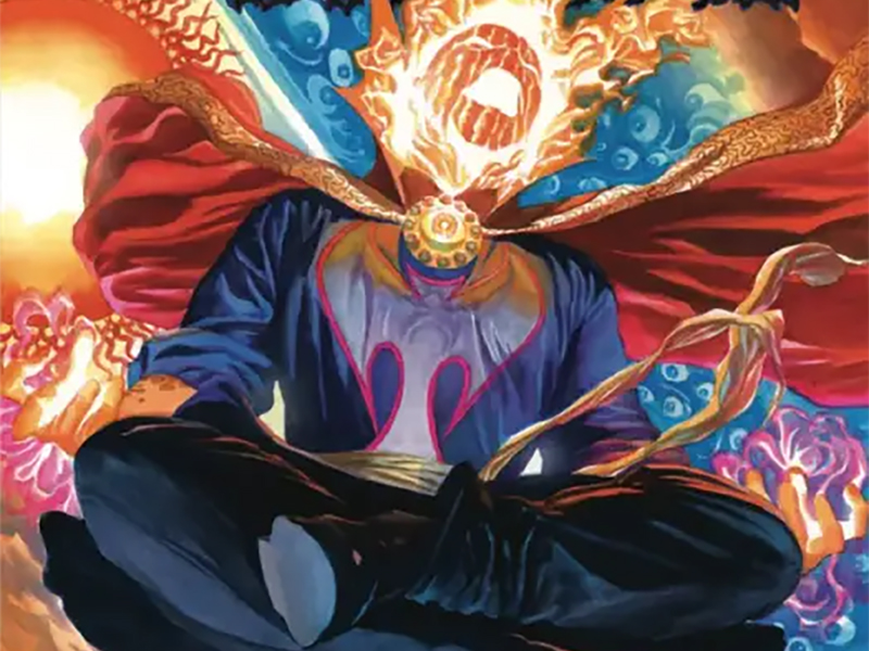
Dormammu Has Come To Bargain: Reviewing ‘Doctor Strange’ #3
by Scott Redmond
Overview
‘Doctor Strange’ is a truly fun character-driven series that leans on mostly single-issue style adventures that are smoothly wrapped into the overall ongoing plot lines. A magical series from top to bottom, with artwork that is perfect for this type of series. Another entry in the overall run of titles that is pumping energy into Marvel’s magic realms once again.
Overall
10/10In superhero stories, one of the most powerful relationships is often the one between the hero and their villain — not just any villain though.

No, this would be the one that is their archenemy. Their antithesis, their opposite, the one that plagues them the most. You know, the Joker and Batman or Green Goblin and Spider-Man or Red Skull and Captain America. The whole peanut butter to their jelly situation.
Not all arch-foe relationships are as well-known or lauded by the masses for various reasons.
Doctor Strange was a middle to higher-middle-tier character in comics for decades. In the 21st century though, well before the films in fact, that changed. Sometimes an Avenger, headlining his own titles again, and occupying a space on the low end of the higher character tier. This changing status hasn’t left much room to allow his arch-foe situation to rise as much as it can.
Apparently, Jed MacKay, Pasqual Ferry, Heather Moore, and Cory Petit took that as a challenge. Together they delivered one of the best Doctor Strange comics that I’ve ever read. To be fair, I haven’t read a ton outside the 2010s/2020s, but I stand by my sentiment.

On paper, it’s a pretty simple idea. Basically, every year Doctor Strange and Dormammu meet up for a day of truce, with the Dark Dimension’s lord taking a willing host. It’s just these two characters taking us on a walking tour of New York City while throwing barbs at one another. Pretty casual stuff for dreaded enemies.
That’s because the idea is simple but what is done with it is far from that.
First, Ferry’s artwork is always just so beautiful to behold and fits this series so well. This is a strange book (sorry I had to) with supernatural and fantastic elements always in play. Ferry has the great ability to tap into that energy while also presenting something that is grounded and lifelike. The surreal and the real mingle together, matching step for step as they glide across the dance floor.
A tight focus is kept in the majority of the panels. This keeps us there alongside the characters feeling their energy right up close. Every panel is dripping with emotion because Ferry is top-notch at facial expressions and body language. Everything feels equally deep/weighty but light, giving every space and character a ton of personality. This is a unique and lived-in world, one that we know well but also shines in new ways as we move through it here.
In the previous two issues, we saw coloring work from Matt Hollingsworth that meshed quite well with this art; it was light but dark and weighty at the same time. Moore comes into this issue and keeps that same feeling going. Yet, there is a difference that sets the two colorists apart.

There was a bit more of a reserved nature to the previous colors, purposefully going with more washed-out tones punctuated by pops of vibrancy. Here though, things are often far brighter and poppy, reserving less vibrancy for the grays and browns of various buildings/settings. It fits the story though, as almost the entire thing is outlandish with the flaming visage of Dormammu waltzing around.
That’s not to say that everything is neon and super bright though. There are some pages where Strange and Dormammu are the elements that have brighter colors to them. While the settings around them are almost ripped right out of a photo with how stunning they look thanks to Ferry’s artwork and Moore’s colors.
The best way to describe this issue is a chess match without a board. Strange and Dormammu have too much animosity and baggage to just do a walk and talk. No, their time together is part of their overall constant battle against one another. Except on the surface, it only seems that way from the Dormammu side of things.
There are many things I love about MacKay’s writing. Chief among them is the attention to deep character work/development as well as a keen wise use of continuity. In every series MacKay makes the character(s) and their world feel rich and old without continuity weighing things down. Essentially, he employs continuity/nostalgia with purpose. It’s not just there for the sake of being there, but it informs the character or plot or both in important ways.
Here though, I would insert a chef kiss gif right now if I could, he takes that to a whole other level.

Strange spends the issue spouting off moments he beat Dormammu in an almost nostalgic way; relatively minor seeming swipes at the villain. It simply doesn’t feel like the same sting as some of what Dormammu is saying and doing here. That’s because Strange is ten steps ahead of the Dark Dimension master as well as us. These beats of remembrance (complete with editor boxes and issue numbers) are not nostalgia, they are weapons.
Essentially, Strange beats his villain and saves the host because he’s a good storyteller. That’s some big, wild — borderline meta — awesomeness right there. We, the collective, often equate a superhero story being good with one full of action. There is little to no action here and it’s one of the best superhero/villain battles depicted on the page.
All the previous talk about energy and visual flairs that add personality goes doubly for lettering. Just like the rest of the art, it’s at its best when the letterer can cut loose and have fun. Cory Petit is always that type of person. Creating that personality and fun energy on the surface seems easy, and the ways to do it appear simple, but it’s not something we always come across.
The best letterers are those that bring in the colors, the various shaped balloons, the changes to the font that showcase volume/tone, and so much more. We get the colorful and fun, and fitting, fiery speech bubbles/text for Dormammu. Caption boxes that are bright and stand out from everything else. Editor notes that blend in yet stand out at the same time. All of this while making sure that it all flows in a logical way, sets up smoothly around the rest of the artwork, and delivers without overwhelming. There is a reason that Petit is one of the great ones.

In this issue, we’re also treated to a stylistic and fun backup story featuring Nico Minoru/Sister Grimm from Amy Chu, Tokitokoro, Fer Sifuentes-Suto, and Petit. Dormammu and Strange also appear, creating that connective thread.
I love that it’s a flashback to the Runaways days. Chu has a great feel for the character and where she was mentally at this point. It’s a really fun story that has Nico learning more about her (now well-established) limits while taking on a big villain alongside Strange.
Tokitokoro has a very interesting style that is very sharp and smooth with so much energy. Not only are the characters and other elements sharp, but the panel styles are also crisp and varied. Tons of different shapes, including a half-dome type, which adds even more kinetic energy to the action. Color wise, there are tons of really bright popping colors mixed in with a lot of shadows. It keeps a darker tone for the story while also digging into that sort of colorful energy that makes comics so fun. Sifuentes-Suto keeps it light and infuses the artwork with even more energy.
Doctor Strange #3 is now available from Marvel Comics.