
Review — ‘Gargoyles: Dark Ages’ #1 Begins The Legend
by Benjamin Hall
Summary
The Manhattan clan of Gargoyles have a past. That past is older than the castle they came to North America with. Most of the clan remembers it well. Yet, how do these experiences impact both their present and future?
Overall
7/10Writer Greg Weisman creates a mostly strong script. One of the strengths is the dialogue, particularly the natural integration of the exposition. Another strength is the limit on dialogue allowing for small visual character moments to shine. However, Weisman does somewhat play fast and loose with the idea of Gargoyles having no names during this period of time. Also Weisman ends this issue’s main narrative a little abruptly. Yet, Weisman arguably makes up for that by doing a fine job on the back-up prose story.

Artist Drew Moss and colorist Martina Pignedoli are responsible for the interior visuals. Moss also is responsible for covers I and N. While the cover design Moss uses is somewhat generic it displays how close to the cartoon series style Moss is able to get (Gargoyles 1994-1997). Meaning that the interior and cover art are very high quality. Pignedoli enhances the feeling Moss’s style evokes with the color palette, especially during the day to night transitions. Though both could arguably do better on a moment when the Gargoyles are waking up, specifically the violence of it.
Letterer Jeff Eckleberry uses a font that is thick and easy to read. Eckleberry also does a good job at sizing the text.
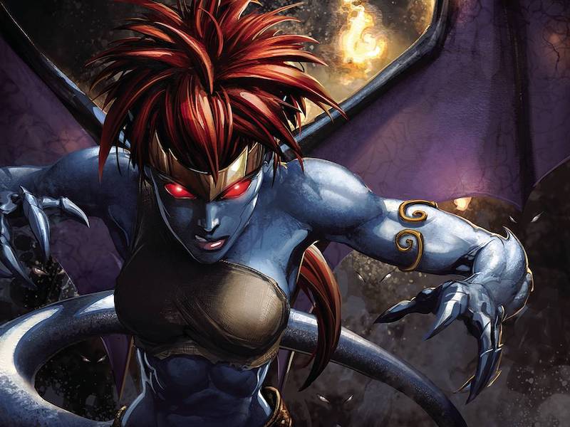
Covers A, J, W, and X are by artist Clayton Crain. The image design is strong due to the use of shadows to avoid a generic look. Not to mention the darkness on the covers helps evoke idea of this being a darker era in the Gargoyles history. However, these same shadows may turn some readers off. Also the look of the virgin art on W and X may make it hard for certain collectors to justify getting them in these currently tough economic times.
Artist Alan Quah is responsible for covers B, M, and V. While all feature the same high quality design the lack of trade dress on V makes it look like it would suit a poster better.
Cover G is blank except for the trade dress. Thus, there is nothing to really critique.
An artist lacking proper credit is responsible for covers K and P. They feature what seems to be television pitch art that Drew Moss essentially redoes on an interior page. Cover P is arguably weaker from a seller’s standpoint due to the lack of trade dress. Yet, both are of lower aesthetic quality than the majority of the other covers due to weaker hues. Although the line work and this being television pitch art should appeal to die-hard fans.
The variant covers F and Q are by artist Parker. There are amazing looking hues on both of these covers. However, the Demona/Angel in the lower foreground (arguably) looks simplistic. In other words it comes across like a quick sketch image. Also while both covers are high quality Q lacks text which makes it have lesser quality.

Artist Mirka Andolfo provides the image on covers C, U, and ZA. Arguably there isn’t much difference between the black and white variant that is ZA and the colorful C and U. Though Andolfo’s inks and line work are clearer to admire on ZA. Yet, there is a sense of magic occurring in the background that the colors present better on C and U. Unfortunately, without the colors the castle is hard to distinguish from the rocks.
Covers D, T, and ZB are by artist Kenya Danino. The trade dress balances out the color palette on cover D. It also works well with the black and white version of Danino’s art on cover ZB. Yet, the lack of trade dress on cover T allows for the shadows to dominate the image. Danino’s also crowds the cover with the characters, and this arguably makes it feel busy.
One finds the variant cover image by Jae Lee on covers H, L, O, and R. The virgin art of O and R is high quality, but it is debatable if they are as high quality as H and L
Artist Erica Henderson is responsible for covers E, S, and ZC. Henderson’s design is cartoonish in style and has a good sense of depth.

Covers Y, Z, and ZD are by artist Ken Haeser. The line work, positioning, and proportions are all excellent no matter which version of the image one looks at.
The Comicxposure retailer exclusive variant covers are by artist Bjorn Barends. While the image arguably looks cool it may not appeal to those who prefer traditional artistry.
Gargoyles: Dark Ages #1 is out now from Dynamite Entertainment.
