
Till Death Do They Part: Reviewing ‘Doctor Strange’ #5
by Scott Redmond
Overview
Various threads from three series over the past three years begin to converge as Doctor Strange #5 takes a huge leap forward in the overall magical storylines. A colorful engaging series just gets better and better with every issue, bringing great life to a section of Marvel that can often be overlooked.
Overall
9/10Weddings are usually meant to be happy occasions. That it, unless that wedding is a transactional one between two Sorcerer Supreme Warlords. Doesn’t help when there is someone or something running around murdering magical beings.

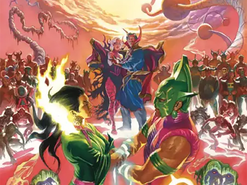
Strange and Clea are headed to a wedding. The wedding of her mother Umar the Unrelenting Sorcerer Supreme of the Dark Dimension and Tiboro the Sorcerer Supreme of the Sixth Dimension. It’s not a marriage of love or even care. No, this is a marriage of convenience and safety, to combine forces against the mysterious murderer.
A wedding in the Dark Dimension with various colorful beings is a playground for an artist. Especially an artist like Pasqual Ferry, who has such a unique and fun style. Ferry and colorist Heather Moore are reunited on art after taking off the previous issue.

There is just something inherently magical about Ferry’s artwork. It can blend the mundane and the fantastical in a way that just feels right. All the fantastical things are elevated and feel out of reality while also feeling like they belong. If you’re working on a book that needs to really pull out the stops with weirdness Ferry should be one of the first names considered.
It’s not just that he can do weird and magical things in a grounded way. All the panels are smoothly set up so that they always feel like things are in motion. Having such a keen focus means that the emotions/expressions are clear on every page. These stories are heavily character moment-based and Ferry plays into that perfectly.

One of the things that always works well with Ferry’s artwork is colorists that understand how to complement it. There is plenty of vividness in some respects but what really works well are the more toned-down yet still out-of-reality colors. Moore does that very well. The Sanctum is a very vivid yet light green, with cool blues popping up. While the Dark Dimension is far brighter than one would expect with a wider range of colors.
Moore also deftly drops in different aura-like colors for specific characters. Clea gets a great glowing pink or purplish color around her in some panels. Strange’s green tones follow him. Various magical elements are very powerful yellow or red at times. Washed out is kind of a term that works for lower key colors, and we see that some with Moore. Mixed into that, though, are more poppy brighter tones.

When Jed MacKay is writing a book, a deep dive and eye for continuity can be assured. One of Doctor Stranges most epic battles is the War of the Seven Speres, or the five-thousand-year war. It’s a battle that wasn’t seen on the panel but happened ahead of 1995’s Doctor Strange: Sorcerer Supreme #80. References to Strange’s part in this massive magical war came up in the Strange series that preceded this one. No reference is made just for the heck of it with MacKay, as this issue proves.
Not only does this issue finally reveal who is killing magical beings, but it also pays off all those references. I love that MacKay is one of those writers that weaves mysteries, but knows exactly when and how to address them. Too long means people might lose interest or not find the clues and too short may not have the right effect. Somehow, he pulls off the Goldilocks ‘just right’ approach each time.
In this case, it works because the seeded references were never major points of the previous stories. Just like with other books, he writes they were bits of continuity that were fun to see and hear, and that fleshed things out. Little by little they became more important and culminated just in time.
I also must applaud how well MacKay always manages to do one-off feeling issues that aren’t one-offs. By that I mean, each of the issues of this run so far is about something different but is also intrinsically connected. Elements build through all four issues that are referenced or paid off in subsequent issues.

As much energy as the art and colors bring is matched by the words that Cory Petit brings to life. Stories like this allow for a letterer to really go all out. These are magical beings and realms which means that colorful bubbles and changed fonts fit into things easily. We don’t have as much of that here, but things still feel so unique and fun.
Petit infuses every letter on the page with deep powerful emotions and feelings. We can instantly hear and feel when someone’s tone rises, and the bolds, and font size increase. Just as we can tell when they are speaking softer or lighter to someone as the font decreases.
Doctor Strange #5 is now available from Marvel Comics.


