
Here Or There Be Dragons: Reviewing ‘I Hate Fairyland’ #8
by Scott Redmond
Overview
What seemed a simple mission has gotten increasingly chaotic as ‘I Hate Fairyland’ #8 continues the unhinged revival of the bloody colorful fantasy series. A side of character development adds plenty of flavor to the frantic shenanigans that the series is so well known for, thanks to the artwork that easily captures both sides of the story.
Overall
9/10The battle is over, and one Gert remains. So that means she’s gone home, and the story is over, right? Haha, nice joke. Of course, something went wrong. Otherwise, there would be no comic book series left to read or to do this review.
There will be spoilers ahead, so take note of that.

Unpredictable is probably the best word to describe this series. We began following a disillusioned adult Gert struggling to deal with the real world, thrust back into Fairyland madness. Only to see that Gert offed after several issues of the series, killed by her ‘younger’ alternate self. Now we’re following that version of Gert and…oh wait nope.
That version is seemingly pretty dead now too. Well, that just happened.
We get an issue that is structured in a very fun way. Gert is drunk and complaining to the bartender about how she’s stuck in Fairyland while keeping the head of her dead self. King Cloudeus is also there drunk and upset because Gert is stuck there. Turns out he had a loophole to get Gert out of the land and she naturally screwed it up without knowing. Cause that’s what Gert does.

Skottie Young continues to expand this world while bringing in familiar pieces in new ways. There is a ton of very emotional elements in play here that help prop up the more over-the-top stuff. We feel for various characters involved, especially Duncan once we learn what Gert and Larry did to him. It’s funny that the change in Gert also brought a shift in emotional energy.
The Gert that was messed up by this world and lost in the real world was somewhat relatable. There were ways to somewhat feel for her, while also noting that she is just awful. The still childlike, never been home, Gert has some of those bits but is far worse. She’s the Gert that we know from before willing to do anything to get home. There is a bit more selfishness to her concerns, naturally so in a way, reducing the relatability just a bit.
I mean really, Young has set up a fun dynamic with the ability to have the same protagonist but also a totally different protagonist at the same time.
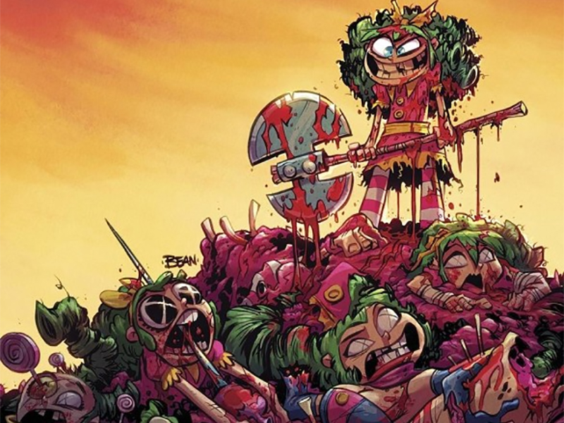
A mix of the more outlandish and the emotional can be a tall order at times. Not when you have Brett Bean and Jean-Francois Beaulieu on the art though.

Everything naturally has the fantasy and fun energy that Bean brings to every single issue. It’s all detailed and deep and popping, especially with the vibrant colors that Beaulieu is peppering in. Never does the place stop feeling like a good fantasy-style world, pulled right out of a picture book sort of appearance. Even with that fun pop of energy, it all feels weighted and real, as if it’s a true place that any of us could visit.
All that depth is where the emotional side of things works out well. Bean nails facial expressions and body language, telling us so much about various characters. No matter if that emotion is anger, sadness, goofiness, or anything else we feel and see it. This is another reason I said the word feels real, the characters are over the top but also relatable. The better we can read and feel emotions, the better a story will resonate with us.
I mentioned the vibrant popping colors of Beaulieu above, but those colors are also able to shift with the mood fluidly. Plenty of shadows and darker elements are sprinkled into panels to heighten the tone/mood. All the night scenes are some of the best because they feel authentically dark both in a realistic and emotional sense. It’s meant to be a Gotham-type pastiche and it very much feels like that with the ominous energy that Beaulieu’s darker palette brings.
Another element that really worked was the shift to a very washed-out, brighter type of color palate for the flashbacks. I love it when colorists do this because not only does it make flashbacks/cutaways/etc clearer, but it also gives things that real dreamy sort of appearance. It’s fun and changes up the energy a bit in the moment as most scenes can and often should do.

Characters do a lot of talking, both for exposition and emotional reasons, and Nate Piekos makes it sing. Lettering is such a fun art form because on the surface most just assume it’s the equivalent of filling a Word document and pasting it places. Except, that’s not the case. So much of the energy of the story and issue comes from how the letterer places those words, SFX, caption boxes, and more on the page.
Piekos makes sure it always flows so well and has the right little flairs to allow us to hear tone, volume, and emotions easily. It’s not just putting those words on the page; it’s about making them hit hard or just being super fun to look at. Colors, font changes, different bubbles, and more can elevate it all to a place where it’s a joy to read through every single letter.
I Hate Fairyland #8 is now available from Image Comics.
