
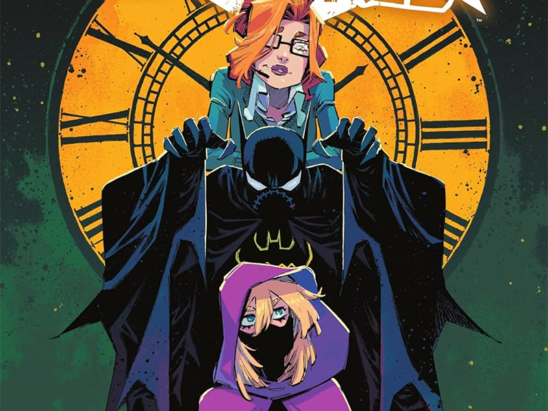
This Is How It Ends — ‘Batgirls Volume 3: Girls To The Front’ Review
by Scott Redmond
Overview
All things must end, and ‘Batgirls’ goes out the way it always lived: wearing its proverbial heart on its sleeve at all times. Every artist brings their A-game to this series, finding ways to keep it serious but fun and always engagingly gorgeous to behold. If you haven’t read this book yet, do yourself a massive favor and pick it up now.
Overall
9.5/10Body swaps, bad family reunions, Mad Hatters, bat formulas, and snipers out for revenge are, sadly, a typical Batgirls day. In the end, though, the power of friendship and love prevails, seeing this found family of characters triumphant.

Batgirls Vol 3: Girls To The Front brings a close to one of the top DC Comics series of the past few years, in the most fitting way. A series of adventures was brought to us by Michael W. Conrad, Becky Cloonan, Robbi Rodriguez, Jonathan Case, Neil Googe, Geraldo Borges, Rico Renzi, Dave Sharpe Frank Cvetkovic, and Becca Carrey.
We’ve seen a variety of artists across the twenty issues of the series, this volume in particular showcasing quite a few of them. Each artist brings their unique style into play while keeping the trademark lighter, fun tone intact. It’s amazing how well this series has managed to keep its identity intact no matter how many different hands were active in the proverbial kitchen.

Among the names listed, it is Rodriguez who spends the most time as an artist within this volume. A style that balances the fun and serious content, keeping those aforementioned vibes resonating strongly. His style is a bit exaggerated while being detailed and deep. Some of the depictions of the people and backgrounds are almost picturesque in quality. Yet, they maintain an air of unreality with very comic book sort of sensibilities.
Plenty of kinetic energy is found as the chosen layout and panel styles really lend themselves to playing up the movement of the characters. It keeps things flowing as the panels shift and change to match the moment. It keeps us bouncing around and focused on where we need to be. This includes a number of unique panel choices such as a wheel spoke-like title page or a montage page made up of Polaroid-like panels.
There are some solid uses of shadows and darkness to play into the darker serious tone. I also appreciate how some of the darker/more brutal pages are dark and hit hard without needing to be detailed in a graphic manner.
As noted, this series tackles a lot of darker or harder topics or situations while maintaining a lighter sort of feeling, and a lot of that comes from the choices in the art teams. Googe’s style very much hits that fantastical and whimsical feeling, while carrying around a great weight in the darker and more brutal elements at play at any given moment. It’s terrifying to meet sillier or more human-style moments, though this issue is heavier on the human element than the sillier bits.

There is a bit of a change in Googe’s second issue as Nightwing artist Borges drops in to handle the finishes and the last handful of the pages. Their styles have some similarities but also some notable differences that very much work in the story’s favor. Borges’s work has a lot of rougher sharper edges that also play well in the whimsical and serious realm.
Their handling of different places in the story helps a lot too. Both of them though are so great at creating depth and filling the panels with such detail, hitting all the emotional beats perfectly with the facial expressions (love it when full face masks are so darn expressive) and body language.
One of the bridges between some of the artwork (namely Rodriguez, Googe, and Borges) is the colors from Renzi. They switch between the heavier darker more toned-down colors and those that are far more vibrant. It adds to the overall lighter or fun vibe of the series.
Many of the pages are full of bright colors alongside more normal realistic backdrop tones, followed by other pages where bright reds or greens, or other colors dominate and set the tone. Every single place that the characters travel to has its own distinct energy and feeling because the colors shift, and vary wildly in the best way possible.

There are plenty of threats to be faced in these issues, and one of the artists is a threat of their own type. That would be triple-threat artist Case who does the pencils, colors, and letters for his two issues of this volume. These issues were the first time I ever saw any of Case’s work and it’s instantly memorable because it fits this series like a glove.
There is a sort of old-school sort of energy that permeates the work which is so vibrant and kinetic through every single panel and space. There is enormous detail on display that captures the characters and their world in full but there is room left to make things feel outlandish sort of.
A lot of this comes from the bright splashes of color that mark the panels. From deep purples to bright yellows, some of the more tense scenes have alarmingly bright colors. For example, Shiva and Steph-Cass are bathed in a bright pink that borders on being close to an almost bloody sort of pink. It’s just a vivid trip of colors through every single page, from those that are more standard to those brighter ones mentioned and it keeps the energy pumped up from start to finish.
All of this is very important since one of the issues tackled by Case happens to be a silent one focused fully on Cass/Batgirl. Having such an expressive artist helps to make such an endeavor work. Tackling all three realms of the art himself also makes sure that it comes with a unique connection through line from start to finish.

Lettering-wise, there is plenty of big right there in the middle of everything bright personality-filled SFX that make sure we can hear everything happening on the page, but also the caption boxes were stellar. Those purple omnipresent narrator boxes are always great and here they take on a slightly different personality as they feel boxier and outside of what is happening in a good way. Can’t forget the more normal style lettering dialogue that has some very fun stuff going on.
Sharpe steps in to cover the lettering side of things for the annual matching the energy and power the letters have had all along. All the great purple fourth wall breaking narrator boxes, big powerful in-your-face colorful SFX, and dialogue that allows one to hear and feel personality dripping out of it fully. Shifting some of that dialogue around in size or shape lets the volume or tone of words appear clearly so that we know how things are being said. Also, gotta love it when a word is said so loudly that it bursts beyond the confines of the speech bubble and makes the bubble expand with it. Comics are great.
Cvetkovic is another new member to the party who captures a ton of that same energy. Right away the board is set as things like tone and volume are made abundantly clear with the choices for the font as well as its size and placement, allowing the emotional moments to have far more impact as they land. Because with those elements in play, we can actually ‘hear’ how the character might say a given line or just how they are feeling. One of the best elements is just how small the font for Cluemaster is in many cases, his voice coming off softer likely because of the neck injury that had in fact killed him in the past, giving it an even more creepy quality.

Carey infuses every piece of lettering on the page with the same energy as the rest of the story. Every bit of flair added makes sure that the tone and volume are not only clear but easily ‘heard’ as we read through. Giving the emotional moments that extra punch. There are a lot of words across these pages, but it never feels overwhelming.
No matter what the overall plot focus might be, this series has been about characters since day one. Cloonan and Conrad completely get these characters and have worn their hearts on their sleeves the whole time. Everything that made this book what it was centered around that character/emotional work. Action and superhero stuff is fine and all, but character development/emotional work is what makes stories the best. That is why the series will be missed because it was just such a joyful, painful, powerful, life-affirming, fun ride.
I absolutely love this series and everything about it because it’s just so rich in character and emotion as they pull all the right strings to make this book dance the greatest of dances. People have wanted any of the Batgirls in their own book again for years, but truly the choice to put them all together in one book as Batgirls was the greatest choice ever. Especially in the hands of these writers and the various talented artists, colorists, and letterers that they have been able to work with along the way. This is a comic book that you hand to someone to show them how fun, powerful, meaningful, and just amazing comic books can be so maybe they’ll understand and join us in this amazing space.

Truly this is the best focus that Stephanie and Cassandra have gotten in years. Here’s hoping that this spotlight continues for them beyond this series. We need more titles like this on the shelves, not less. Happy for the journey but upset about the loss.
Batgirls Vol 3: Girls To The Front is now available from DC Comics.

