
A Storm Full Of Pain: Reviewing ‘I Hate Fairyland’ #10
by Scott Redmond
Overview
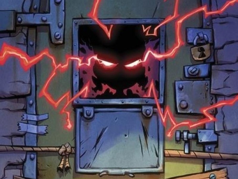
Sometimes you have to hope that the face-eating leopard won’t eat your face, which is where ‘I Hate Fairyland’ #10 places Gertrude. Another typical type of storyline gets a Gertrude makeover as the series concludes its second arc with a game changing moment.
Overall
9/10Gertrude has one final hope for freedom. The quite literal key to escape lies in the hands of her nemesis. The former queen known as Cloudia. Unfortunately for Gertrude, Cloudia now resides in The Prison and surely can’t be reached for an adventure.
Guess she and Duncan will just have to keep calling Fairyland home. Oh, who are we kidding, clearly it’s time for a good old fashioned prison break.

Masterminds Skottie Young, Brett Bean, Jean-Francois Beaulieu, and Nate Piekos orchestrate this classic plot with a twist, as I Hate Fairyland #10 closes out this story arc with a bang.
Naturally, one of the things you will really notice about this series is the rude, crude, adult humor and violence that stand in contrast to the animated/fantasy atmosphere. Sure, that is a huge thing, but there is something else that needs to be said. This series has a true knack for being able to lampoon while also seriously engage in a wide variety of genres.
Last issue was a whole story about dragons and witches, a war fought between them. Before that we got, like, a Batman like thing with the return of Duncan Dragon and his city. We’ve had the multiverse, a Gremlins-like piece, a survival story, and now a prison break. Each issue is something truly fully unique while carrying on the overall plot line. Few other books could wildly fluctuate in such a way without the storyline or characters getting lost in the shuffle.
Not this book, though. Gert and company are themselves through and through, sometimes to a fault (looking at you Gert), while engaging in so many different wild shenanigans.

Young has a clear vision for where things are going, with enough room to just really live up the opportunities such a story setting can bring. What makes this really work though is the characters. As despicable as many are, there are true emotions and understandable motivations. Gert is a truly broken despicable being, but we’re given enough to know the how and why of it. We’re not really meant to be rooting for any characters here, but we can see glimpses of humanity amidst the chaos.
I’ll never tire of the way that the bright splashy colors and the more whimsical artwork live harmoniously with the darker plot elements. Bean’s artwork brings a fun animated sensibility to things while making sure every single emotion is heartily felt. Everything moves with determination and energy, owning the space they appear within. Plenty of depth and detail make sure that this world, even as outlandish as it appears, feels truly real.
All those moments of action mentioned above felt just as epic as they should when you think about them. There is no big war or moment here, but we get plenty of big giant montages which are just chock full of powerful energy. What is meant to be somewhat of a gag (condensing a whole arcs worth of quest into a few pages) is rendered gorgeously. Bean makes sure that whether something is meant to be a big action set piece or a deeply human moment or even a chuckle moment, they all look damn good.

Big, flashy, vibrant, thick colors, mixed with plenty of shadows and darkness. Creating a heavy weight that mixes with the lighter quality of the artwork. Together they create that real tangible energy that I was talking about. Alongside that is the more toned down colors thrown into play that allow many spaces, and even times of day stand apart from the big characters and beings. It also brings accuracy, with things like times of day that truly feel as dark or light as they should.
Essentially, everything just breathes so easily, dancing together creating something special.
Joining that dance is the lettering work that Piekos brings to play. Inherently it captures the same seriously meets playful tones as the rest of the artwork. Bolds, italics, all caps, font that bursts out of its bubble, the colorful censored swears, and more. All of it makes sure that the tone/volume/quality of the voices are clear. We’ve never actually heard these characters/people speak before, yet, it’s easy to form a version of their voices within the mind.
Thus, the beauty of really good lettering. Not only is it bringing the necessary dialogue, sounds, and more to the page, it’s creating atmosphere. Creating levels that we can explore and understand. Using bubbles and boxes to deliver these feelings, shifting them around the page masterfully for the fullest impact but also the best ways to accompany/frame the rest of the artwork.

Truly the epitome of how well everything works in this issue is the interlude with the moon. A truly hilarious moment, that is framed so seriously and epically, full of heavy dark popping colors. You can just hear the condescending moon voice in their head, followed by those agonizing screams. Oh Gert, you rascal.
Before we go…that cliffhanger. What a brilliant move.
Gertrude spent 30 plus years ruining the lives/world of others, and now that will be paid back upon her own world perhaps.
I Hate Fairyland #10 is now available from Image Comics.
