
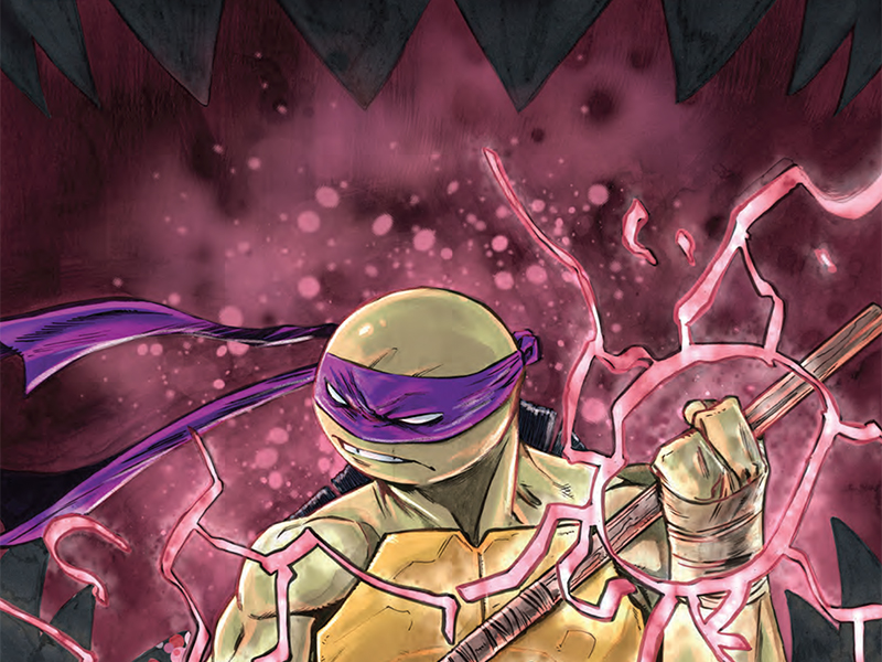
Paved With Good Intentions — Reviewing ‘Teenage Mutant Ninja Turtles’ #145
by Scott Redmond
Overview
Years worth of threads begin to converge and weave themselves into the final image, as ‘Teenage Mutant Ninja Turtles’ #145 begins the countdown to the anticipated 150th issue. A truly engaging issue, same as they all have been in this run, that highlights just how far these characters and those shepherding them have come over the years.
Overall
9/10Time. What a truly messy thing. A human-created concept based upon observations, which we still don’t really fully understand. Thank goodness (as far as we know) we haven’t figured out how to time travel.

Unfortunately for the Splinter Clan, they don’t have the same luxury. Time is not on their side and comes with a pretty nasty bite in Teenage Mutant Ninja Turtles #145 from Sophie Campbell, Vincenzo Federici, Ronda Pattison, and Shawn Lee.
Messing with forces beyond one’s understanding is never a good idea. Donatello might have found that out the hard way since his mission to stop the arrival of the threat, Armaggon might have doomed it all. One of those self-fulfilling prophecies or paradoxical time situations. A real what came first the chicken or the egg situation. Insert other words to do with time/time travel/how circular it is right here.
We’re not only on the road to issue 150, as the banner on the cover reminds us, but on the road to the end of this particular run of the series. After all that Campbell has written and others like Pattison and Lee have helped bring it to life, where it all would go wasn’t quite certain. Never was there any fear though because this run has been an absolute gem and remains that way.

Even with the timey whimey stuff sprinkled in, this is still a series that is focused on the characters, their connections, and their struggles to find their place in an ever-shifting world. Donatello’s fears about losing his family and avoiding a dark future are very relatable in a way. Leo gets to be the fount of wisdom again as he looks on the dispersed family not as a failure, but as individuals finally able to have their own lives. Still a family, but not one bound to spend every moment together as they began life.
I love how much Campbell just understands and presents these characters time and time again. Finding that perfect balance of familiar characterization which made us fall in love with these characters and fully exciting new developments that move them forward. Loving iconic characters should never come at the price of keeping them trapped in some static amber state. Just like with living breathing individuals, we can continue to love someone even if they grow, mature, and change as we’re meant to in life.

A giant chunk of this issue is the more down to Earth stuff, on the O’Neil family farm. Quieter, reflective moments with a few that are wilder and louder. Federici makes that work while smoothly transitioning into the bigger bolder action pages as well as the memorable final page. There are elements within the artwork that lean towards the rougher while others towards a smoother approach. It’s a solid pairing dynamic that hits the right notes for this story tone, light and hopeful but also dark and foreboding.
This is mostly a night time story, and it feels that way. Heavier shadows are always around, adding depth and weight to everything. Night can be a freeing but also an oppressive force. That darkness all around can allow one to wander or explore but also can make one feel trapped or uneasy about what might lurk. Here things are more the second and Federici makes sure that resonates through each part of the artwork, leaving us uncertain about what danger truly lurks beyond.
These tonal feelings are always nailed down with color inclusion because Pattison’s colors are just so powerful. Shifting and changing not just with the moments on the page but with every artist that cycles through the series. Lifting up their personal strengths and making sure to meet whatever energy they exude, without losing the personal energy of her own style.

Much of that mentioned darkness comes from the color palate. Heavier colors are chosen to reflect the darkness, with plenty of blacks and blues mixed in, and adding to that overwhelming factor. Plenty of popping colors can be felt when needed, the rest of them remaining at a more neutral/toned-down/neutral sort of level. Making this feel akin to someplace in our world even as it features mutants and wild fantastical elements.
It’s not enough for us to just see and feel emotions through the artwork and writing. Yes, technically it is enough for us to understand and feel what is happening. Without the hearing element that plays into comics, it’s not complete though. Having the right letterer allows us to actually feel and hear the voices of the characters. Lee is one of those letterers and has been doing that so well this entire time.
Dropping little changes to the fonts or bubbles, including bolds and colors and shapes, which make sure the tone/volume changes as needed. Personality crackles in the words and makes us believe what the characters are saying. It flows through the pages in the best ways so that nothing feels too bunched up or overwhelming.
Teenage Mutant Ninja Turtles #145 is now available from IDW Publishing.
