
Gold For A Colorist: Talking With Brad Anderson From ‘The Ministry Of Compliance’
by Tom Smithyman
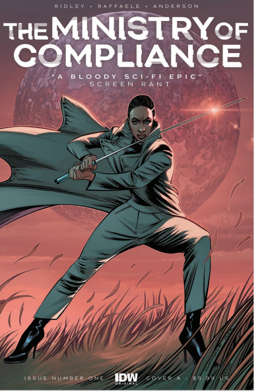
Aliens are among us – and they have been for decades, in the new IDW series The Ministry of Compliance. Veteran colorist Brad Anderson lends his palette to the new series, which is written by Oscar-winner John Ridley and drawn by Stefano Raffaele. In an interview with Comicon, Anderson discusses why he was drawn to the story and how he approaches his projects.

Tom Smithyman: It’s an understatement to say that you are a prolific colorist after working on Superman, Batman, Flash, and Hulk. What attracted you to this new, independent project?
Brad Anderson: When I was first told who was involved, I was hooked. Then when the story was discussed, I was even more hooked.
It was something totally different and from a color aspect, the new challenges sounded intriguing. The departure from “superhero” stuff also attracted me. I absolutely love superhero stuff but adding this to the mix would give me a chance to play with more real locations and push mood with color, something I love to do. And this seemed like the perfect story.
Smithyman: How did you approach this series? Do you have a preconceived idea about the color palette or do you look at the script and the illustrations before finalizing your approach?
Anderson: There were discussions prior to starting, and I was fortunate to work with this team before, so that really helped getting started. John Ridley has a specific idea of what he wanted for this, and his script is loaded with info, so with our past history working together and following Stefano’s art, I really felt comfortable.
As I go through the script and follow along with the art, I try to initially break it up in scenes. I really want the reader to be immersed in the scene, getting used to the mood and tone, then when they turn the page to another scene/location, it’s a huge change. Colors are a main factor in a visual change, there are areas in the story where I want the reader to almost smell the room, or whatever, they are in. This is a great story for that, so many cool locations.
When I get the first batch of pages done, on issue #1, the team can discuss any changes or concerns moving forward. From that point, I can get my footing.
Initially, with most books I start, I do a little too much, just excited about the project, I guess. So toning things down and not over thinking sometimes is the best move.
Smithyman: The first issue opens with the main character Avigail slicing through a group of bodyguards. It’s quite a scene of carnage, but you chose not to make it as bloody as you could have. How do you know where to draw the line in such situations?
Anderson: I think, normally I would have done that, but in this story I didn’t think it fit. Avigail is so calm, you can see her face panel to panel, and so precise when this is taking place, I wanted the reader to almost feel like the scene was in slow motion and she was moving effortlessly through the carnage.
Avigail’s GreyMatter sword is also something that I felt wouldn’t fill the page with red. They are a special force, and the fact that she isn’t covered in blood after these events kind of pushes that fact. Making these scenes a bloody massacre, to me, would make her look like she was out of control, which is the opposite of what she is.
We’ll see, as the story and the character evolve, I may start pushing into to carnage, but only if the story or scene needs it.
Smithyman: John Ridley has made quite an impact on popular culture and now on comic books as well. Did you have a chance to interact with him as part of the creative process?
Anderson: The creative process color wise, yeah, before I jump into it. The story and art are established well in advance of me getting it.
John’s scripts are great, so much information, locations, time of day, etc. This is gold for a colorist. John was really specific about the clothing and GreyMatter and how he wanted those to come across, for example.
Working with this team is great, I understand that John has a certain thing he wants and it comes across in the script. So when I get Stefano’s art, I just really try to follow their lead and add something to it.
One of the great things about this story is it takes place in real locations, so doing color is great. I can really set the mood and play with lighting that really occurs in this areas, different sky colors for time of day which affects the characters, dropping a face in shadow for certain moments to set the mood while having that established sky color frame them throughout the scene.
Smithyman: You’ve had the opportunity to work with Stefano Raffaele before? What is your collaboration like?
Smithyman: Yeah, we worked on DC’s G.C.P.D.: The Blue Wall together. It was awesome. Great story, so that is why I was so eager to jump on this project with them. John puts so much into his stories, you can’t help being sucked into it. You feel so much for the characters, whether you love them or hate them. So getting the art from Stefano just brought that to life, like watching a movie. Stefano is so great to work with, I get lots of freedom to do things with textures and colors and basically bring something to the table.
The collaboration on that was a little different as I never worked with them before, so initially, like I said earlier, I think I went a little too bright for the story. So toning it down in the initial pages really set the tone for the rest of the story. Trying a little different approaches early in the story and discussing it with them makes the rest go smoothly. And Stefano and John are so easy to work with.
Smithyman: While you have worked on so many iconic characters in the past, are there any that you haven’t tackled yet that you would like to try?
Anderson: Jeez, I’ve been doing this for almost 30 years, I think I’ve worked on almost every character, to some degree…Hahaha.
I am starting to work on some books with the creative team at Ghost Machine, which includes Geiger, Rook Exodus, Redcoat, written by Geoff Johns, among some other stuff upcoming, so I am super pumped to be involved with that.
The creative team over there is unbelievable, I really can’t wait for you to see the incredible stuff they have in store for you. Stay tuned and check out ghostmachinepro.com for more info.
Smithyman: There’s an actual Ministry of Compliance in Amsterdam, though it’s not a government department but rather an initiative that offers courses for finance professionals. Doesn’t that sound kinda worse than your Ministry of Compliance?
Anderson: HAHA!! I hope it isn’t an alien cover, or maybe I do.
Not sure that sounds worse, you did see the carnage the MoC can do. If one of the financial pros gets a small grey, handle looking thing, I would run.
That’s how it starts, you sign up for some courses, then they invite you into the head office and next thing you know you’re part of the alien takeover…classic tale…Hahaha!
Smithyman: Yeah, I can’t imagine Dutch finance courses. Give me GreyMatter any day! Thanks for talking about the series.

