The Company Is Life: Reviewing ‘White Widow’ #3
by Scott Redmond
Overview
Social commentary, quips, sharp knives, and a whole lot of explosions are just some of the icing on the cake that is ‘White Widow’ #3. The spider-themed assassin turned tutor series continues to be utterly delightful, with the right levels of biting critique, absurdity, and emotional depth.
Overall
9.5/10Welcome to Armament, where everyone is family. Per contract, Armament has the right to maim, kill, or blow-up family members. It’s all there in the fine print of the signed contract.

Grab a lawyer (maybe a Hulking one) and dive into the world of corporate shenanigans in White Widow #3. All corporate papers have been prepared by Sarah Gailey, Alessandro Miracolo, Matt Milla, and Travis Lanham.
Corporations sure do suck, don’t they? Yelena Belova, the White Widow of course, is getting a up close and personal lesson on this fact. Everything about this series is just so delightful, even with the horrible life-destroying corporation that rests at the heart of things.
Gailey has a penchant for finding different ways to tell stories rooted in areas of richness and privilege where someone not of that level gets to actually tear them down, put them in their place, andend them. A bit cathartic in many ways as we witness what is happening all around us daily and have little recourse we can take in many cases. Especially as this corporation uses health care and other things people need as the carrot to lure them in.

Oh, to be Yelena and just be able to Widow Fang (love the new knives and name!) things away.
What makes it work is that Gailey can find the humor and humanity to base things around, letting us have an easier entryway to things. They place protagonists at the center who feel rich in spirit and depth right away, allowing us to cling to and want to follow their adventures. Yes, Yelena is a legacy Marvel character compared to Gailey’s other comics starring original creations. Yet, their interpretation of the character is quite different from how the characters originally debuted, because time and attitudes have changed.
Sure, this Yelena still assassinates, but she’s funny and bubbly and throws out the wrong phrases as she tries to find a space in life that is more than just assassination. Sometimes she’ll try to fight a Hulk and dance around whether kill or assassinate is fancier. That’s the good stuff right there.

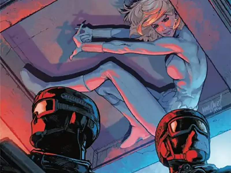
Capturing that fun energy takes the right kind of artwork to match tone, and Miracolo was so the right person for this series. His style is one that allows for plenty of depth/detail as well as great facial work, but it’s got a touch of roughness and exaggeration to it. Body proportions are not purely photo anatomical or ‘realistic’ because it’s the fluidity of the page and the world that makes this work. Everyone’s spirit is shining through and the joy of everything lights up the page.
Also, lighting up the page are the smart color choices that Milla makes. Many of them are more toned-down/natural style to bring the authenticity of the space the characters exist within. This is meant to be a idyllic small town, so everything feels similar to any town you might drive through almost anywhere. A heavier bit of color comes into play during some of the infiltration and night scenes, giving them that weight they need. Rounding things off are the more vibrant popping colors which emerge alongside White Widow and others during the more fantastical parts of the story, allowing those bits to stand out.

I continue to love the panel choices that are made in this book, especially the use of the gutter/white space. This allows the panels not only to have more freedom in where they are, and often pop more, it just makes the page feel lighter. Things are able to flow in and out of standard panels as needed, adding to that fluidity I mentioned before. Yelena and the other assassins move pretty quick, things are bounding around, explosions rocking the world. We can feel that because the panels follow and have that same frantic yet controlled energy as we get deeper into the story.
A lot of the fun of the story comes from those visuals, including the lettering. Lanham gets to have some fun with the various beats from the little caption boxes and love to hate spectrum under them and other bits. Different balloons or fonts or colors here or there. Letting it all flow through the pages smoothly, framing the other artwork and assisting in guiding our eyes where they need to go.

Emotional beats are hit through the artwork facial expressions, but also through the lettering where Lanham makes sure we can hear it. Tonal or volume changes are inherently clear, adding to our ability to really play the character exchanges out in our minds.
White Widow #3 is now available from Marvel Comics.