
Rocking Out Double Style — Reviewing ‘Spider-Punk: Arms Race’ #1
by Scott Redmond
Overview
Fans packed around a stage screaming for more from their favorite band who is rocking hard is exactly the feeling Spider-Punk: Arms Race #1 captures and wraps up into comic book pages. A sequel series that is just as powerful, fun, engaging, witty, and gorgeously quirky as it’s predecessor and then some.
Overall
10/10What’s a band to do after coming to the end of a successful concert? Return for an encore, of course!

Prepare for more punk rock action as the Spider-Band is back for another set, taking on even bigger and louder threats in Spider-Punk: Arms Race #1. The gang’s back together again behind the pages too as Cody Ziglar, Justin Mason, and Travis Lanham return and are joined by Morry Hollowell.
Unsurprisingly, the first Spider-Punk series was so popular, both in single and trade format, it was inevitable that Marvel would want more. With the reign of Norman Osborn at an end, Hobie Brown (Spider-Punk) and his band find themselves in a new position of helping protect and guide their country in this time of change. Unfortunately, some Earth-138 warped familiar faces have plans of their own.
After the previous series, I wrote that the “series is a visual and emotional feast that perfectly blends superheroes and real-world issues into a powerful mix that packs quite the proverbial punch.” It was true then, and I stand by those words with this new first issue.

Ziglar continues to pull no punches, balancing the perfectly musical superhero action with more serious questions about the competing new and old visions for the world. Watching as the rebellious Spider-Punk has to deal with being the overall leader rather than just the leader of a rebellion. Toppling fascism/Nazism is a tough battle, but so is the battle to keep that void from being filled with the same thing once more.
Some writers excel at vast out-of-the-box ideas or plotlines. Other writers are amazing at the nitty gritty character development and emotional beats. Then there are some who do both, as if it’s the simplest thing in the world. Ziglar fits right in that third space.
Each of the characters featured here, good and bad, has focus. They have their quirks, personalities, concerns, issues, emotional arcs, and presence in the issue. None of them feel the same and no one ever feels shortchanged. Even if someone didn’t read the last series, Ziglar writes in a way that is new and reader-friendly without having to explicitly spell it all out. Characters inform us of the changes and overarching plots in the most natural of ways.
Bringing T’Challa and Shuri, as well as Wakanda, into this was a brilliant move. Especially having a Wakanda that was hidden, till it saw the fascism end in the U.S. and decided to lend a hand to these revolutionaries. Also, Shuri and Riri as a couple are perfection.

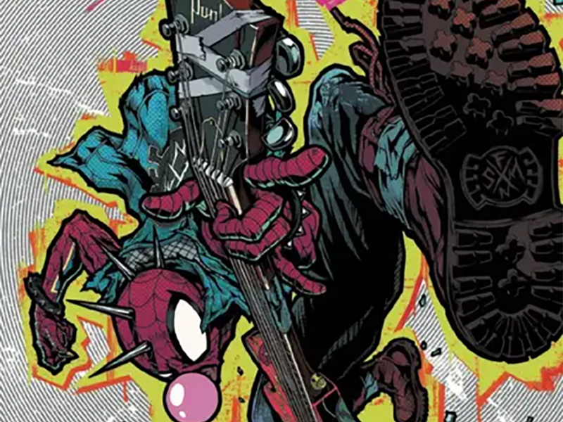
A lot of this issue is energetic, that’s what happens when there is giant robot fights, and it continues to look amazing thanks to Mason’s work. His style has a lot of smooth fun energy bursting from the seams, while also having a really solid rough texture. If someone wanted to imagine what a punk rock story might look like as a comic book, this artwork sure does a great job of hitting that energy.
I mean damn, just look at that opening montage spread. I want that on my wall, exactly how it’s presented in the issue. Webs used as dividers of the wildly shaped panels are just a taste of the thoughtful and unique framing choices that Mason makes in the issue. Fluid kinetic energy is a term used in a lot of these cases and some comics embody that more than others. Through both these miniseries, Mason has hit that note time after time.
Hollowell steps in to offer up colors this time, which were brought by Jim Charalampidis in the first series. There is a difference in their colors, but also a ton of similarities. A lot of the differences come from the fact that the previous series had a lot of creeping green at all times (signifying the approach of Norman Osborn) and heavier fascist-coded shadows. With those figures gone there is more light energy to be found.
This is something Hollowell taps into. Heroic scenes are so vibrant, that no colors are holding back. Splashes of reds, greens, purples, oranges, and more are just right there in your faces. Even with the vibrancy they feel heavier because some of the surrounding colors are muted from the shadows that still are sprinkled in.

All that color stuff spreads out to include the lettering, where Lanham continues right where he left off. Big colorful SFX that are as loud as the characters. Bubbles that are broken by the words that are big enough to burst through those seams. Tons of red comes into play with the font too, making it pop even more.
Speaking of that red, I still love the way that the emphasized bolded words in any given dialogue have that red color. It’s a great way to show the emphasis in an eye-catching important way.
It stands alongside all the other ways that Lanham makes sure every bit of emotion, volume, and tone change is clear. These characters’ voices are ones we might not be as familiar with, but we hear them immediately as we read.
Spider-Punk: Arms Race #1 is now available from Marvel Comics.