
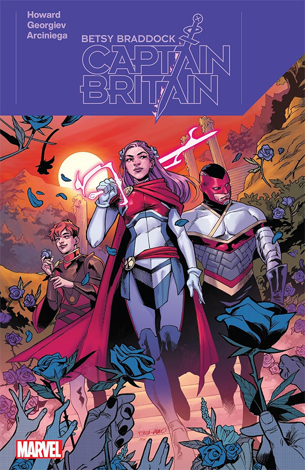
Captain Of The People — Reviewing ‘Betsy Braddock: Captain Britain’
by Scott Redmond
Overview
‘Betsy Braddock: Captain Britain’ puts a perfect capper on the title character’s Krakoan era journey, delivering on years of promise alongside wonderful depths of character. A gorgeous action-packed affair that feels like it could leap off the page at any moment while doing every emotional beat great justice.
Overall
9/10Once upon a time, witnessing character evolution from the same writer though a title (or multiple titles) was quite common. In the modern era of shorter runs and relaunches from new creative teams, it’s less common.

That’s what made the adventures of Betsy Braddock as Captain Britain in the Krakoan era so interesting. Though three titles, Tini Howard and a bevy of other creators including colorist Erick Arciniega and letterer Ariana Maher took Betsy on quite the journey. Betsy Braddock: Captain Britain, a series featuring Vasco Georgiev on art, is the perfect culmination of her evolution.
Excalibur and Knight Of X, the first chapters of this trilogy of sorts, dealt heavily with Betsy’s work in Otherworld. With those threads wrapped up, this final miniseries turned attention back to focus on what had befallen the country whose colors and name Betsy sports as a hero.
Truly, while I was critical of it at the time, the slower paced build of Excalibur was fully one of those “walked so ____ could run” situations. By this point it was clear how much Howard knew and loved this character, her supporting cast, and the magic/Marvel UK side of things.

While there is stuff that calls back to the prior two books, everything to do with the Braddocks and Clan Akaba amongst other things, Howard makes sure it straddles that space where it’s both new reader and old reader-friendly at the same time. Every time a past reference or callback comes up, it’s done in a way where all the relevant information is given so that new readers are up to date with the basics and long-term readers are excited to see these threads brought to completion and grown. A real best-of-both-worlds situation.
Howard has a perfect handle on Betsy and Rachel at this point, as well as many of the other supporting characters that are still part of this series, and is seamlessly weaving in other Marvel British elements to keep building on a story that began all the way back in 2019.
I’ve been a fan of the artwork of Georgiev since the moment I stumbled across the variety of DC/Marvel fan art covers that he created back in 2020. It’s a style of art that is just so fluid and dynamic and gorgeous to behold, every character has a presence and energy to them as their emotions and movements are seen and felt always. There is depth to every space the characters occupy, making it feel like a real place, but that depth can also be obscured or taken out of focus any moment in order to let the characters or the overall moment be the complete focus.

Shocker to anyone reading my reviews, but I’m in love with the way that so many artists are handling paneling styles these days. Allowing the panels to shift around in size and placement eschewing many of the standard type paneling styles in order to create a specific feeling or to lead the reader in a particular direction through the page. Also using much of the negative space around the panels to either border the moment or to even create portions of the panels such as dark walls or other aspects.
Georgiev has a very engaging panel style that makes sure every page is unique and comes with its own overall feeling or aesthetic.
With the colors, we get more of the great visual pairing of the brighter popping vivid colors and a lot of inherent shadows and darker tones that Arciniega always brings to play. It’s such a solid pairing because it fits the heroic/fantastical stylings of this story but reminds us of the weight of the story and characters and that there are heavier darker elements in play all the time. On one page, we can have more sort of toned-down colors that give a space, such as a scene in a bar later, a more comfortable and realistic quality to them that we can relate to. Jumping to another with battles and some of the supernatural elements will have so many far more vibrant color tones popping all over the place as they should.

Just like with the last series and the time spent in Otherworld, there are shifting color palettes brought into play that make sure that every space we visit in this issue completely feels different and unique rather than one sort of set of colors across the book as a whole.
If I were to walk outside my house right now and walk for a couple of miles there would be some wild color changes when it comes to things like houses and cars and such, but the overall ‘coloring’ of the world outside would remain relatively the same. Yet, if I traveled to some other cities, states, or countries the color palette of life would be considerably different and that’s what Arciniega does wonderfully with the different spaces and realms in this book.
There is no argument that can be made against the idea that Maher is one of the best letterers working right now.

No matter what book you find her work it comes with such a powerful distinct energy that makes sure that we hear these characters and this world as it is meant to be. Maher always has a great process that makes sure everything flows in a logical way but with such energy. It’s fun and pops as much as the rest of the artwork while helping inform us of so much.
Not only can we hear and feel the character’s personality through the words, but the tone or volume is also always clear. One thing that Maher does well for this is the use of sentence case. Comics often are done with all caps for dialogue which works just fine. There is something even better about sentence case, though, because it inherently is a perfect baseline style of dialogue font. Normal voice, if you will.
That makes it easier to showcase louder or quieter moments using all caps or smaller fonts. A sentence suddenly shifting to all caps and becoming louder is far more impactful, in my humble opinion. So, I always love to see sentence case making an appearance and Maher is always good for that in certain books.

Cannot ever ignore the inherent bit of fun energy that is pumped into all the SFX on the pages as well as inspired choices made to speech bubbles or text such as having a scream making the speech bubble blow up like a balloon or adding colors to bubbles and so many other things. One of my favorites here is how damn chilling the laughter of the Furies is because it’s depicted in SFX which looks like calculator font. Cold and robotic like the Furies, sending a chill down my spine just thinking about it.
Betsy Braddock: Captain Britain is now available from Marvel Comics.

