
Reassembly Not Required — Reviewing ‘Uncanny Avengers: The Resistance’
by Scott Redmond
Overview
Visually appealing but very mediocre in execution and message is the perfect way to describe Uncanny Avengers: The Resistance, a very clearly rushed affair that leaves too much on the table. Leaving us with something that added very little to the overall line or current events.
Overall
6/10After Krakoa’s fall, mutants were murdered, lost, imprisoned, framed, displaced, and harassed. They were sorely in need of some Avenging. Unfortunately for them, all they got was a slapped together resurrected Unity Squad armed with awkward romance, swords, and some white guy speeches.
Some things are better left for dead.

Uncanny Avengers: The Resistance was a return to a decade old idea from one of the former architects, Gerry Duggan, who was joined by Javier Garrón, Emilio Laiso, Morry Hollowell, and Travis Lanham.
Stories are often compared to roller coasters. Plenty of ups and downs, thrills and chills, maybe some screams along the way. Sometimes though that roller coaster has a thrilling start and then just sputters along on a flat boring track without any more dips or spirals or anything. Other times it’s like that one track you know we all built on Roller Coaster Tycoon where after the first giant hill the track just ends and sends the cars flying off into a fiery wreck on the park grounds.
Don’t worry, I’m not judging you for this questionable behavior.

It’s just a perfect way to describe Uncanny Avengers. A series that starts with a Nazi/Fascist slicing, dicing, and punching bang that sputters out so quickly.
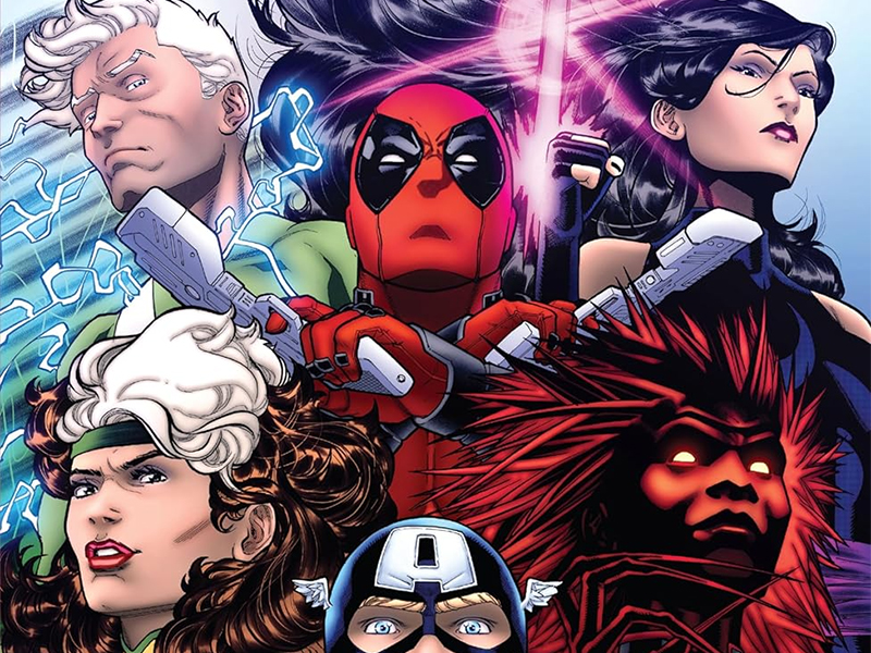
Essentially the evil figures of Orchis (chiefly Mr. Sinister variant Doctor Stasis and the cackling M.O.D.O.K.) have created an evil new Captain Krakoa (a persona Cyclops used briefly when the world thought he was dead) to lead a new Mutant Liberation Front/Brotherhood Of Evil Mutants. So, that they can sow chaos and terrorism and push humans to hate mutants even more. Poor Fred Dukes/Blog gets swept up thinking this Captain Krakoa is Cyclops, while being strangely dumb to the rest of the team being mutant Nazis and guys who love to slice and dice just for kicks.
Captain America and Rogue (who is such a non-presence really in the book that it’s criminal) form a new team featuring mutants that are trying to avenge their fallen. A bunch of not great dialogue pops up, an awkward lusty relationship between Quicksilver and Monet happens for some reason, Captain America gives some extremely out of touch Liberal cringe speeches, and in the end the villain basically wins.

Oh, and the reveal of that villain is so predictable it’s a boring snooze. Hell, this bigot fascist Captain Krakoa revealed figure also gets to have a cringy speech in this series. It’s just bad.
Duggan is a writer who has been very hit or miss for me lately, after historically being far more on the hit side. This felt so rushed and, basically, was a Captain America solo story with cameos by some mutants. Additions like a thrown in useless classic costume change for Rogue, the aforementioned “shocking” romances and other bits that go nowhere just feel like a waste since the whole line is getting a relaunch (where bigots won the day).
I swear this feels like a bunch of ideas glued together with little cohesion. There is no way anyone in the X-Office could conceivably convince me that the overall planning and execution of Fall Of X was not rushed. It truly feels like while they had an end in mind, the sudden editorial move and upcoming relaunch of the entire line pushed that ending up significantly.

Despite turning in really great imagery, the artists feel so wasted here. A big hero book is for sure something they can and should be doing, just not this book.
An energetic, solid, bright, fun and deep art style with plenty of emotion clear upon all the characters faces and movements. Garrón has a naturally kinetic style that lends itself to these action-packed stories. When Captain America throws that shield, we can feel it slicing through the air. Same thing as Quicksilver zips around or Psylocke unleashes her steel upon a deserving Orchis agent. Each and every blow or moment has true impact. Nothing about this is characters just posing and doing their thing.
The same goes for all the settings, plenty of depth and focus added to let the spaces feel lived in at all times. Some of the whimsical, almost cartoony, appearances feel out of place with how bizarre and faux-serious the story is trying to be.

I will say there are a few panels sprinkled throughout where the faces take a bit of a hit. By that I mean they are a bit off compared to the panels near them, with faces smushed or stretched a bit. That very well could be just a sacrifice made when choosing how to frame a scene, a natural consequence of the angle. It also could be the tight deadlines that artists are under, scrambling often to get these issues done. Overall, it’s not a huge detractor or mark against the comic, just something that stands out a bit at times.
With Laiso’s work everything has a sense of weight, proportion, and solid movement as the handful of action scenes we get have enough kinetic energy. Emotions are pretty well rendered, though some of the faces are a bit squishy in a lot of panels but nothing too off-putting or distracting. I think part of that is that it’s a bit heavily smooth like everyone’s face is super shiny smooth which highlights the squish.
Plenty of solid framing, though some of that is used to really ramp up the rah-rah America stuff in a really eye-rolling way (a whole white background panel with the flag front and center).

Darkness permeates the story thematically and also actual color-wise. Hollowell drops in some vibrant colors to contrast the darker tones that can be found here, but also plays with some scenes that are very light. It toes the line between pulling from its superhero roots while remaining respectful of what this book and the moment represent.
Settings feel toned down or more grounded, while the fantastical elements get the splashiest of colors. That is how it should be really. These costumes and powers and such are the things that are beyond the ‘normal’ when compared to our world. While the Marvel Universe is not our world, foundationally it’s built to mirror ours for that whole ‘world outside your window’ appeal.
Bringing everything together is Lanham on the letters. Just like the rest of the artwork, there is a heaviness present within these words. Lanham leans into that darkness and heaviness with the choices in font, bubble presentation, and even the way the captions are laid out.

Characters have a lot of stuff to say. Some of it over the top, and some of it out of weird left field. Either way, Lanham does a solid job bringing those voices to life. There is only so much energy and personality as can be wrung out of them, mainly because many of the characters feel very off personality/energy-wise overall.
Uncanny Avengers: The Resistance is now available from Marvel Comics.
