
Review: ‘X-Men United’ #1 Has A Lot To Do And Falls Short Of It All
by Tony Thornley
There’s a lot of pressure on a series touted as a new flagship or anchor, especially in a line as large and expansive as Marvel’s X-Men. That means X-Men United #1 has a lot to live up to, and a lot of room to fall short.

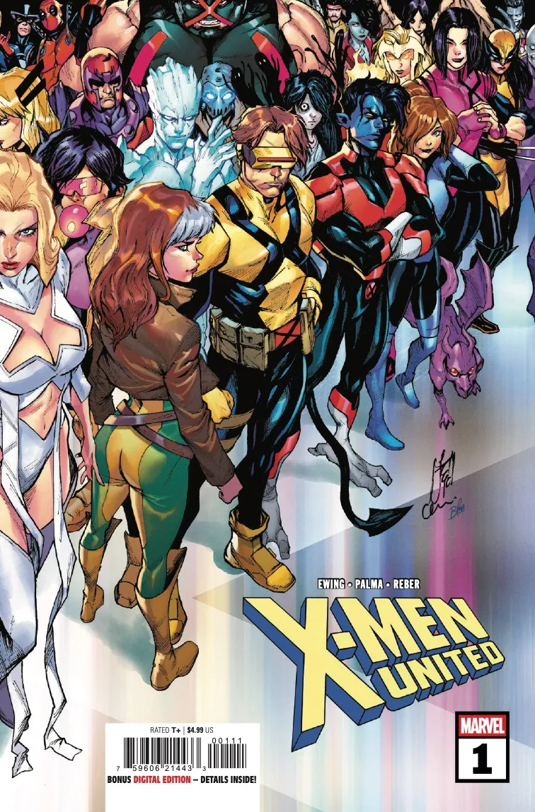
Eve Ewing, Tiago Palma, Brian Reber, and Joe Sabino launch the Shadows of Tomorrow anchor book with this issue.
Welcome to Greymatter Lane. An astral refuge for mutantkind, Emma Frost has created the space as a new school and center for mutants to call home. But strife from within and outside may cause the new space to fail before it even really starts.

I really enjoyed Exceptional X-Men. This series’ predecessor was a bit too slowly paced, but overall it was the strongest entry into Marvel’s From the Ashes X-Men initiative out of the gate (with both X-Men and Uncanny X-Men requiring a lot longer to get their footing). That made this issue all the more disappointing.
There’s an obvious break between what Ewing wanted to write and what she didn’t (whether it was editorial mandate or just an idea she was less cool on). In the former, the continuation of Exceptional was generally very good. Ewing’s new X-Men continue to be the most interesting batch of new mutants in this era, and when they’re on page, the issue is much stronger.
However, the rest of this issue is full of much weaker points. Pretty much all of the veteran X-Men are out of character, particularly Cyclops and Rogue. The issue is full of plotholes, like Kitty just trusting a Sinister-made clone, the choices in included secondary cast or the logic of Graymatter (is it truly astral or is there a physical element?). It made for a read that was equal parts confusing and frustrating, to the point that I nearly didn’t want to give the series another chance (I always try to give a serialized story at least three to four issues).


I did not like Palma’s art though. His work is technically competent, but it doesn’t do anything innovative, eye-catching or creative. The conversation between the veterans is flat and has no dynamism. The danger room sequence is stronger, but it’s set in a plain featureless room, not anything more dynamic or creative that could have been depicted with its astral plane setting. It feels like art that belongs in a fill-in or side limited series, not a “flagship” story.
Reber and Sabino both do strong work supporting the art and script though. Reber’s colors are eye catching, and does a lot of heavy lifting in strengthening the line art. Sabino paces the dialogue and captions in a way that enriches the reading experience, and enhances the script.

Am I going to give this book another chance? Absolutely. I’ve read stinkers of first issues before that I’ve come around on without a doubt. But as a central flagship? This issue falls so far short that it has to be placed under a microscope.
X-Men United #1 is available now from Marvel Comics.
Overview
This debut is aggressively mediocre, which is disappointing considering the previous volume. The art falls short, and there’s simply too much going on. An overall disappointing launch.
