
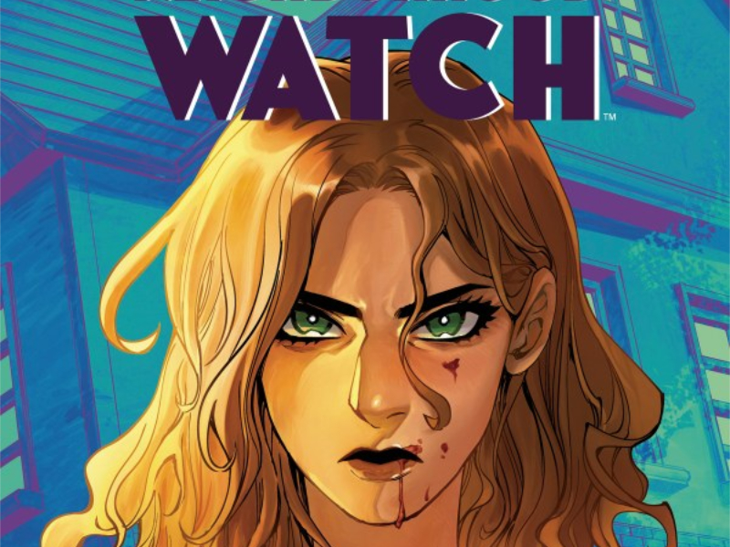
Open Arms And Closed Gates — Reviewing ‘Neighborhood Watch’ #1
by Scott Redmond
Overview
There’s some trouble in the area when two communities find themselves entangled thanks to spilled blood in ‘Neighborhood Watch’ #1. A truly gorgeous and perfectly executed debut issue that sets the tone for the whole series instantly. Just the right dash of reality, fiction, and social commentary rolled into one delicious meal.
Overall
10/10On the surface, a gated community and a collective commune would seem to have not a single thing in common. These are communities with a host of personalities, daily lives, struggles, and incidents that come from totally different worlds.
In Neighborhood Watch #1, the Will Haven Gated Community and neighboring Open Arms Collective are about to learn they have far more in common. A commonality born in secret tunnels, blood, and murder.
This bold new thriller series debut comes from Sarah Gailey, Haining, Rebecca Nalty, and Jodie Troutman.
-Spoilers Follow-

Oh yes, this was exactly as good as I was expecting it to be.
There was little doubt of that. I’ve loved everything I’ve read from Gailey over the years and adore the artwork that Haining produces. Putting them together to build a thriller of this nature, while poking at various beats of society, was sure to be a winner.
Right off the bat, we’re given some really bite-sized, streamlined introductions to these communities and some of their personalities. From the main focus characters Bianca and Val to various supporting figures and some that might even be suspects in the overall murder. Gailey wastes little time or space, being very focused on what she delivers, which is always the case with her writing. This gives us so much meat on the bone without it being overwhelming or full of fat that could have been trimmed away.

Speaking of the murder, I love how they dealt with the lead up to this point. Perfectly placed figures and items kept the face of Jill and Cassie, the folks in charge of the two communities, hidden. I assumed this was just a thing to play off us knowing little about them before they died, keeping the focus on the others around them.
Oh no, I was so wrong. We couldn’t see their faces because, even with the different hair colors, we would have instantly also realized that Jill and Cassie are (dun, dun, dun!) the same person, who uses hidden tunnels to pull off double duty of running two polar opposite communities. There is the mystery and hook that turns this from a must read to a super must read. Just let me give a round of applause for that well-paced concluding twist.

There is another beautiful contrast that is present within this series. This would be the overall appearance of the artwork. Haining’s style is one that is very lush, whimsical, detailed, and open. It’s not a style that some would assume pairs well with a darker story, especially a murder thriller, but oh yeah, it works here.
To be more precise, it works because the style is in contrast to the tone, and therefore pairs with and actually bolsters the tone. This helps establish the overall somewhat brighter feeling that the beginning of the story is trying to put across. It feels welcoming and safe, full of brightness and hope before it quickly shifts to perfectly embody darker elements. Funnily enough, I realized how well this contradiction works when seeing Haining’s work in the recent DC Comics special Gotham City Sirens: Unfit For Orbit.
Additionally, the color palette that Nalty employs here helps set those moods. Very lush and bright and comfortable in the beginning portions. Contributing to establishing that tonal feeling that I mentioned previously. It becomes progressively darker and heavier as the mood begins to shift, culminating in the very darkly colored underground tunnel.

There are a lot of tones that are built to be very natural and neutral in scale. This gives the normal spaces a familiar and relatable feeling. This is, after all, a story being told in neighborhoods that can be just like any other ones here in reality. Therefore, it makes sense to build colors in a way that feels relatable and tangible in this respect. Allowing the more vivid colors to set the Collective apart from the more cookie cutter suburbia of Will Haven.
Voices are crafted with a precise vision in mind. How they sound from their vocabulary to perhaps their cadence or patterns. Volume and tone are major portions of what we hear with those vocalizations as well. Turning audio vocalization into text is an intricate business because the presentation of the words must do a lot of heavy lifting. They need to be distinct and bursting with emotional energy so that we the audience can “hear” that voice clearly in our mind.

Troutman does this with absolute grace and style. Delivering on the differing vibes, voices, and personalities through the issue. Precisely adding in all the right seasoning to make sure that the tone and volume of each utterance and sound within the world feels authentic.
Neighborhood Watch #1 is now available from BOOM! Studios.