
A Setup Issue With Heart — Reviewing ‘Venom’ #259
by Scott Redmond
Overview
Another summer of symbiote centric events is about to begin, and ‘Venom’ #259 sets the stage for all the chaos. This creative team has masterfully pulled the strings through this whole series, never losing the fun and deep elements that have made it so good.
Overall
9/10Symbiotes have had a lot on their collective plates these days, what with new hosts, serial killers, and government interference. As things begin to cool down, that’s when the worst is happening, as the being known as Knull is returning alongside something possibly even worse.
It’s time for a reshuffling of the deck and collecting of allies as Mary Jane Watson and Venom prepare for the worst in Venom #259. This event preparation issue comes from Al Ewing, Carlos Gómez, Frank D’Armata, and Clayton Cowles.

Events are all the rage right now at Marvel Comics. Between the Queen In Black that this issue leads into, the just-started Avengers: Armageddon, the soon to start DNX, and the just-ending Ultimate Endgame just about every editorial office has or had an event (or two). These are just the ones that Marvel has currently announced or started, who knows what else is up their event and nostalgia filled hat.
Events are a very mixed bag. They can be really cool and connective or they can be really disjointed and lagging. More often than not we get the latter, but sometimes we get the former. Right now, thanks to this issue and the team involved, the Queen In Black event has the most solid chance to be the former option.
Chiefly, I rest that feeling upon the characterization that Ewing drops into every issue. This is an issue that is purposefully meant to lead into an event, reorganizing deck chairs before the big party. Yet, like usual, Ewing finds a way to make that still interesting. He does it by leaning on the characters and their feelings and struggles, with enough action and well used callbacks to bring the fun.

It was also a good way for Ewing to wrap up some of his own threads from the series ahead of the big event. Unlike other events, this one has been seeded for quite some time, and feels more natural coming in to sort of take over this series. It also helps that Ewing is handling the vast majority of it as the creative anchor alongside a bevy of great artistic collaborators.
Seeing Toxin get to pick a host was great, as was the way that the symbiotes’ feelings and traumas were addressed. Same with how we get more into how Dylan feels about not having anger anymore and how the loss of Paul is still affecting him. Capping it all off with an Iron Man cameo and a callback to MJ’s time working for him buttons up a really tight and rapid feeling issue.
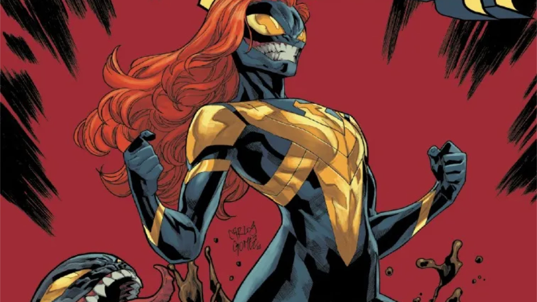
There is just something so bright and vivid and fun about Gómez’s artwork at first glance. It’s so dense with true tangible weight to everything that happens on the page. Characters and their surrounding set pieces feel like they have genuine presence, emotional weight, and so much detail. A word that perfectly describes it is slick, with enough tougher and rougher textures to add an air of authenticity.

Action sequences bounce around the page, as they should, with a full well of kinetic energy to power them through. Similarly, the more quiet character moments have that same energy to them, making sure we’re always right in the middle of whatever is happening. It makes us a participant and not just a viewer, as we’re feeling it all crashing down around us too.
Finding pencils and colors that compliment one another near perfectly isn’t always the easiest thing. Even the greatest artists can have their work look off if paired with someone else whose style isn’t the most complimentary. It takes nothing away from the talent of either collaborator, it’s just the fact that not all styles are compatible. Much like any type of relationship.
With Gómez and D’Armata, the pairing continues to be perfect.
The slickness of D’Armata’s colors compliments the aforementioned slickness already in Gómez’s pencils and offers up a lot of very vibrant and power punching colors that befit the type of story being told. Every setting space feels unique and wide open with lighting and coloring aspects that fit the mood we should get from the space. That being said, the brights are never too bright when setting up the overall spaces. It’s the costumes, powers, and other stuff that gets the most push on the vibrancy dial.

As it should be with a superhero story.
I believe I mentioned this was a very heavy setup issue, which means a lot more exposition. A lot of plates are spinning and a lot of information, as well as character moments, have to go down. It’s all well paced to never feel too overwhelming. That’s in part because Cowles is always so adept at making sure lettering flows as smooth as the calmest river, bouncing it around the page in whatever format works to keep the rest of the visuals central and unobscured.
There are plenty of chances to play with colors and shifting fonts, and Cowles misses none of them, allowing caption boxes, bubbles, and fonts to shift and embrace a variety of styles and colors to keep voices more unique and fun. We love some colorful fun, these are comic books after all, and Cowles is a letterer who understands how to bring that every single time.
Venom #259 is now available from Marvel Comics.
