
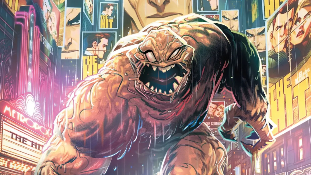
What’s In A Name Anyway — Reviewing ‘Clayface: Celebrity Dirt’ #1
by Scott Redmond
Overview
Body horror meets mental and societal horror in ‘Clayface: Celebrity Dirt’ #1, giving one of Gotham City’s worst a chance to stretch in a different way. Every detail of this debut issue hits and delivers, as the team defies any expectations that the series synopsis might have set.
Overall
10/10Villains of Gotham City compelling are flawed, nuanced, and tragic. Some of them are good or average people pulled into events or moments that scarred them.
Basil Karlo, once one of the hottest stars in Hollywood, fell into this mold as one of the many holders of the name and powers we know as Clayface. Ready for a comeback, Karlo finds out that someone has beaten him to it in the body-horror filled debut of Clayface: Celebrity Dirt #1, from Jude Ellison S. Doyle, Fran Galán, Patricio Delpeche, and Tom Napolitano.
-Spoilers Follow–

This, this right here, is the kind of thing that I love to devour.
As noted in the intro, the rouges of Batman are some of the most interesting villains in all of comics. They’re right there alongside the compelling rogues gallery of Spider-Man. Many of their villains share space as normal folks pulled down and given power that they use selfishly and harmfully.
If there is anyone that could successfully get into the mind of Clayface and mine all the nuggets of horror that come with the character, it’s for sure Doyle.

One bit that I absolutely love, is how the fact that eight different Clayfaces have been created over the decades plays into the plot. The story takes the fact that comics does this — recycles ideas and creates new versions — and turns it into something far more. Eight beings with this ability are all criminals with mental health issues, so there could easily be confusion on their parts. Our focus Clayface swears they are Basil Karlo but their paperwork and the inconclusive nature of Clayface DNA say otherwise. Are they lying, or are they delusional, or even more wild could they be telling the truth despite what the evidence showcases?
These horrific elements play out beyond beautifully thanks to the work of Galán, who brings a style that on the surface feels soft, and whimsical, and bold. It’s perfect for a story featuring superpowered beings and their world. Yet, right away, with the reveal of the meltdown of an actress, we see the way that this softer brighter artwork can easily deliver spine-tingling body horror elements. As things move on and Clayface escapes, this keeps going.
Plus, that page with the masses of Clayface faces on the ceiling featuring so many eyes and teeth, while dripping down on the unsuspecting guard…nightmare fuel.

Intertwined with this is the element that this is a horror story from multiple angles. It’s not just the Clayface we start with escaping in such a gruesome way or the meltdown we see. There is the obvious bit by the end with the Basil Karlo we see being something horrific in his own right, who or whatever he actually is. On a more subtle level is the horror that a story of a villain reforming is just a shell to something worse. There is a hope that people can be reformed and will turn their lives around, but the horrifying fact stands that sometimes society, others, or ourselves stand in the way of such things.
We feel all of that through what Doyle presents with the character and story, as well as how Galán depicts it upon the page. Raw emotions are felt through and through, the settings are dense and familiar, and the characters and their moments take up space. Creating a rough and tumble experience that flows so smoothly.
Colors that are toned down in some respects before being skyrocketed the other way are an important element. It sets the mood as Delpeche’s color palette choices really add so much to what we’re seeing. — bringing darkness to the forefront alongside vivid splashes of colors from browns to reds to others. There is an almost watercolor-esque quality to some of the pages in the delivery of the colors, feeling weightless at the same time that they feel beyond hefty.

There are quite a few spaces where focus characters, Clayface and Basil in particular, are featured heavily in filter colors — An almost toxic green in one case, and then gray shadows in another. It keeps realistic lighting effects from the space in mind, while also adding another level to the feelings they’re mean to evoke in these particular moments.
Little shifts to lettering can do so much. Take this series for example. Where Napolitano takes caption boxes and dialogue bubbles and creates an almost amorphous always shifting lumpy feeling to them and the text they contain. Right away the voice we create in our mind for Clayface really is altered and sounds like you would expect from this lumpy shifting being. Personally I hear it as the way that Ron Perlman delivered it for Batman: The Animated Series back in the day, but that’s my 1990’s coded brain.
I love the way that Napolitano just goes all out when it comes to lettering. He leans into the moment and makes each voice, each utterance, sound, or whatever feel unique and powerful. It’s allowing it to mold to the story moment in the best ways possible and evoking emotional resonance and impact with each bit of lettering that graces the pages.

Together, this team has created something that is terrifying, sad, intriguing, and mysterious all at the same time. I look forward to where it goes next and what twists and turns might remain, as well as how much horror can be mined from this solid concept.
Clayface: Celebrity Dirt #1 is now available from DC Comics.

