
Review: ‘Frontiersman’ #1 Explores Sociopolitical Questions
by Benjamin Hall
Summary
An eco-activist organization approaches a socially conscious former superhero. Will he join them, and will it be dangerous to do so?
Overall
8/10Writer Patrick Kindlon and penciller/colorist Marco Ferrari do great work on universe building. This occurs primarily to flesh out the titular character. However, it also happens so that any kind of reader can feel that there is a sense of history to this title. Unfortunately, Kindlon and Ferrari go a bit obvious who and/or what the inspirations are. Yet, they do so in a way that suggests both love for the originals and thought to where the analogies may go. The latter is a good thing considering this ongoing seems to have a lot to say

Ferrari’s artistry and coloring are both exceptional, but one panel is slightly out of sequence. Speaking of the sequencing in this issue Ferrari uses an unusual style to layout certain pages. Yet, for the most part this issue’s sequencing is standard and flows nicely. As for the color palette there seems to be a lot more range than most comics featuring superheroes. For example the titular character’s costume for example features more hues than most other superheroes.
Letterer Jim Campbell does great at placing the text. Campbell also does a good job at enhancing characterization via bolding certain words for emphasis. This bolding is noticeable and subtle due to the style of font Campbell uses. It is more noticeable in the boxes due to Campbell using italicizing the text. Whereas the text in the word balloons looks more standard, and thus the bolding is more subtle.
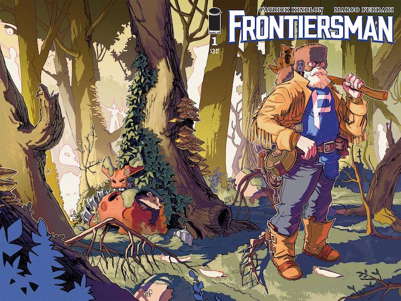
Artist Maurizio Rosenzweig creates a great wraparound design for cover A (creative credit is according to Image’s official site). Of particular note is how Rosenzwieg uses negative space and light coloring to create visual Easter eggs. Rosenzweig also does a great job at suggesting that this is a non-traditional superhero story via the overall design. While cover B by artist Matteo Scalera is non-traditional in its lack of color its traditional in its action. Still the action has a lot of depth and an arguably epic feel. Finally Scalera’s overall design works both as a wraparound and a regular cover whereas Rosenzweig’s cover does not.
Frontiersman #1 is out now from Image.
