
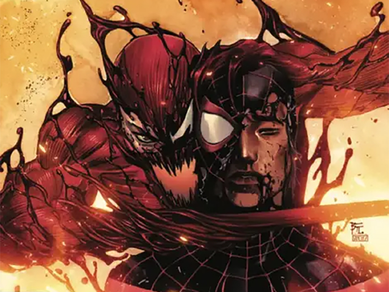
Between A Scorpion And A Carnage Place: Reviewing ‘Miles Morales: Spider-Man’ #6
by Scott Redmond
Overview
‘Miles Morales: Spider-Man’ continues the title character’s battle against the deadly symbiote Carnage, putting the young Spider-Man in a very precarious situation. This highly emotional, energetic, visually stunning series is exactly what many fans of Miles Morales have been asking for. A must-read for anyone that likes Miles, Spider-Man, and just great comic books.
Overall
9/10Miles Morales sure can’t catch a break. Fresh off Rabble burning down the family home, turns out Carnage is back. Serial killer Cletus Cassidy’s got a fresh symbiote Iron Man suit/Extremis fusion body and is looking to bring more terror to New York City. Let there be Carnage!

Pulling a series into a crossover for a couple of issues can always be a tough thing in comics, with the long waits between issues. There is also the fact that often the overall main story beats get lost in the crossover shuffle. A series, especially a newly launched one, can have trouble keeping its identity under the event pressure. That’s not the case at all with this issue as Cody Ziglar has this whole event tie-in situation down to a science.
Not only does the issue start off with a great recap of the aftermath of the first story arc, but elements of that run also keep informing this issue. Sure, this is the second issue of an event (following the set up in Carnage Reigns Alpha #1) but it’s still very much the sixth issue of Miles’ series. Every bit of the great character work and emotional beats from the previous issues find their way to this issue. Naturally, it also helps that Ziglar helped write that alpha issue alongside Alex Paknadel, his co-runner of this mini-event.
Pairing Scorpion and Spider-Man leads to some great back and forth, as well as exploration of this classic Spidey villain. It’s a very tightly packed issue that never slows down, delivering tons to the foundation of this event. Typically, this would have been a space for Peter Parker, but having Miles as the star fits so well. Truly this run is putting the character back up at the top-tier spot that he deserves and once called home.

Every bit of the artwork is radiating with that rapid-paced energy mentioned above. Federico Vicentini showcases exactly why he was one of the Marvel Stormbreaker artists with this series, delivering some highly emotional kinetic, and powerful art in every single issue. The New York City of Marvel is the “world outside the window” and it feels that way here. It’s deep and dense, every space feeling like an actual space in the world. Even when the characters are trapped in the underground rubble.
There is no mistaking how the characters are feeling in these tense moments. It’s clear within their body language, as well as written on their faces. Capturing facial expressions/emotions is surely not the easiest, doubly so with a mask in the way. Yet, Vicentini accomplishes it with ease with Miles. We the audience are right there with him in this trying time, and we feel it.
Spider-Man is a character that just sort of bounces and flows through the world at large. Often, we’ll get very static or posing shots of the hero in things, which is fine, but the more fluid approach is king. Vicentini delivers there as every single panel, even still ones, have inherent movement. The angles change, as does the focus, creating a unique flowing feeling through the pages.

Matching coloring with art isn’t always an exact science. More often than not, it works, with some occasions where the two paired don’t fully mesh. That’s not the case though with Bryan Valenza and Vicentini, who pair up spectacularly.
A lot of heavier and darker color choices by Valenza match the world outside the window/reality feel that I mentioned. It gives the space a grounded appearance that allows the fantastical to stand out more. It’s the heroes and powers and situations that often have the far more vibrant palettes in play. Even then they still have some darkness/shadows in play that play into the darker and more dire tone of the story. Choosing the right colors at the right spot can help set or change the tone/emotions instantly.
The artwork and colors display the emotions and set the tone visually. We feel them on the page and can understand the world/characters/moment through them. Giving us the complete picture though is where lettering comes into play. Through this, we can fully hear everything in our heads. Cory Petit is always so masterful at laying out the various bits of lettering on any given page.

Adding in the little bits and pieces that will help make the voices in our heads as accurate as possible. Popping up the font size here or there, throwing in some bolds, or colors can instantly raise the volume/change the tone. It’s also another realm where fun can be brought into play, tapping into the awesome medium that is comics. Colorful loud SFX, shifting speech bubbles, etc. just bring so much to an issue and remind us why comics rock.
Miles fans are eating really well.
Miles Morales: Spider-Man #6 is now available from Marvel Comics.


