
Sometimes You Can’t Go Home Again: Reviewing ‘Poison Ivy’ #13
by Scott Redmond
Overview
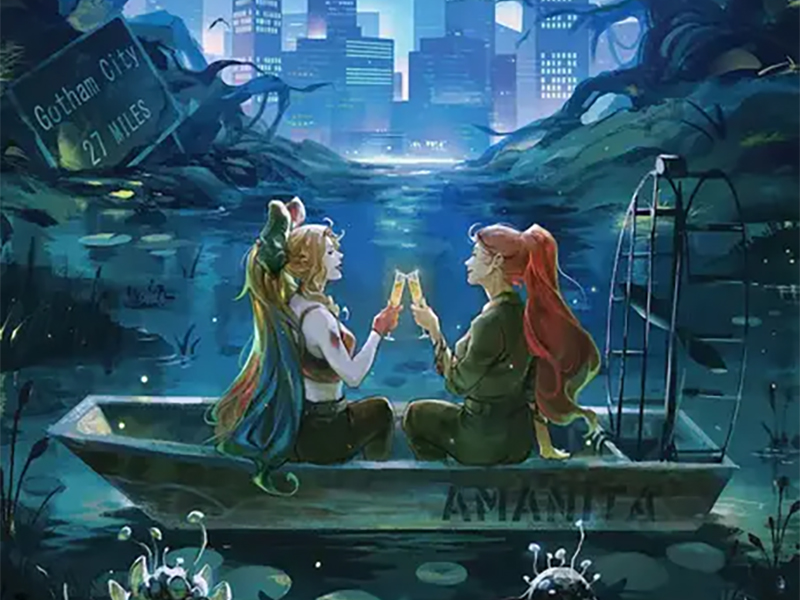
‘Poison Ivy’ kicks off the second year of the title, now a full ongoing series, with another character-centric development piece full of plenty of emotion and great moments for the title character. A solid rotation of artists comes together to create something unique and unified, showcasing the different styles that make Gotham City a great visual playground.
Overall
10/10Poison Ivy and Harley Quinn are together again in Gotham City. A city that Ivy left on the worst terms. There very well might be some Bat-related hell to pay.

Year one of this amazing series has closed out and the second is starting off with a bang of its own. We finally get to see Ivy and Harley in the life they wanted, one where they are together. But while Harley is semi-on the side of the Angels currently, Ivy still has much to answer for regarding the recent past.
Speaking of the current day and the past, we get a truly intriguing artist jam on this issue. Changing artistic teams across pages is always something that is planned out as the issue is produced. Sometimes, though, it feels even more perfectly planned out in a way that benefits the issue greatly.
Regular team Marcio Takara and Arif Prianto kick things off, and finish them, by handling the framing pages of the issue. Guillem March, alongside Prianto, swoops in for the Gotham City Sirens reunion of Ivy and Catwoman (a series March worked on). A blast from the past comes as Kelly Jones works with Jose Villarrubia on a chunk of the issue that brings Ivy face to face with Batman. Lastly, A.L. Kaplan takes on art and colors for a section in Slaughter Swamp with Killer Croc.

These are the types of artist jam issues that work so well. Where each creative team has their own section with their own focus. It makes the changes of artwork flow better because a scene change is a clear breaking point. Rather than a change happening right in the middle of a scene.
All of them have such different styles and it makes it fun. We get the usual detailed but slightly exaggerated light with swirls of darkness from the regular team. Giving us that tie to what has come before while also setting up what is to come next. March’s style afterward leans even a bit more into the close to reality/almost a photo but still allows for creative flairs to the side. It’s a smooth transition because of some of the traits the styles share, including the colors Prianto brings to both.
Kelly, of course, is a big-time Batman artist, and that distinctive rough, somewhat exaggerated style is a welcome one. Just the way that Kelly draws Batman with those huge ears and an almost otherworldly being is so great. Villarrubia plays into that darker style with lots of heavy shadows and muted color choices. Ivy’s red and green are the brightest pops, as the rest is rougher and plays into the tense tone.

Somewhat in the middle would be Kaplan. A style that has that depth/detail, but also the exaggerated roughness. It works perfectly to move from Kelly’s work back into Takara’s. Also, the colors here are so vivid with tons of yellows, oranges, and pinks that dominate at times. It fits the feeling of Slaughter Swamp and Croc, paired with plenty of darker and firmer colors too.
The story continues to move Ivy forward from what happened before. Yet, those past issues and moments still hold the power of where we’re headed. G. Willow Wilson has created a situation where the character grows but it’s not an easy road. It’s not something that just is done and etched into stone. As with all living things, it’s a constant battle to find and keep oneself.

What I really appreciate about the issue is that it would have been simple for Wilson to have Batman and Ivy fight. They are heroes and ‘villains’ after all.
Instead, Batman warns her while also showing support of a kind. What makes villains like Ivy so compelling is that they are not cackling supervillains just bent on destruction or power. They are flawed people with trauma and/or mental health conditions that color some of their choices. Being a flawed traumatized individual himself, Batman can understand and often does what he can to support villains even after stopping them.
Books are about to take a pause for Knight Terrors tie-ins, an event that happens in July and August. Poison Ivy is perfectly set up for this nightmare story, as the horror tone is a large part of this series. Especially with the continued hint that Jason Woodrue might still be haunting Ivy after his presumed death.
One element of art that is the same from start to finish is the great lettering from Hassan Otsmane-Elhaou. Every issue that Otsmane-Elhaou has been on this series has been stellar. Here though, we really get to see his magic really go off. It would have been simple to do the same little things to the lettering on every page from start to finish. We don’t get simple here.

It all flows and fits the work as usual, but where it stands out is how the lettering shifts with each artistic change. All the speech bubbles, dialogue font, caption boxes, and SFX quickly take on the energy of the artwork. Shifting from smoother to rougher to lighter or darker as needed. It’s seamlessly part of the same feeling as the rest of the artwork, as Otsmane-Elhaou works to make sure it all comes together.
Poison Ivy #13 is now available from DC Comics.

