
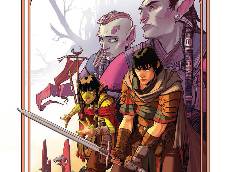
A New Era Fantasy Epic: Reviewing ‘The Hunger And The Dusk’ #1
by Scott Redmond
Overview
‘The Hunger And The Dusk’ throws the audience into a world that is both familiar and brand new at the same time, laying the groundwork for a possible new epic tale. Lush colorful detailed worlds, fluid swordplay, and deep lore are married together in a well-crafted opening issue. A must-read for fans of this genre, this creative team, and just good comics period.
Overall
9.5/10Humans and Orcs go together when it comes to fantasy stories. The Hunger And The Dusk switches things up some. Rather than just being constant foes that will fight till one side is triumphant, these bitter enemies must become allies in a dying world. For a threat worse than either side has arisen to slaughter them all.

Any new fantasy story needs to have the groundwork laid out for the audience quickly. We need to understand the setting, the stakes, the characters, and some of the quests to ease us into a new fantastical realm. This series accomplishes that all in an engaging way within the first issue.
We’re thrown right into the mix with a quaint seeming human village about to be attacked by orcs. Those orcs are quickly dispatched by some shadowy force, that descends upon the villain themselves and slaughters everyone there (save one child). It’s a brutal opening but one that quickly tells us all we need to know, in an effective and powerful way.

This is to be expected from a writer like G. Willow Wilson who is a master at crafting narratives in this manner. We’ve seen her do this in numerous titles or with brand-new characters in established realms time and time again. Within the span of a few pages, we learn so much about various new human and orc characters that are forming this new alliance. The seeds are planted for the romance that will be key to this overall saga.
We’re presented with a bleak world, yet lighter moments of levity find their way in, and soften the blows. Deep emotion, sweeping world-building, swordplay and magic, and plenty of hallmarks of the fantasy genre are present. Stepping into this world feels like returning to a place most familiar yet new at the same time. It’s heavily expositional, yet moves swiftly, with enough sprinkled in action, that it never drags the book in any way. In fact, all the exposition boosts the series as it brings that deeper feeling into play.

Exposition isn’t the only thing we need to build a world of this kind, especially in comic books. Bringing it to gorgeous visual life is the job of Chris Wildgoose, Msassyk, and Simon Bowland on art, colors, and lettering, respectively.
Wildgoose creates sprawling vistas and detailed depictions of these various beings across the page. Every human and orc is unique, with their personalities shining through every page. There is a very light sort of feeling to Wildgooses’ artwork that works as a solid counter to the overall bleakness of the story. Every single bit feels like a tangible textured world that we could leap right into at any moment. As intricate as the writing of the story is, the artwork matches it beat for beat.
Wildgoose’ artwork feels truly dynamic, both in the exposition and action sequences. Those action sequences are so smooth as they flow across the panels. There is a weight to them that makes each blow and impact land in a way we can almost feel/hear. One might find their mind turning to any other fantasy world they deeply know as they gaze upon this work. There are elements of the genre as a whole present, but Wildgoose also makes this world truly unique.

A lot of this comes from the color pallete that Msassyk pulls into play. The opening pages are full of golden colors, speaking to the innocence and quaintness we’re meant to feel. It quickly switches as the reds and oranges and yellows are wiped away with overpowering darkness. Throughout the rest of the story, she balances the lush lighter colors with heavier darkness easily. It allows us to remember how dangerous this world is but also how beautiful is, and what the characters are fighting to save.
Most of the colors are kept to a sort of toned-down ‘regular’ level. This allows the bits that are more lush or powerful to be the ones that are more vibrant. Plenty of bold lush greens fill some of the pages, or reds that pop during a battle. It keeps the world feeling real in a sense, while still having its fantastical tones.
As this is a highly expositional intro, the lettering has a lot to do. Bowland makes it all move through the series smoothly. They feel as hefty as the rest of the art within the issue, emotions and personality popping out of every word. Little changes like bolds and italics help always make volume and tone abundantly clear. While the SFX might not be bold and colorful as in other types of comics, they are still powerful. Bowland makes sure they are right at the moment and fit the overall tone of the series.
The Hunger And The Dusk #1 is now available from IDW Publishing.
