
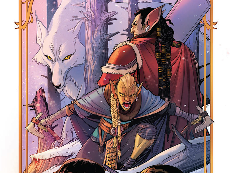
Blood, Steel, And Orc Love: Reviewing ‘The Hunger And The Dusk’ #2
by Scott Redmond
Overview
‘The Hunger And The Dusk’ gains even more depth as the second issue throws the characters and the readers into the fire once more, continuing what surely will be a fantasy epic for the ages. Bold dynamic art full of vivid colors brings life to everything on the page creating a world one surely wants to visit. If you haven’t picked this book up yet, nows the time to get on board.
Overall
9.5/10One would assume that building and fleshing out a new fantasy world would take quite a significant amount of time. Surely one could not accomplish a large chunk of such a feat in say, just two moderately sized comic books.

Oh, dear one, clearly, you’re not reading the new IDW Publishing series, The Hunger And The Dusk. I say that because the first two issues of this series have very much reached that accomplishment and then some.
After such a thorough — and harrowing — action-packed first issue, no one should be shocked that the second does even more to give the characters and their world vivid life. This is a dangerous realm under siege, making for strange alliances full of very compelling characters. When that “I would die for this character!” sort of fan feeling creeps into play this early on, you know things are going well.
I mean truly, how can we lose after that character introduction bit that kicks off this issue? G. Willow Wilson, of course, knows that there are a ton of characters she’s presenting to us, and to spend too much time introducing them would slow things down. Sure, we could have a heavy dialogue meet the team issue. But why do that when, instead, one can do a realistic crunch time quick intro that plays into the idea that the characters and audience both will forget some soon enough?

The members of the Last Men Standing company are a menagerie of familiar fantasy types with their own flairs and personalities shining through. It’s one of the lighter moments of the issue as we, the audience, can put ourselves in the shoes of Tara. Many of us have been that new person in a group desperately trying to remember names and faces full of awkward energy trying to fit in.
I love the way that Wilson weaves the two stories, that of Cal/Tara/Last Men Standing and Troth/Faran, together so seamlessly. Especially since these moments serve to both establish who these characters are and their wants/needs/pasts and also keep fleshing the world out. Being able to achieve both feats at the same time is the goal, and anyone familiar with Wilson’s work knows that it’s something she’s very skilled at doing.
Just like the first issue, there is plenty for Chris Wildgoose and Msassyk to breathe vibrant life into. From animated characters, nailing the emotional facial/bodywork, to giant beasts to fluid kinetic battle sequences.

Everything has a very deep and lush feeling to it, as this world doesn’t feel small or simple. Wildgoose chooses ways to present it all that keep us down with the characters while also making sure we inherently feel that this world is truly massive. We’re occupying but a corner of it currently and should be so lucky as to get to see tons more before the tale is done.
In that intro section mentioned above, we get to see once more how well Wildgoose can give each character such a uniqueness. Every member of the human group is quite different in build, facial features, style, hair, and all other bits of their appearance. Same with the various Orcs that we’re seeing. They all are living breathing individuals and we can feel that as we gaze upon them.
There is just something really dynamic but also whimsical about what Wildgoose accomplishes here. Each sequence has weight and heaviness to it while also being quite light, tapping into the fantastical energy that is needed for such a story. Taking this to the next natural step is the color work that Msassyk is bringing to the table.

Plenty of space is allowed for some colors that are very noticeably vibrant, popping off the page, here or there to make certain elements stand out. Around them though, most of the colors are toned-down, natural, and middle level. Not too bright and not dark, allowing for colors to take hold but all blending the same way that things do in any given space. Walking down the street right now most things would not inherently stand out as the colors and light would not command that attention for the most part. Then comes the bright vivid red house out of nowhere that the eye can’t help but dart towards.
This is what Msassyk is doing with every bit of color.
That’s not to say there aren’t darker elements that also catch the reader’s attention. We’re in a war-torn fantasy world after all, and things take a pretty dark turn near the end. Both in the colors, but also the story beats around the characters. Lush was a word I used above to talk about this world, and we can’t have that feeling without the natural colors that Msassyk drops onto the forest and other areas.

All the energy put into the other pieces of art is something one would want to see brought into the lettering as well. No worries, that’s what Simon Bowland is always doing. Emotions are screaming from the words in the way they are presented, letting us know the intensity and feeling all at the same time. Just some font changes here or there and their words and tone can greatly change from one moment to the next.
Just like the first issue, there is a lot of exposition needed to lay out some things in this world. Action does a lot of the talking too, but we are given plenty of words to take in along the way. Bowland deftly makes sure they all flow in an easy-to-follow way, framing the rest of the artwork to draw our eyes where they need to be. We can see and hear the characters so well, and that adds so much to any story of this nature.
The Hunger And The Dusk #2 is now available from IDW Publishing.

