
Soaring High Once More: Reviewing ‘Birds Of Prey’ #1
by Scott Redmond
Overview
When the Canary cries, the Birds Of Prey answer the call. A stellar debut issue sets the tone for this series revival, tapping into the past while presenting something modern and refreshing. A perfect jumping-on point for fans new and old ready to see these women kick butt and maybe take names later.
Overall
9.5/10Black Canary has a deadly personal mission and needs to gather the best team. Enter the new Birds Of Prey.

That’s a name that carries a lot of weight in the hearts and minds of many modern comic book readers. Hard to believe it’s been almost 30 years since Black Canary and Oracle teamed up in the first Birds Of Prey minis, back in the old days of 1995. Time sure flies.
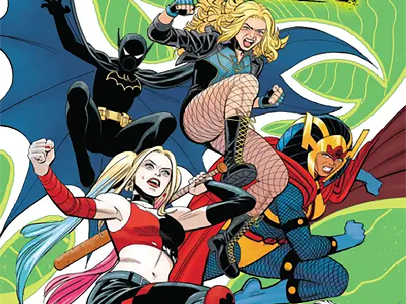
As much as things have changed since then, some stuff has stayed very much the same. By that of course, I mean that the team is still made up of some of the best kick-ass female characters around. This time that would be Canary, Batgirl (Cass), Big Barda, Zealot, and the wild card that is Harley Quinn.
What has changed though is the creative forces tapped to bring the Birds back to comics at last. Gathering this new edition of the team is the Eisner Award-nominated team of writer Kelly Thompson (making the leap from Marvel Comics/Captain Marvel), artist Leonardo Romero, and colorist Jordie Bellaire. Yes, that’s right, the creative team that brought the world Kate Bishop’s first Hawkeye series in 2017 is together again, joined by letterer Clayton Cowles.

Everything about this issue is pretty much perfect. That’s a word that I don’t like to use very much because it’s so subjective, but it fits for this issue.
Right off the bat, there’s the work that Romero and Bellaire are putting in here. At first glance, everything about those visuals just screams classic in the energy it’s radiating. I’m not one of those who prefers any era of artwork over others, and often feel like we’re in a golden age of some stellar powerful artwork. There is just something about the artwork that is very modern in design but evokes those warm blanket homey sort of classic vibes. This duo has really figured out the formula.
Every character is bursting with life as there is so much flowing movement in every panel. Details and depth are key, as this feels like a lived-in space with real individuals populating it. Other times though Romero knows where to pull back on the overall details to make sure the characters or a moment takes the spotlight. Our first page with Canary and Batgirl is easily one of my favorites, as it should seemingly be chaotic, but the fight choreography is solid.
Smoothly gliding around the page in an easy-to-follow fashion that gives these wild superhero fights a more tangible feeling.

There is a vividness to the colors that is paired with a somewhat more toned-down aspect. Bellaire comes in with many of the sort of neon-like tones that she uses at times, giving the book a stylish pop. Overall, there is a very Ben Day Dot-esque quality to the colors which plays into that classic feeling that I spoke about previously. It makes sure that this story stands out and it compliments the tone that Romero is laying down with his work. It’s clear why these two work so well together and were nominated for prior collaborative work.
Gathering the team issues are always a hard thing to accomplish. If not executed the right way, they can be kind of boring and drags. It’s about the presentation of the team building that can make it sing. Thompson uses the good hook of Canary trying to brainstorm who is best for this mission to save her sister Sin. It leads to some of the characters helping find the next person and a lot of fun meetups and fights along the way.
Doing it this way, seeding action along the way makes sure it’s not just people talking about a team or dropping exposition on us the audience directly.

Thompson has a solid handle on these characters and their interactions, including those that don’t regularly interact. Barda referring to Cass as small bat was hilarious and adorable at the same time. Even the bits with Harley hit differently. She’s one of those characters that can be a bit much, but her recent heroic sort of turn works well, and her attitude here just worked for me.
Do I buy the bit about her almost beating Cass in a fight? Not entirely, but I see what is being done here. The wildness of Harley is something that could faze Cass a bit because her fighting style and that of many she has fought are usually more disciplined and ordered. Harley is generally chaos personified.
While I said that the exposition dropped isn’t being aimed right at us, there is a lot of talking in this issue. There needs to be as there is a lot to lay out. That’s where Cowles comes into the picture. Making sure it flows smoothly and never overwhelms the reader or the panels, infusing it with just the right bits of personality and energy along the way.

I’m a huge fan of caption boxes that incorporate logos or colors or themes of a character, and we get those here. It makes it easier to tell who they belong to, but it also personalizes what otherwise might be somewhat plain. Comic books are meant to be bright, colorful, and fun in many cases (outside of those meant to be darker) and these elements are part of that idea. Just like the fun bold in the moment SFX that give that little extra bit along the way.
Birds Of Prey #1 is now available from DC Comics.

