
Rise Of The Outlawed: ‘Detective Comics’ #1076 Review
by Scott Redmond
Overview
Gotham and its defender stand on the brink of darkness in ‘Detective Comics’ #1076, causing the unlikeliest of characters to gather for what might be the biggest heist ever attempted. A truly darkly gorgeous journey played out in a number of stories packs this issue full of so much greatness. There is no slowing down this amazing ride, as the next chapter of the ‘Gotham Nocturne’ begins.
Overall
10/10As the second act concludes and the intermezzo begins, Batman’s fate lies entwined with that of his beloved Gotham City. Imprisoned, slated for execution, and battling demons within, the dark knight’s only hope lies with an unlikely group of outlaws.

So, it begins, as Detective Comics #1076 kicks off the biweekly event aptly titled Outlaws. The next chapter of this operatic run from the minds of Ram V, Jason Shawn Alexander, Dave Stewart, and Ariana Maher. This tale is paired with three backups, with the first from Dan Watters, Christopher Mitten, Trionna Farrell, and Steve Wands. Our second backup comes from Watters, Liam Sharp, and Wands and the final sees Ram V handling writing and art with Aditya Bidikar on letters.
Let’s just start with how damn stylish and impactful this issue, and this series have been.
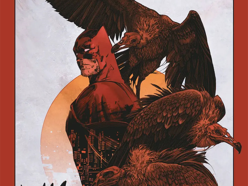
Alexander and Stewart are a perfect pairing here. Stewart helped kick off this epic story, and it’s only fitting that he returns now to help guide it toward its next act.

Batman is just a man. A man that is highly trained and determined, but still just a human being. So, it would be easy to really gravitate towards more grounded, realistic, almost photographic art styles for his adventures. Those certainly have their place within the sphere of the Dark Knight.
But by golly, the really rough, sharp, exaggerated, stylized stuff is really peak Batman stuff. This bat-themed vigilante that seems huge, misshapen, with bumps and sharp edges all over just works. Criminals are meant to fear this guy, and if you see these stylized versions coming for you in the night, better believe the fear would be pouring out.
Everything is very dark and rough, showcasing the grit of Gotham and the toll that things take on its residents. Everyone, from Batman, to Azrael, to Catwoman, to Poison Ivy, is truly unique in their appearance and presence. There is plenty of weight to everything, making each panel/moment have a true impact. Gotham is on the precipice (When isn’t it, though, really?) and there is no way that isn’t felt when glancing at these pages.

Amidst that darkness, Stewart brings plenty of sharp vivid colors into play where necessary. These vigilantes, other beings of great power, and fantastical situations should feel unreal. They should instantly stand out from the rest of the urban landscape, a city meant to mirror parts of our reality. Yet, those colors are not so vivid/bright that they pull away from the heavier shadows and gloomy atmosphere.
Ram V is a true maestro, deftly conducting the proceedings. Giving the artists the space that they need to take the ideas upon his pages and bring their own energy into play. We’re witnessing a masterclass of a story, which takes everything we know about this character and finds ways to use it without it feeling nostalgic or confined. Far too often trying to bring too many characters or continuity into play can bog down a story or even end up taking over.
Within this series, that is not the case. Various characters and spaces come in and out of the narrative, in the most natural ways. Only enhancing the story, rather than detracting in any way. Even with all the faces, this remains a truly human story. One that is stripping Bruce Wayne/Batman to the very bone. Reminding us, as noted, this is a human being, one who is pushing so hard to accomplish his personal mission. No matter the personal cost.

As the artists shift through this run, so does the lettering. Not because the letterer changes, but because Maher makes sure to embody the energy of her fellow artists into her own work. Where last issue the fonts and bubbles changed to embrace Francesco Francavilla’s whimsical roughness, here they become sharper in their rougher gritty nature.
Each of the more eccentric characters has its own color scheme and font shifts within bubbles and captions. It gives each of their voices a distinct tone and shift, really changing how we imagine their voices. Especially Azrael with the slanted letters and the boxy bubbles, with that fiery red. It fits his very theatrical religious tones.
For the first backup, we follow Commissioner Renee Montoya, otherwise known as The Question. Watters really delves smoothly into her mindset, as she struggles with being the cop she wants to be and being the vigilante that can do more without the red tape. There is just such a matter-of-fact, logical, almost eerie quality to her caption boxes, which Wands nails perfectly with the placement and visual choices. A solid encapsulation of a detective story with an emotional core.
Much like the main story, there is a roughness to the artwork and colors, creating a gritty detective sort of feeling. Mitten pulls back on details in the setting in order to steady our focus on the characters themselves. One of the neat things is how, as herself, Montoya’s facial expressions are distinct and clear but as the Question with that mask, all faces are slightly less detailed. Mirroring her closed-off expressions in the world around her.

The art is paired with a color palette which is very toned down in scale but is still quite bright. Lots of purple, green, and other hues can be found to give the city personality. In other scenes, those hues are gone to be replaced by colors that are natural to the world/environment, with heavy shadows, that showcase the darkness that lurks in Gotham.
Just as Montoya moved from the main story to a backup, the same goes for Azrael. This moment is a return to the character for Watters who penned the recent Sword Of Azrael miniseries. It’s a very contained story with Azrael trying to create a ‘machine’ (the reveal of what it shows at the end is so good) while coming to the aid of Father Valley and Vengeance (daughter/clone of Bane). Again, it falls to Wands to make the plethora of words flow and fit the personality of the speaker, creating the perfect tone throughout the story.
There is a coldness, in a logical matter-of-fact way, to Azrael when he’s not theatrical. It can be felt and heard throughout. We feel it everywhere as Sharp’s artwork captures that tone in places but then easily slips into a very exaggerated fluid kinetic burst. Again, I love this kind of artwork that shows how strange and dark this world is and how these characters truly are. It makes everything sharp, rough, bigger than life, but still very grounded in many respects. This is seen within the color choices as well, which are bright but also heavy with shadows and darkness.

Lastly, we get Ram V picking up the artist pens to give us a bit of a clue about the Barbatos bat demon within Batman’s mind. It’s a short piece but there is so much delivered through it. Both in the words, which Bidikar gives such a powerful dark flare (oh the white on red and red on black are so good), and the artwork. Almost watercolor-like in color quality, the panels which are set over a black background (with faint symbols) are striking. Our half glimpse of Barbatos is truly haunting, felt like he was staring into my actual soul.
In a way, it encapsulates what this overall run has done, diving deep into character and world in the moodiest and most powerful of ways. The inclusion of Doctor Hurt returns to my earlier point of how this series has pulled so much from the whole Bat history without it feeling forced or overwhelming. Naturally, all these pieces of Batman’s world from various eras would still have ties to him, no matter what he’s going through.
Detective Comics #1076 is now available from DC Comics.