
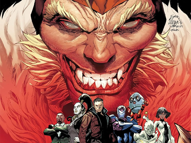
We’re All That We Have: Reviewing ‘Sabretooth And The Exiles’
by Scott Redmond
Overview
‘Sabretooth And The Exiles’ was one of the best series published in the Krakoa Era of the X-Men. It tackles some real and complicated situations through the metaphor lens that is so much a part of the X-Line. Spot-on and powerful visuals complement the grand ideas that this string of miniseries is trying to broach. A series that never shies away from a dark world, choosing to shine a light in it’s face instead.
Overall
9.5/10As the Sabretooth War rages in Wolverine, now seems a good time to revisit one of the foundational preceding chapters.

Picking up where the first Krakoan Age Sabretooth miniseries left off, Sabretooth And The Exiles took the title characters further and to places they had never gone before. Victor LaValle, Leonard Kirk, Rain Beredo, and Cory Petit returned from the prior series to create this one as well.
Comic books fit into a variety of realms. They can be wall-to-wall action-packed blockbusters or deeply emotional character-focused journeys. High fantasy romps, out-there science-fiction spectacles, terrifying mind-bending horror escapades, or just a true exploration of human nature and the world.

At the end of the day, they have a message, whether that message is small or huge and powerfully resonant. Sabretooth And The Exiles is a comic with a lot to say.
There’s no surprise here, since the previous series from the same creative team was a comic with tons to say. While that one was focused on the systems of incarceration and how societies fail their members, this one moves broader. Here, Sabretooth and his fellow former prisoners are free from Krakoa, outside of the “paradise” and living up to the exiles part of the series title.
This series points to what happens to those who are allowed to slip by the wayside. Mutants who were not brought to Krakoa or excluded. It asks the question who fights for those who are exiles, the forgotten, especially when their exclusion leaves them at the mercy of a system meant to exploit and harm them? In this story/world, the mutants that are not of Krakoa or Arakko are at the cruel awful mercy of Orchis and those like them.

Even with all this big messaging around the lost and forgotten, LaValle makes sure to take the space to showcase these characters and their voices.
We get little snippets, mostly, but it’s enough to once again make sure you know just who each character is and what their situation or overall feelings are about the world and themselves. It’s terrifying to watch as both Nanny and Sabretooth work to undermine groups of mutant youths and influence them using their fears and anger. Toad is there as the character to speak to how sadly easy it can be for the wrong element to take advantage of anger.
These characters and spaces have a rich history that is both remembered and not so remembered. That’s what happens when there are so many decades of stories. Great writers find ways to make sure that stuff still fits into the ‘now,’ without being an anchor to their story or just nostalgia-baiting.

Data pages are a curious thing in this line since they debuted with the Jonathan Hickman-led relaunch of X-Men.
Some books use them to drop lots of lore or explanations that would take up multiple panels or pages to get out. A few are more effective than others.
Those here have been quite effective as they highlight relevant moments in history, either outright or in a letter from someone, where society did much like Orchis is doing towards marginalized groups. Instances include the regularity of medical personnel being able to experiment on Indigenous populations for far too long, and the history of birth control and how it was used to harm before it was approved as a means to help.

Approaching a story that has a bright, shiny, outward appearance besieged by the inherent darkness of the world needs the right art team, just like Kirk and Beredo.
As in the last series, the pair tackles detailed, emotional, heart-wrenching, dark, and bright moments across the pages. Kirk brings these characters to life so wonderfully, making sure that they are all distinct and accurate to their situation — making the world around them detailed and rich to gaze upon. With the brutal moments mentioned, Kirk can perfectly balance the line of making them horrifying and bloody without descending into an overly gory or off-putting level; hitting with just the right amount of impact necessary.
Similarly, Kirk makes the more on-the-nose stuff work too.

There is a moment where Orchis has taken over the Astral Plane, to drain energy. We could have gotten any sort of imagery with that but, instead, the picture that Kirk brings here is an actual representation of an oil rig draining resources from the inhabitants. It is some spot-on imagery. That right-on-the-nose type of thing works on various levels because it’s clear imagery to understand and says so much. This is the case where subtle is not the key because this series is not trying to be subtle.
It’s speaking loud and clear about these issues and the failures of society, both in the real world and the fictional one we’re reading about.
Beredo has a great hand in accomplishing that lighter and darker feeling, easily mixing the two color palettes to create something striking. In the last series, the characters were heavily in darkness because of their time in the pit, but here they are out in the real world sailing the seas and then striking the Orchis base, and all these settings are far brighter with the beaming sun and bright pops of color. Inside Orchis though things take a turn where the color drains to place them in a more brown and gray heavy space, matching the grim horrific tone that emanates from that prison with what they are doing inside.

One thing that I want to point out about the colors in this series, and the prior one, is the skin tones. There have been many cases across books at times where characters that are darker in skin tone have been greatly lightened. That’s not the case with Beredo handling the colors. We have two much darker-skinned characters amongst our main cast, and another was spotted in the prison set (in fact both prisoners that don’t have physical mutations have skin with brown tones to them). It’s something that is greatly appreciated because it doesn’t erase the fact that there are so many shades of skin tones, and all of them are equal in their need to be represented and respected.
Seeing emotions and personality pop on the page brings so much of this story to life within our minds, and it’s the lettering that ties it all together. Things such as dialogue help to explain things to us and give us the character’s verbalized thoughts/feelings, often to make it clear what the visuals cannot implicitly tell us. Petit always works the lettering side of things so well, helping it to flow through the pages in the most effective way to build upon rather than take away from the rest of the imagery on the page. At the same time, he has a good knack for helping us be able to hear the characters.

That is accomplished by letting their voices, personalities, and emotions bleed from the words so that when we read the words we can just tell how we’re supposed to be hearing it all. The use of font changes or things that emphasize that font like bold sets the volume and tone for the words so that we know clearly whether they are speaking louder or softer or even in a sarcastic or emotionally heavy sort of way.
Sabretooth And The Exiles is now available from Marvel Comics.