
Punching Capitalism Right In The Face: Reviewing ‘White Widow’ #4
by Scott Redmond
Overview
Corporate evil is no match for an assassin turned mentor turned assassin as White Widow #4 ends one of the most fun minis that Marvel is publishing. If we don’t get more of this character and more from this creative team, that’s a big head-shake type situation.
Overall
9.5/10If there is one thing that is always true about villains, they love to monologue. Especially the capitalistic CEO types. Just can’t do all that evil stuff without sharing it with someone to get that ego-stroking boost.

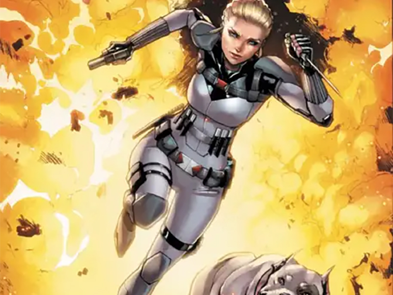
Yelena Belova gets the monologue treatment as she finally comes face to face with Armament’s leader in White Widow #4. The final issue in this great miniseries comes from Sarah Gailey, Alessandro Miracolo, Matt Milla, and Travis Lanham.
There are numerous things that I enjoy about Gailey’s work. Uniqueness and fantastic character writing chops are at the top of the list. Alongside them is the focus on the ills of the capitalistic overlords of society. While in real life there sadly isn’t much that most of us can do to stop their evil, in these stories there is a way.
Not to wipe out the system fully for everyone, but the evil gets its comeuppance. However, the open-ended cagey way we leave things is quite juicy.

We get a whole issue that is majorly a conversation, with some action sprinkled into the mix. Gailey makes it all work and pay off from what we’ve been following through four issues. They give Yelena such a unique and fun voice and presence. I could read a whole longer series of this type easily. Sassy Yelena doing the assassin thing, teaching, and helping out along the way. Please, Marvel, give us more.
What also works here is that the plot of Renata Best is not that outlandish. It’s exactly the type of shadowy, beat the system, pretend it’s for good type of thing we see in reality. Makes the whole affair more worrisome. The longer we go, the more the types of villain plots of supervillains and James Bond villains become more common.
Almost like the powers that be are using fiction as an instructional guide or something. Surely that can’t be happening.

Visually, this has been a high-energy striking type of series. I was not familiar with Miracolo’s artwork before this, but I’m going to want to see way more now. It’s full of depth and details, dashing figures, with a rough whimsical edge. A bit of softness is there as the proportions are skewed a tiny bit, to allow it to feel grounded with the right touch of unreality.
Fluid is a word easily applied to this art. Things flow through the pages so smoothly, panels shift and morph to fit the tonal mood. Characters burst out of their confines as the square panels completely lose their borders at some points. Hell, the entry shot of Renata is sure something, just that dress and pose and that gun aimed right down the sight of Yelena and the audience. Or the shot where Yelena takes charge and pulls her blades, a big old black bubble with “Kill” in it.
I mean, there are just so many moments I could gush over all night long.
Paired with Milla’s colors boosts everything to the next level. Overall, the color palate is of a more muted variety. Tones are more natural, befitting the idea that this should feel similar to our world in many ways. Flashier popping colors are still there since this is a world full of costumed types, even if a lot of the costumed (and not costumed) figures here are all clad in white and black.

Tons of this issue happens at night inside a dark living/workspace. Rather than being so heavy with darkness that things can’t be seen, Milla achieves that level of realism. Heavier darker colors are there but enough light that things are still illuminated. They are depicting that realistic sense of night, giving the whole thing more weight.
Since there is a monologue and a lot of back and forth, that means a lot of dialogue. Too much dialogue can feel overwhelming unless you have the right letterer who places and frames it in the best ways. Lanham is one of those letterers. It flows through the pages just as smoothly as what I said about the action and panels a few paragraphs ago.
Fonts and their visual flairs shift to let the tone or volume of a moment wash over us. It helps frame the artwork almost like borders of its own, guiding the eye where it needs to go on each page. I still totally love those title caption boxes with the love-to-hate bar underneath. Just a fun, quirky type of thing that brings some great energy all around. I mean hell, one of them actually cracks and breaks from a punch on screen.
That’s the stuff right there.
White Widow #4 is now available from Marvel Comics.