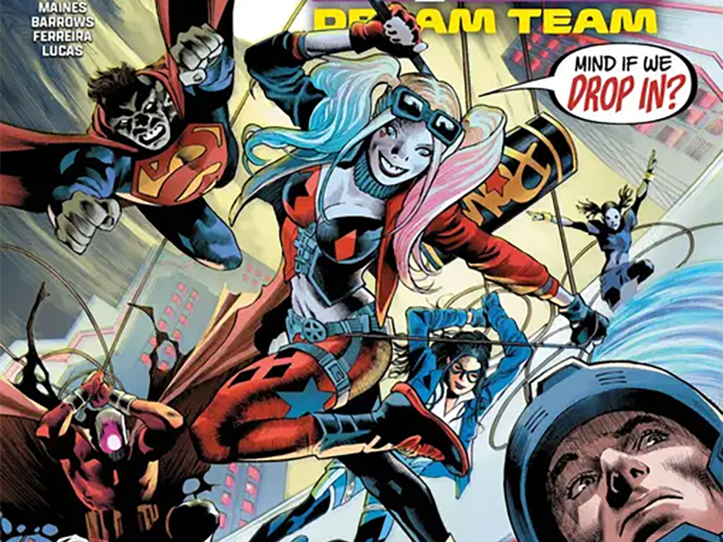
Living A Nightmare — Reviewing ‘Suicide Squad: Dream Team’ #2
by Scott Redmond
Overview
Where the Squad goes, chaos follows, especially when the plans of their taskmaster Waller become quite clear in Suicide Squad: Dream Team #2. An issue that perfectly captures the feeling and mood necessary for these characters and their place in the DC Universe. Each page makes it clear that this creative team knows what they are doing, and how to make it flow perfectly.
Overall
9/10In an uncharacteristic move, Amanda Waller has done something terrible. All in the name of gaining absolute power and control. Oh wait, sorry, that should have read “In a characteristic move.”
What a mistake.

Unfortunately for the heroic Dreamer, she’s caught in the middle, as Suicide Squad: Dream Team #2 turns up the heat ahead of this summer’s event Absolute Power. The next chapter in this miniseries written by Dreamer herself, Nicole Maines, with Eddy Barrows and Eber Ferreira on arts and inks, colors by Adriano Lucas, and letters from Becca Carey.
What a solid sophomore issue.
While the first one was about fun and wackiness alongside the introductions and setup, this one juggles a whole host of things. Masterfully juggling them though, as if Maines has been writing comics for years and years. Every moment moves with rapid speed, leaving us reeling but in a great way. Yet, even as it moves at Flash speed through all the moments there is weight and power to each one.
There isn’t a single page that I walked away from feeling lost or unsatisfied.

Hero and villain, since Waller is very much in villain mode these days, get their piece and there is an equal give or take. Other members of the Suicide Squad have their moments, but it’s very much the Dreamer and Waller show. As it should be right now, since they are the two that are really set on their views and goals. Essentially the others are mostly caught in their wake and trying to figure out how to stay afloat with Waller holding their lives in her hands.
Barrows and Ferreira are such a perfect choice for this book. Together their work really leans into the realm of rough and heavy, but with enough of a light whimsical energy to balance perfectly. Panels shift and slide around creating dynamic angles and visuals, helping with that feeling of moving rapidly through moments. The heavier inks and the overall shadow really play into the darker foreboding energies that this story needs to work.
I really get a sense of depth from how detailed and dense every panel tends to be. Even when things are laser focused on a character or moment, with backgrounds sparser, what is in focus feels life-like or lived in. Same thing with all the body language and expressions, which convey exactly what one assumes because they are crystal clear.

Especially have to give a ton of love to those dream sequence pages. Where panels mostly fade away as items, figures, faces, and more blend together and overlap to create stunning visuals. It speaks to the jumbled and flowing nature of dreams, in a way that is still ordered enough for us to really focus upon.
Seeing Lucas’ colors bouncing through numerous DC Books, multiple that I cover, is always a delight. Chiefly because they are tremendously rendered colors that find the right tones to match whatever artwork happens to be on the page. Secondly, if you held up the colors from here next to the ones on Nightwing, you would probably swear they are different colorists. Because while there is clear DNA shared between them on closer inspection, they hit very different parts of the spectrum.
This is a book where colors are heavier, very shadowy, with little room for the brighter more poppy colors in some of the standard superhero cape books. Sure, costumes are bright and vivid and look as outlandish (compared to reality) as they should. Everything else though has that worn down, sometimes washed out, tone that reminds us of what is at stake here.

Capturing the right energy, be it fun or serious, is something Carey does so seamlessly with lettering. I first encountered her work on Batgirls which was both very different from this book but also very similar at the same time. Achieving that balance between the lighter and heftier was key for both of these books, and it shows in the lettering work. All the right levers are pulled, and buttons pushed to make sure voices are appropriately conveyed through every bubble or box.
Tapping into some more fun elements with choices on fonts or colors to bring into the mix. Not to mention the SFX that shift from matter of fact to loud and powerful at a moment’s notice, as they need to.
Suicide Squad: Dream Team #2 is now available from DC Comics.