
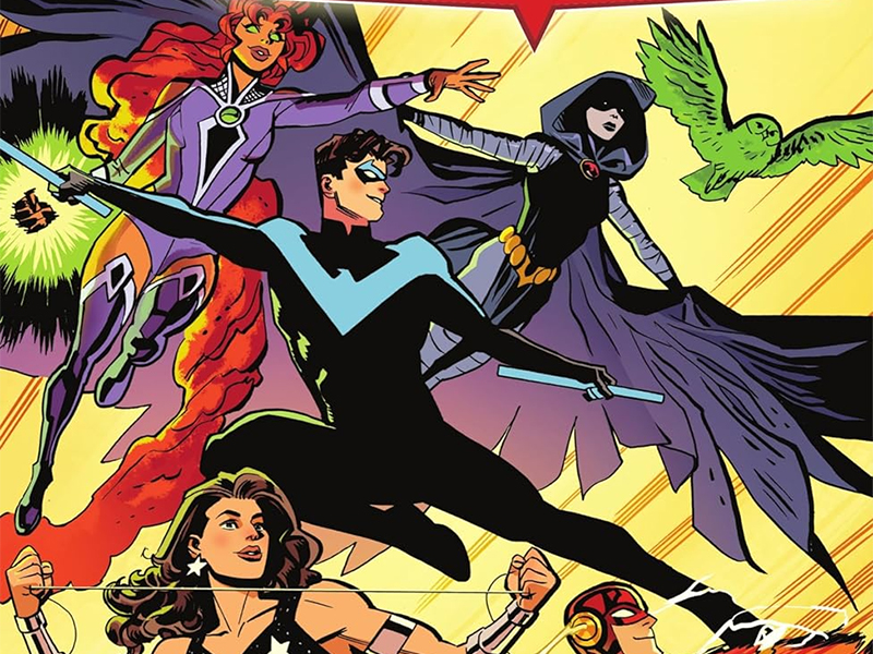
Not So Teen Titans Any More: Reviewing ‘Tales Of The Titans’
by Scott Redmond
Overview
DC Comics drops even more spotlight on some of the most prominant teen heroes turned adult heroes in ‘Tales Of The Titans.’ This collection includes numerous stories from a bevy of creators, hitting the heart of these characters and their world. Portions of the story feel like being wrapped in a warm, comforting, but also powerful blanket.
Overall
8.5/10While their whole deal is being a team of ‘found family’ superheroes, the Titans also have plenty of important solo adventures. With the team reformed as the premiere heroes of the DC Universe, the spotlight turned towards a few of those adventures.

Tales Of The Titans, a relaunch of sorts of the old Tales Of The Teen Titans series, brought together a variety of creators to tell four stories with these former teen heroes. Featuring the work of Shannon Hale, Dean Hale, Tini Howard, Steve Orlando, Andrew Constant, Javier Rodriguez, Eleonora Carlini, Kath Lobo, Bob Quinn, Brandt & Stein, Lee Loughridge, Adriano Lucas, Hassan Otsmane-Elhaou, Troy Peteri, Rob Leigh, and Wes Abbott.
These stories centered on Starfire, Raven, Donna Troy and Beast Boy who are popular stalwarts of the hero team. It served as a sort of companion to the Blüdhaven located Titans series which reunited the team in 2023.
Shannon and Dale Hale do a fabulous job of tapping into Koriand’r’s mindset and character. They give us a tale that bounces to numerous places but is overall one big overall story that has a satisfying conclusion. It starts with questions and assumptions made about Starfire and ends with her having come to peace with who/what she is. Taking the term princess and defining it in a way that she feels comfortable with and wears like a badge of honor.

Blending a fun classic type stop the ‘monster’ adventure story with a deep character study is top tier. Not all comic stories can be that way, and I wouldn’t want them to be, but this sure hits a nice, sweet spot for me. I love comics like this and the Hales signed and delivered exactly what I was hoping for.
Visually, Rodriguez’ artwork feels old school yet modern at the same time, hitting notes of the past through the lens of today. All the characters are deep and recognizable, and there is a ton of deep detail and weight that is more familiar to modern comics. Overall, their appearance is realistic but has a very animated feeling to it to bring that familiarity.
Even though it has that whimsical fun appeal, there is still danger and heaviness everywhere. All the colors are so warm and bright, vividly popping all over the place, creating a colorful feast for the eyes. It makes sure the story feels sufficiently superhero and alien at the same time. Darker colors and shadows are mixed in to tone some elements down a bit, to keep that heavier element in play.

Otsmane-Elhaou’s work has such a personality and clear care for the art. We get tons of big colorful caption boxes or shifting colorful fonts. As well as bubbles that take on different shapes to depict the volume or quality of voices. One also can never forget the variety of personality filled SFX that dots the pages and brings us even more into the world at large.
Out of all the Titans, it might be Raven that comes with the most baggage just thanks to her parentage. Being the daughter of Trigon doesn’t define her, but it comes up a ton since the demon is never done with her or the Titans. Howard taps into that for a story that shows Raven trying to stop someone else from being put through what her mother suffered, complicated by her demonic brother who wants to impress dad.
Honestly, it’s a bit much to follow, a lot of the story being very confusing and leaping around. Demons, angels, rituals, cults, and Raven trying to be a Titan. It’s a denser leaping all over the place read compared to the other stories.

Part of that also comes from the artwork on the page. Carlini has a very energetic but often slightly hectic style of artwork. It has a lot of exaggerations but a good sense of motion. Paneling keeps things in focus and moves them around, even if some of the cuts feel sudden.
Color-wise things are very toned down with a lighter filter attached to it all, as Loughridge brings in a lot more shadows alongside them. Some spaces allow for poppier vibrant colors but most of it stays closer to the middle ground. In some cases, the lighter attempts overwhelm and take over.
Peteri has a lot of fun with the lettering. Raven’s signature jagged balloons and slanted text come into play, keeping her voice distinct and different from others. A few other characters, especially those of a mystical bent, get some shifts to be more colorful or outlandish.
Donna going against what the powers that be might say to do the right thing, freeing people from an oppressive force, is a solid idea. I think some of the execution leaned a bit more toward the hero running into smash things to save the day. That’s not entirely a bad thing as this is a superhero comic at the end of the day. It just feels like there could be other deeper ways to go about it without simplifying things where if the hero comes in with fist swinging all will be well.

Orlando is a writer that I enjoy, and he often tackles bigger issues with stuff being written. How they land is a situation where the mileage will vary for the reader. For me, this one lands somewhere in the middle. It leans a bit too much one way as I noted, but it’s also enjoyable and we get to see a real jerk handed his own ass by Donna. So, there is that.
Lobo has just such a slick emotional and detailed style. There is a bit of whimsical energy to it, as it still has a bit of superhero fun vibes to it even with the serious subject matter. It’s not overly grounded or pushing for full realism. It fits within the universe that is presented on the page.
Tons of kinetic energy vibrate off the page as the action moments, and the quiet moments, have weight and realness to them. I can believe in the moments and that the figures are moving, even though I know that they only exist on this page as drawn.

Quinn, making his DC Comics debut, finishes out the final pages of Donna’s story. There are plenty of similarities to the styles of Lobo and Quinn, making it a solid natural pairing. Quinn’s work is so dynamic, emotional, and deep. That shot of Nightwing and Donna at Titans Tower with the city behind is almost picturesque without losing the grand nature of superhero comics.
Lucas’s colors have a lot of that same smooth nature to them and mix the heavier darks and brighter flashier colors easily. We get quite a few night scenes early on and they feel accurately dark but also beautiful but oppressive at the same time. As things get more colorful those colors do not overwhelm or take away from the overall darker/toned-down aesthetic. They complement one another.
Rather than relying on standard punctuation marks, Leigh gets more creative with depicting a different language. When words switch languages, they take on a purple color, instantly telling our eyes a switch has occurred. It stands alongside all the other great being done from shifts in font sizes and types to denote volume or tone changes and plenty of big powerful in-the-moment SFX. Oh, and can’t forget one of my favorite comic book things, characters declaring names in the shape of a comic book-style logo. I’ll never tire of things like that, gimmie more!

The final story in the collection picks up on events from the Dark Crisis On Infinite Earths events, where Deathstroke shot Beast Boy in the eye.
Constant does a good job really digging into what is happening with Garfield. We see him in the Titans series being more like himself and this bridges the gap that gets him there. Out of the four stories in the series this and the Starfire one is the closest in connection to the series and building the characters up.
A story dealing with trauma, grief, and trying to build back what is lost needs a particular artistic vibe. Brant and Stein create some really rough, sharp, and powerful artwork. It captures all the emotions and moves pretty solidly.
Much of the story is dark both in tone and actual light, and Loughridge leans into that. Most of the colors are pretty bright, but plenty of shadows really take over. A lot of the palette is sort of washed out in quality as it’s not the very vivid superhero stuff that usually accompanies these characters.

Abott has such solid lettering choices that capture voices in fun and unique ways. Little shifts to bubbles and fonts change how the voices are being heard. I especially love how Abbott and others do Raven’s bubbles, those really rough and bumpy bubbles that make me think of the cartoon voice. Something deeper and stoic, bridging the light and the dark.
Tales Of The Titans is now available from DC Comics.

