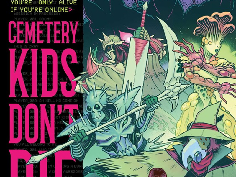
Playing With Life: Reviewing ‘Cemetery Kids Don’t Die’ Vol. 1
by Scott Redmond
Overview
Reality and fantasy blend in the most emotionally charged and dangerous way in ‘Cemetery Kids Don’t Die’ Vol. 1. A heavy, colorful, resonating, horror filled tale that taps into some elements routinely explored and unexplored in unique ways.
Overall
9.5/10Do you ever wish that all the things you enjoy could still be enjoyed even when you are asleep? Finish off your favorite movies, complete that novel, or hell, maybe even play a game you love.
In the world of Cemetery Kids Don’t Die, dreams really do come true. You can even play games in them! It’s a dangerous new world in this tale from Zac Thompson, Daniel Irizarri, Gegê Schall, Brittany Peer, and Andworld Design.

Technology is a wonderful thing. It’s also a very dangerous thing, especially when pushed too far. This is a line the series walks finely, which is par for the course with Thompson. It’s a tendency that was very apparent in the eco-horror that was Ka-Zar: Lord Of The Savage Land, a book of Thompson’s that I absolutely fell in love with. My passion for that series made me jump right away to read and review this title.
A solid move that paid off immediately.
If that previous book was eco-horror, this one is very much fantasy and tech-horror related. Thompson dives right in, creating a vivid, tangible world centered upon relatable characters who feel fleshed-out and real from the word go. With just four issues, we know and feel more about these characters than some we spend years with. A true testament to the writer and his character developing abilities, as this series left me craving more of this world and more of these characters.

Stories that center around a particular topic (technology, society, etc.) tend to be at their best when there is more behind it. Generally, that more is very human interests and relatable emotional development beats. Thompson always nails those sorts of things, giving even more weight to the themes of the story.
Depression, grief, emotional abuse, withdrawal, substance abuse and more are heavily hinted at or specifically mentioned. Dealing or not dealing with those issues is at the core of why characters are where they are here. All of it is wrapped up in the trappings of a horror fantasy within the game sphere, which is just utterly terrifying.
While Irizarri handled the artwork for the first half of the story solo, the addition of Schall in the latter parts changes the dynamic in a really solid way. Finding two artists with similar styles, tonally, with notable differences to tackle the real-world versus the video game world, is a great touch here. It allows the spaces to share many vibes while also standing completely alone. Glance at a video game right now and even the most photo-realistic ones aren’t going to perfectly mirror the real world.

Exaggerated with a whimsical appearance, plenty of lightness and rougher textures to boot, is very much what we feel with Irizarri’s work. Similarly, Schall’s style has much of that whimsy and a bit of exaggeration, but with a smoother finish to things. It works really well as the story beats begin to make the real-world and video-game world slip further apart, both heavy and dark in their own ways.
No matter which world we’re witnessing, the emotion and kinetic energy are spot on. Letting the characters and their world have weight, pairing that whimsical feeling well with the darker horror tones. Even the body horror and more violent moments have a slight toning down thanks to that whimsy. Don’t think that lessens their punch though.
Painful impact is felt with each moment, while the depiction makes sure to get the point across without moving into gory or overly graphic territory.

Tackling each space, Peer pulls from the same color well with noticeable adjustments. There is a slicker, smoother — often more saturated — appearance for the real world. While the game world has rougher, toned down, less vibrant appearance in many respects. Shadows are present in all spaces, but multiply to heavier levels for the game world.
Keeping some of the palette choices different in the two worlds also helps give them differing energies.
A lot of hefty things are tackled in this series and the emotional weight is not just on the facial expressions or body language. It has to be heard and felt in the voices, as we create those voices in our minds. Those at Andworld Design are always good at bringing that level of energy to lettering. Switching up fonts or shifting bubbles to bring the most impact at any given moment. Letting voices find themselves and grow, while also bringing some visual quirks into the party.
Cemetery Kids Don’t Die Vol. 1 is now available from Oni Press.