
Review: ‘The Seasons’ #3 Slows Down
by Benjamin Hall
Summary
Springs Seasons is the only one not having a great day in her home town. This is partly because she has recently been disrupting the days of the other citizens. Also Springs sister Winter does not believe the Carnival in town is nefarious and after them. Can Spring turn things around?
Overall
6.3/10Writer Rick Remender creates very little plot progression, and this problem combines with some arguably repetitive characterization to make the scripting seem rather weak. The repetitive characterization is mostly the “talking heads” type scenes. Not to mention the main character Spring Seasons suffers a lot of abuse in this installment and this makes the issue a bit hard to read. In this reviewer’s professional opinion Remender needs to move past set-up and get the plot going forward at a faster rate. That said this issue is in no way the worst it could be

Artist Paul Azaceta does a great job with the limit Remender’s script puts on the amount of scenery Azaceta has allowance to create. Not to mention that Azaceta is still bringing some high quality tricks to the art. One such example occurs when a certain reveal happens with a villain. This particular sequencing almost feels like something in an animation. Also the depth sees use to help enhance the emotional moments. Azaceta does have a flaw in his art in that some elements come across a little flatter than others. Nevertheless, this flaw is only apparent when carefully examining the art.
Colorist Matheus Lopes continues to show high quality work with the palette selection for each scene. However, Lopes does apply a debatable range of hues in one panel.
Letterer Rus Wooton does an amazing job with placing the text. Unfortunately, the script being rather weak may result in some readers failing to notice the complex positioning of the word balloons and anchors.

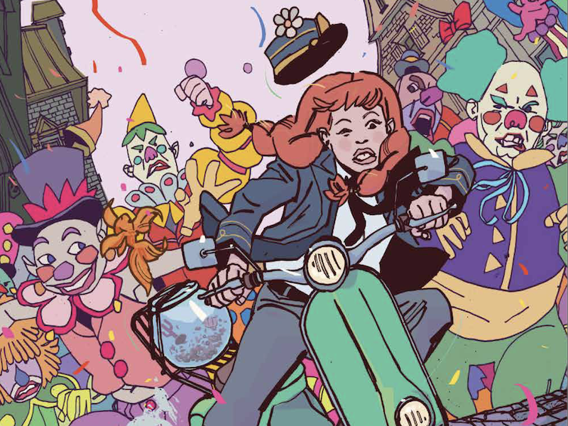
Azaceta and Lopes’s create a very fine main cover. A noticeable part of the design occurs with Azaceta’s use of a dutch angle to help increase the sense of danger Spring Summers faces. There is a use of depth to enhance various elements of the cover including the sense that Springs hat might fall off. This particular little detail also increases the suspense. While Lopes’s choice of colors gives an idea of what range to expect in the interiors.
The variant cover for this issue is by artist Ben Caldwell. It is a beautiful piece, but feels like it suits issue 1 more than issue 3 because of the introductory type design.
The Seasons #3 is out now from Image Comics and Giant Generator.
