
Be The One Without Fear — Reviewing ‘Absolute Green Lantern’ #1
by Scott Redmond
Overview
There is no slowing down for the Absolute DC line, as the latest addition comes out swinging with a different dynamic and demeanor for the fan-favorite ring bearing heroes. Visually distinct the series really delivers a powerful punch that can be felt down to the soul.
Overall
10/10Ask any comic book fan who’s ever read a Green Lantern comic, you’ll find they likely have a different favorite Lantern. There’s a large field to choose from: Hal Jordan, John Stewart, Guy Gardner, Kyle Rayner, the newer Jessica Cruz, and Sojourner “Jo” Mullein.
With so many favored Earth Lanterns, how is a writer to even choose when doing a fresh take on the space mythos corner of DC Universe? Easy. They don’t.

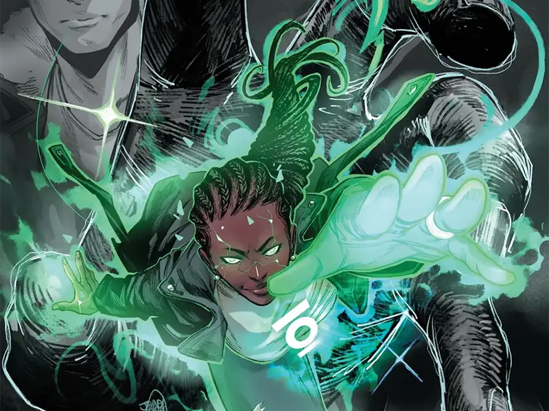
Absolute DC presents creators an opportunity to take familiar DC Comics characters and create a bold modern version located in a darker or harder universe. Absolute Green Lantern #1 sees Al Ewing, Jahnoy Lindsay, and Lucas Gattoni do just that with a trio of Lanterns for this dynamic debut issue.
One of the things that is really working for this new line of comics is the visuals.
DC is pulling not a single punch with choosing artists for these books. Tapping some unique, fun, and entertaining artists for each character. Some are more grounded and realistic feeling with the mixed in whimsy. Some are very exaggerated and play into the weirdness of comics. Others come in with rougher textures that tap into the overall universal feeling.

Lindsay is more of that last option, creating such a deep world that has quite a bit of rougher textures in play. The last time I recall encountering Lindsay’s artwork was my time covering the Firefly series a few years ago. Much of the foundational panel work, use of space, and other elements are still there from that time. Overall, though, there is a natural clear evolution at play when placing the pages side by side.
It’s clear why this was the artistic choice for the book.
Every emotional beat has weight here and resonates, because Lindsay really captures it all so smoothly. Similarly, the colors add so much here. They are very toned down, leaving space for only specific elements to really carry vibrancy. Therefore, the more alien elements can pop more against the overall backdrop. It’s fitting since the spaces are more small towns that are usually less colorful compared to their big city cousins.

Hal Jordan is my least favorite Lantern. I just can’t stand that guy in most cases. He’s so boring and one-dimensional-feeling.
Lo and behold, Ewing actually made me intrigued in what might happen with this guy. Talk about some great writing right there. Mostly, it’s because Hal is not a Lantern here. Instead, there is something else happening to him, which is terrifying and traumatic after his encounter with Abin Sur. It’s Jo that is set up to be the Green Lantern of this piece, which is something I wholeheartedly support.
The pacing of this issue really works for me. It shows the aftermath with Hal, some flashbacks of how things got to the moment, and the conclusion with Jo was smooth. It gives us some pieces without revealing too much but also doesn’t leave us with far too many question marks. There are enough tantalizing threads left to pull at in subsequent issues.

I enjoyed the changes that see Hal, John, and Jo as old friends from a small town. Keeping the friendly dynamic of the Lanterns from their other appearances and transplanting it into the new situation. This gives us a familiar and comforting foundation for them amongst all the new choices.
Ewing really can go hard into science fiction and fantastical things. There is no doubt we will see some of that grow as the issues continue. Teasing out just pieces of the bigger picture here was another smart move. It humanizes the characters and space first, before we potentially get into the overall deeper weirdness.
So much is felt in this first issue. As noted, Hal is very broken and traumatized here. He’s at the end of his rope, begging for things not to get worse. Lindsay makes that very clear with the artwork, and Gattoni hammers it home even more with the lettering.

The overall font keeps to a more middle-sized level to create the overall baseline. Shifting that to the much smaller, sadder feeling font that portrays the sudden shift in volume and energy. It’s wrapped up in all the other modifiers which help give each voice a distinct power, tone, and impact. This all helps build to the bigger louder moments as things shoot up in size dramatically, amping up everything.
Absolute Green Lantern #1 is now available from DC Comics.

