
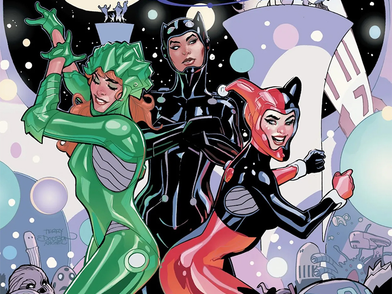
A Big Sexy Sequel — Reviewing ‘Gotham City Sirens: Unfit For Orbit’ #1
by Scott Redmond
Overview
Gotham’s dynamic trio is up to their wonderous chaotic ways once more, kicking off the summer in galactic style. Plenty of action, development, and off-the-wall fun fill the pages of this delightful weekly affair.
Overall
9/10Throw aside the lassos, boots, and hats. This year, the Gotham City Sirens are going galactic with their weekly adventure.
That’s right, a new year means a new multi-week event series featuring Gotham City’s deadliest and sexiest anti-heroes: Catwoman, Harley Quinn, and Poison Ivy.

Writer Leah Williams returns, this time joined by Haining, Ivan Plascencia, and Tom Napolitano.
While their reach is pretty wide, and one of them has a world-ending or altering power, this trio generally has their feet on street-level ground. Meaning they deal with (fellow) criminals, the myriad of Bat-family folks, and a smattering of higher-powered threats. Taking out Punchline and her illegal-energy-drink-meets-hunting-operation was a cakewalk compared to the threat they face now.
No spoilers on that threat (for those that haven’t read press releases or solicits), because that final page reveal deserves to be experienced by every reader. I never thought there would be a way to do that villain in a murderously evil yet sexy pose. Here we are though.

Just like the last miniseries, Williams is having all the sexy fun with these characters. Just letting them go all out. Things kick off with Catwoman doing her best Sims burglar impersonation, which leads into space-themed altered costumes, and right into desperately dangerous secret lair club shenanigans.
Pride month might be over on the calendar, but pride never stops here. We love to see the Harley-Ivy-Janet love and sex connections carrying over to this book. Queerness is bursting out of the seams of this book, as it should be.
A charming roughness is always so clearly present in the art that Haining creates. Just the right amount of exaggeration married to more realistic presentations. Allowing the characters to have the right amount of presence, emotional resonance, and body language. As well as plenty of life and weight to the settings. Letting plenty of shadows and darker elements come into play to bring some of that heftiness.

Loving the panel choices here. They that slip and slide over others, creating a fun stacking effect is always welcome. It gives everything this really frantic yet ordered energy along the way. It helps that the movement also feels quite authentic and keeps the whole comic in motion.
Thicker comes into play with the application of the color palette. Plascencia brings a lot of heavy toned-down more natural colors for much of the spaces. Even the flashier colors of the club are somewhat washed out, giving it some of that rougher feeling along with the textures. Even in this state the more vibrant colors feel that way as they take over in quite a few spaces.
Because this is quite a colorful comic book, and it really should be. These adventures are out of this world (see what I did there? You’re welcome) after all.

Clearly the lettering elements got the memo about the energy.
From the SFX in many places (I see you Face Smash) to all the dialogue and captions. Just chef kiss all around. I expected as much with all the dialogue and captions since Napolitano is on this series, and he always brings the best stuff. All the shifting bubbles and fonts depending on the speaker and the way they are speaking. The location captions being so fun and colorful.
Shifting between sentence case and all-caps is one of those things I tip my cap to. It’s a simple way to showcase the shifting of volume, but the simplicity has creative power to it.
Gotham City Sirens: Unfit For Orbit #1 is now available from DC Comics.


