
Superman Week: Ranking The Rest Of The Superman #1s
by Austin Gorton

Back on “Superman Day”, I ranked all the covers to the first issues of Superman’s self-titled series through the years and its various volumes. But in addition to being the first superhero, Superman is also one of the first comic book characters to be popular enough to support more than one comic at a time. As a result, there’s a bunch of different series out there with “Superman” in the name or consistently starring Superman, and they all have first issues as well!
So in honor of “Superman Week”, I’m back at the ranking game, tackling those “other” Superman #1s that aren’t Superman #1.
9. Adventures of Superman (vol. 2) #1 (2013) by Bryan Hitch and David Baron

The first volume of Adventures of Superman was actually the original Superman series which started in 1939, then got renamed to “Adventures of Superman” in 1987 with issue #424, then went back to just “Superman” with issue #650.
This second volume launched in 2013, as part of the “get Superman comics out for Man of Steel” push. It’s a nice image, but pretty generic for a cover.
8. Superman: The Man of Tomorrow #1 (1995) by Tom Grummet and Brett Breeding

In the 1990s, a number of high profile characters received a new series that published extra-large issues on a quarterly basis which, in the case of Superman, helped fill in the “fifth week” gap (when the calendar works out such that a month will have five Wednesdays — aka new comic book day — in it). With The Man of Tomorrow added to the four monthly Superman titles at the time — Action Comics, Superman, The Adventures of Superman and Superman: Man of Steel — DC was able to say they had a new Superman comic on the stands every week of the year.
As for the cover, this is another perfectly nice drawing of Superman that just happens to be the cover of this debut issue.
7. Man of Steel #1 (1986) by John Byrne and Dick Giordano

John Byrne‘s big revamp of Superman following Crisis on Infinite Earths‘ rewriting DC continuity unfolds across a six issue miniseries. The first issue was released with two different covers (printed in roughly equal ratios). That said, this is generally considered the “main” cover. Rather than presenting an iconic or sweeping depiction of the character and series, it is constructed more like a “part 1 of 6” cover, emphasizing which part of the Superman origin this chapter of the story is concerned with.
6. The Man of Steel (vol. 2) #1 (2018) by Ivan Reis, Joe Prado and Alex Sinclair

In 2018, DC celebrated the arrival of acclaimed writer Brian Michael Bendis to its stable of characters with a second Man of Steel miniseries which showcased Bendis’ take on Superman in much the same way the original showcased Byrne’s (though this series is less concerned with establishing a new origin for the character). The cover puts Superman front and center, using a building effect that puts him at the top of a pyramid of heroes. That said, it’s also not that far removed from a Justice League cover.
5. Superman Unlimited #1 (2025) by Rafael Albuquerque and Marcelo Maiolo

The most recent Superman #1 on our list, Superman Unlimited does for the arrival of Dan Slott what Man of Steel vol. 2 did for Bendis’, giving the long-time Marvel creator a dedicated series with which to unveil his version of Superman. Artist Rafael Albuquerque goes for the “movie poster” approach, making Superman the focus but showcasing other characters/elements that will be important to the book.
4. Action Comics (vol. 2) #1 (2011) by Rags Morales and Brad Anderson

The biggest revamp to established DC continuity since Crisis on Infinite Earths, “The New 52” also led to the cancellation and relaunching of some of the oldest continuous comic book series of all time. Writer Grant Morrison stripped down take on the Man of Steel is unveiled in the first “Action Comics #1” in 73 years, and artist Rags Morales turns in an action-packed scene that highlights Superman and the visual cues — blue jeans, a shorter cape — that this is a different sort of Superman.
3. Action Comics #1 (1938) by Joe Shuster & Jack Adler

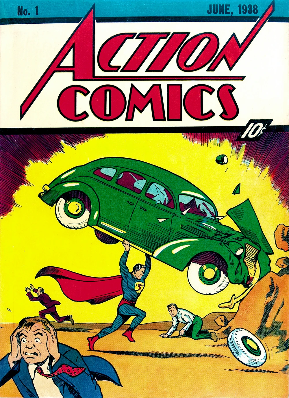
Not just an iconic Superman cover but one of the most iconic comic book covers of all time, Superman makes his very first appearance on the cover of the first issue of Action Comics. It’s an image packed with incident and characterization, though it’s worth noting: if this was the first time you saw Superman, without any context or hindsight, it’d be easy to assume he’s the bad guy of the story despite wearing the traditionally heroic red-and-blue colors, smashing the car of a poor motorist while making passersby run scared. It’s a neat inversion of expectations, whether it’s your first or one thousandth encounter with Superman.
2. Superman: The Man of Steel #1 (1991) by Jon Bogdanove

Is this cover “just” a nice image of Superman, the type I dinged earlier covers on this list for being? Yes.
Is it, with its credits and declaration of the “Triangle Era” of weekly (or near-weekly, before the launch of Superman: Man of Tomorrow) releases, excessively cluttered? Yes.
But also, it’s a really, really nice image of Superman, gaining something extra from being fully painted. It’s also a relatively unique perspective on the “flying Superman” staging, leading with his (very broad) shoulders and tapering back to create a sense of movement, topped off with an aptly steely facial expression.
1. Man of Steel #1 variant (1986) by John Byrne and Dick Giordano

The best Superman cover is one without a full picture of Superman on it? You betcha! By zooming in on the S-emblem while showing enough to make it clear we’re seeing Superman mid-transformation from Clark Kent, the “alternate” Man of Steel #1 cover leans hard into the iconography of Superman.
As a result, it makes for both an effective first issue cover and the cover to a new direction, speaking not to specific plotlines of the singular issue but rather the broader sweep of Superman as a character and driver of stories. Plus, the “pulling back the shirt to reveal the emblem beneath” staging creates a feeling of discovery, the S-shield becoming like the contents of the comic itself beneath the cover/outer shirt. Thus, by giving us less of Superman himself on the cover, the cover urges us to pick up and read the issue — and isn’t that what a good comic book cover is supposed to do?