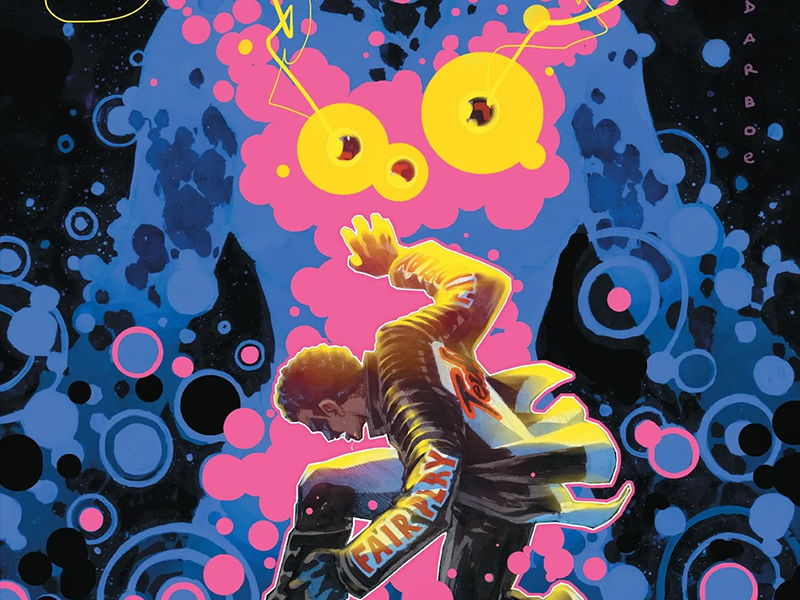
From Hero To Superhero — Reviewing ‘Mr. Terrific: Year One’ #6
by Scott Redmond
Overview
The origin tale of Michael Hold ends just as it began, providing a perfect tale for this deservedly recently popular character. There isn’t a single thing that could or should be changed about this miniseries and what it’s accomplished. DC Comics needs to give us more of this character and his story ASAP.
Overall
10/10A beginning, a middle, and an ending. These are the core components that make up any compelling and complete story.
In comic books though, the end truly is only just the beginning. As Mr. Terrific: Year One #6 wraps up the origin story of the summer’s hottest character, there is so much more to come for the character. Hopefully Al Letson, Valentine De Landro, Marissa Louise, Edwin Galmon, and Lucas Gattoni are somehow part of that future in some capacity.
Because, this series — and this conclusion — were, dare I say it … Terrific, with the big capital T for sure. (Sorry-not-even-close-to-sorry).

What a way to bookend things for sure. Through the whole run, the present-day pieces have been what kicks off each issue. For the final one, those are the bits that are left for the end. This way Letson uses the present or future to cap things off and therefore promise the more to come that my intro alluded to.
This being a father telling their child their story was a welcome surprise. I was a bit shocked at the appearance of someone saying they were Terrific’s kid in the previous issue, but now it all makes sense. It seems I missed out on a few things having not read Flash and some other books in the last few years.
Father and son stories are nothing uncommon in fiction. Ones that are really good that showcase the truths of fatherhood and having the men actually admit their faults, especially emotionally, are not as common. The first thing my mind thought of with this dynamic was Captain Benjamin Sisko (Avery Brooks) and his son Jake (Cirroc Lofton) from Star Trek: Deep Space Nine.
My big-time nerd is showing, and I’m fine with that.

Anyway, I’m all here for more of this story and the dynamic that can be addressed.
So much of the visual language of this series has rested on what De Landro brings to the page. Nothing about Micheal Holt’s journey has been smooth or easy and we feel that on every page. An art style rife with sharp edges and rougher textures, befitting the tough path that has been walked through these six issues.
Every piece though is full of grand depth and dense details. Really allowing the characters to live and breathe as dynamic kinetic beings. Gliding across the pages in the motion or action sequences in ways that highlight how fantastic these elements can be.
I love art styles that are not always the typical kind of ‘house style’ presentation. Not to say I don’t love those as well. There is just something rawer at times for the story to go outside of the box. Which is what De Landro definitely provides here.

Matching that beat for beat always are the just as dense but also so evenly mixed. Backgrounds are full of palette choices that are more natural or so called normal, to give the spaces this more familiar feeling. Providing a foundation through which the darker and more vibrant colors can rest upon and become even bolder with the smooth contrasting. Through the colors we’re presented with a palette befitting of both a human nature story and a superhero story on all counts.
Bridging the gap is very much an overall aspect of this series.
As noted, the present-day piece from Galmon is here to cap things off this time. Once again having the smoother, slicker art style contrasting against the other style was a smart choice. There is nothing easier about the present-day life of Holt compared to the past. Yet, there is a lot that is different because the hero has far more experience and worldly connection than where he started. Galmon really leans into that with the more vibrant splashy colors and the presence that we feel for Holt in these sequences.
There is enough connective tissue though for it to not be jarring to switch up. One of those artistic jam situations that works out for the best because of the artists involved and the story intent.

Bringing it all together in a sense is the grand lettering. As noted, before, Gattoni is one of my favorite letterers to behold. Really delving in to make sure that the voices are clear as day with so much energy, personality, and emotional depth behind them. Modifying all the various types of lettering with a boldness that gives them the perfect impact upon deployment. Keeping the flow smooth and logical without resorting to overabundance or wading into a space that might be so common.
Everything about this series has been spot on and I’m happy we were able to behold such a story. We need far more stuff like this, really delivering the same levels of care that so many of the usual suspect (usually white) characters get time and time again.
DC Comics, hear me out, we need a Mr. Terrific ongoing series from this creative team. Preferably tomorrow if it’s not too much of an ask. Thanks.
Mr. Terrific: Year One #6 is now available from DC Comics.