
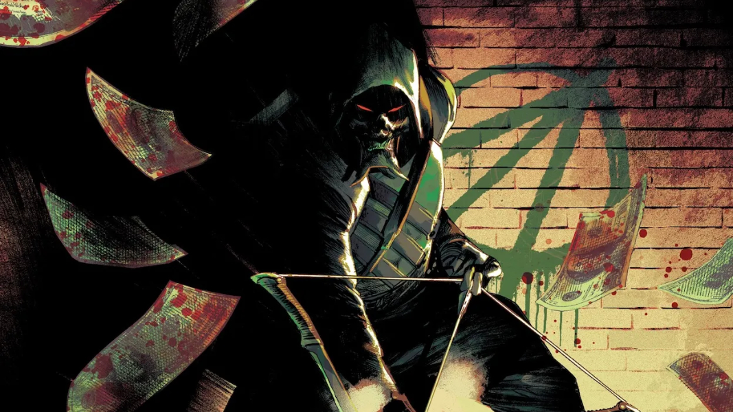
Hitting The Absolute Bullseye — Reviewing ‘Absolute Green Arrow’ #1
by Scott Redmond
Overview
It’s another stunning homerun hit far out of the park for the Absolute DC Universe, as ‘Absolute Green Arrow’ #1 brings a whole new dimension to the table. It’s almost a shame that this is only a five issue miniseries, because there is a lot of meat on this delicious bone to chew upon.
Overall
10/10In Star City, someone has decided that eating the rich isn’t enough. They enact brutal arrow-filled vengeance upon billionaires. Whoever this killer might be, the trail begins with the mysteriously murdered Oliver Queen and leads towards something far more sinister.
A bold new imagining of the arrow slinging vigilante is born in Absolute Green Arrow #1 from Pornsak Pichetshote, Rafael Albuquerque, Marcelo Maiolo, and Jeff Powell.

Oh yeah, this hits and hits hard.
From the moment this series, its creative team, and premise were announced I knew I would have to be reading it. Thankfully I was also able to get it onto my list for reviews. Big time bonus right there.
I haven’t read anything else from Pichetshote, unfortunately, but there are numerous works on my list to get to. Trying to work in education while taking courses to become a teacher while doing this as a side gig sure doesn’t leave a lot of free time. Anyway, enough of my issues, back to the … well, issue at hand.

Basically, the works that Pichetshote has done before are moving steadily up my list now after having read this. There’s a darkness that permeates the book at every level, from the text to the artwork to the overall story elements. Pichetshote delivers a story that mixes equal parts action, horror, and social commentary into the foundation. Capturing elements that are key to the Green Arrow mythos, while stretching the character and space to do so much more.
That aforementioned darkness is rife in what Albuquerque and Maiolo are bringing artistically.

Albuquerque’s work is one that I have really enjoyed for years but really fell in love with during the Detective Comics run with Ram V in recent years. There is a rough raw quality to what is upon the page. Dense lines give everything a bit of extra depth and detail which livens the whole experience up. Maiolo’s colors are on the lighter side giving a semi washed out sort of feeling, while ratcheting up the darkness or vibrancy as necessary.
I love the bits where the social media videos and news reports come into play. Showing actual phones and devices and all the little details is so slick and perfect. Framing them with white space gives them even more focused importance in the moment. Same with how Albuquerque utilizes paneling to not only establish spaces and story depth but uses it to showcase perspectives and points of view.

Like when there are flashbacks to Dinah and Ollie’s relationship and we see Ollie’s old partner Jubal Slade leering at Dinah. The panel really homing in on the dude’s creepiness and what we learn overall about his sexual assaults and trafficking.
I don’t recall coming across Powell’s lettering before but it’s nice to see here. There is a lot of emotion and feeling to everything with how it flows on the page. As the kids or internet say, the assignment was understood, with so much of the dialogue lettering elements give into the horror bent of this issue. Shifting bubbles shapes and placement, with the font changing as well to really give words painful, scared, or horrifying tonal ranges.

Then there is all the grand SFX that dots through the pages to bear mention. Over my years of writing reviews, SFX is one of the elements on the page that I really began to find more knowledge and respect for. Truly that is what I can say for lettering as a whole. It’s just being able to realize in an issue like this how much it’s soaking up and adding to the overall issue feeling and theme with such ease.
Absolute Green Lantern #1 is now available from DC Comics.
