
The Colorful Power Of Nostalgia — Reviewing ‘Mighty Morphin Power Rangers’ #1
by Scott Redmond
Overview
A bold new era feels just a bit less bold as ‘Mighty Morphin Power Rangers’ #1 chooses the far too well-trod path made up of nostalgia. Familiar and comforting in some ways and out of step, far too referential, and lacking any sort of cohesive connections to make it hum as it’s meant to.
Overall
7.5/10Once upon a time, a time displaced space wizard asked his robot companion to summon five teenagers with attitude. That attitude turned out to be five tenacious do-good teens who donned colorful costumes to save the world time and time again from evil.
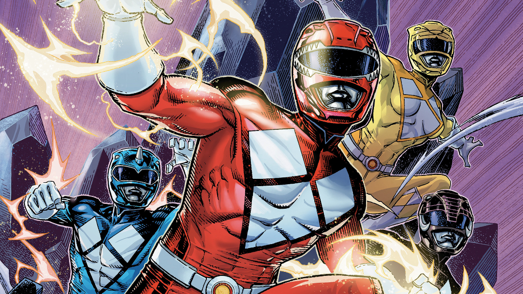
Ten years after defeating evil, those teens now turned adults, are thrust back into a life they didn’t ask for with Mighty Morphin Power Rangers #1. The next chapter in BOOM! Studios Power Rangers comics line from Marguerite Bennett, Andrew Lee Griffith, Joshua Jensen, and Ed Dukeshire.

I’ve loved Power Rangers since the moment the series graced our television screens on a fateful Saturday back in 1993. At recess, my best friend and I would pretend that we were Power Rangers, and our classmates merciless teased us for it. Not a care was given as I followed along for all those seasons and costumes or power changes all the way up to around the Power Rangers: Lost Galaxy era where I fell off a bit.
No matter what, though, I kept coming back. Checking out seasons here or there and jumping as soon as BOOM! Studios began to roll out comics for the franchise in 2016. So many great moments to devour.
Unfortunately, this wasn’t one of them.

I said all that stuff above to paint the picture of my love of this franchise and its characters. I want what I say now to really land. I found this issue to be kind of boring.
Hear me out.
There is no real ceremony or space given to flesh out what has changed for these characters. It drops the readers right smack into their reunion, assuming that they read the free comic book day offering last month. We get very little characterization beyond the bare basics of who these characters used to be and surface-level understanding of what they are doing.

Bennett drops vague hints about their past leaving as Rangers, including something about a Zordon sacrifice (could be the same way he went out in the show or something different). Nothing is really dwelt upon as the Rangers just instantly decide to morph again without any pushback with them now being different people. A sense of conflict is missing. Sure, they are a bit “rusty” as Rangers, but no one has an issue with just jumping back into something they left behind a lifetime ago.
It all feels too easy and too quick to just thrust them back out there for some giddy nostalgia points of having the theme song lyrics, morphing sequences, and summoning of the Zords. Nothing much is set up about this new Rita figure, Trini’s child is just waved off, and the issue ends with a jarring reveal about the missing Tommy. There’s no real momentum or energy that screams continuation and desire to pick up the second issue.
Overall, the artwork is fine. I don’t believe I’ve come across Griffith’s work before. It has a lot of sharp rougher edges to play into the threat of the moment. There is some really sort of wonky stuff going on with the figure shapes and faces at times. It feels kind of washed out and not fully formed, as they are trying to capture likeness without skewing too close to the reality of the actors who played the roles so long ago.

Lumpy. That’s the word I’m looking for. It’s like they are made of mashed potatoes that aren’t quite fully mashed, if that makes sense.
All the setting shots are kind of detailed with not a lot going on. It feels kind of weirdly rustic or small for what we’ve seen of Angel Grove in all these times. Not that there is anything wrong with that, but it just sort of feels off for some reason. There are a ton of panels with not a lick of background or backdrop, choosing to go for colors, speaking to how little detail is going on here.
Style is style, but it just doesn’t feel like the kind of artwork I would expect for such a big line launching debut.

Similarly, the colors are more of a washed-out nature with some pops of vibrancy here or there. Jensen leans on darker tones at times to give into the darker dire nature that the story is meant to evoke. As noted above, there is plenty of coloring work to be done with how many panels are relying on splashes of light and color as background.
The Rangers themselves feel adequately colored, if just a tiny bit light, and the rest feels at least genuinely reflective with coloring.
Providing voices and setting sounds for the changing worlds of the Rangers has fallen to Dukeshire for quite a while now. Caption boxes and bubbles shift in size, quality, color, and more as they bounce around the page. With so much nostalgia and thrust action happening there isn’t a lot of space to really hear any uniqueness in voices. That isn’t on Dukeshire, who makes what he’s given work in the moment.
Mighty Morphin Power Rangers #1 is now available from BOOM! Studios.
