
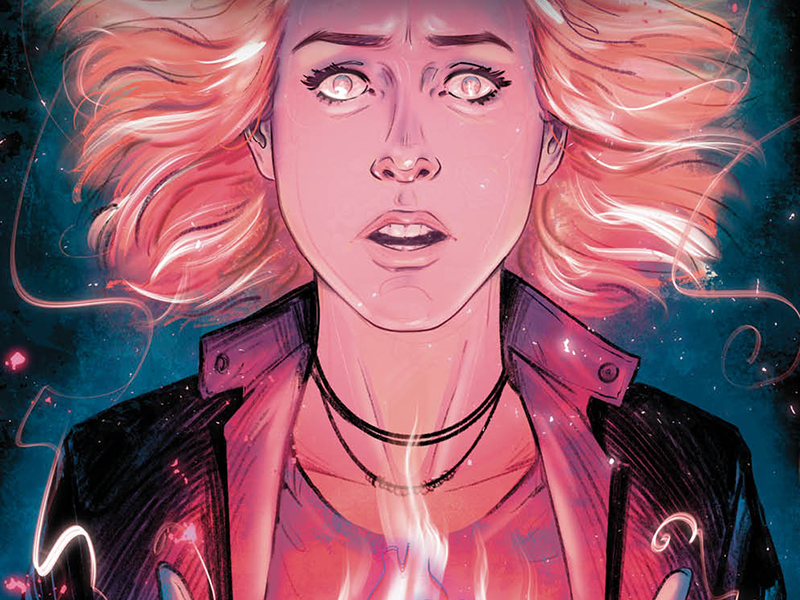
Three Slayers, Two Vampires, One Crab God: Reviewing ‘The Vampire Slayer’ #15
by Scott Redmond
Overview
While the journey is almost over, the fight isn’t quite complete as ‘The Vampire Slayer’ pits the slayers and friends against one final foe who just might have them bested. Another colorful, fun, powerful, and heavy issue of one of the best comic book adaptations but also just one of the best series overall. Nows is the perfect time to catch up on the series ahead of the forthcoming finale.
Overall
10/10Wisdom might say the more slayers, the better. Unless baddies can use those slayers to open a permanent hell gate. Maybe fate was onto something with that whole only one slayer at a time situation.

This issue picks up shortly after the previous one left off. Drusilla and her goons attacked the magic shop, taking Willow and Xander. A ritual that requires the blood of two slayers is the goal, opening that permanent hell gate mentioned above. Good thing the Slayers are wise to the plan. Surely won’t walk right into their foes’ lair and a trap.
It’s always tough when something you really like is close to an end. You’re happy for the time spent, but also bemoan the time that will not be. This being the penultimate issue of this wonderful series is bittersweet. Bitter of course because it’s about to end, but sweet because it never loses that spark that makes it joyful.
This is a series built upon a familiar beloved franchise that took that energy and made it its own. From the very beginning, Sarah Gailey has been subverting expectations. They took a familiar universe and flipped it on its head in the cleanest and most logical way possible. That flipping left things where we remember them but also moved some things around. It gave us new relationships, new character beats, whole new situations, and more.

It was a move that modernized and progressed a series that was already pretty modern and progressive for its time. To me this is what makes the mark of a great writer. Someone that can take that which you’re familiar with and give it an entirely new life. Writing licensed things doesn’t mean that one must just parrot or copy that which came before. As Gailey proves, it is more than possible to stick to the foundation while also building a better new house upon it.
We feel this from all the variety of artwork that has graced these issues. So many artists, including the current team of Kath Lobo and Roberta Ingranata, have captured the essence of the characters without going for photo-realistic. We know and feel that this is Buffy, Faith, Willow, Xander, etc. without having to see their actors’ faces on the page.
All that familiarity plays very well with both artists’ very heavy detailed and emotional styles. There is great depth and space to all the work but also a sort of animated energy to it all. Meaning it feels real and tight, with plenty of darker tones, but light and fun at the same time. Which is exactly what this franchise has been through its long life.
Lobo and Ingranata’s styles are very compatible which is always great for a multiple-artist issue. There is a noticeable shift between them, a difference in rough vs smoother textures, but not in a jarring way. Especially since the change comes with a story scene change.

Paneling is a thing that often is taken for granted and there are standard or normal styles that are commonly used. When an artist goes beyond those styles or norms though it’s truly something to see. In this series, there have been so many cases of out-of-the-box paneling, and that’s no different with this issue. The fluid way panels grow and shrink in the right scenes is one example, adding fun energy to the whole affair.
One of the biggest, though, is the return of a full-page panel showing the characters descending through Hungrus’ lair. A perfect example of the pairing of the fun and the dark. They’re headed into danger but it’s done in a way that we can smile and even chuckle at. Which is really the Buffy way.
What helps them, even more, is the bridging colors brought by Valentina Pinto with assistance from Ricardo Giardina. All the colors carry the same tones and energy with just a little shift in how they play with the two artistic styles. Through it all, they are still heavier in the shadows and darkness, as one would expect, while also helping bring light to the proceedings. There are not a ton of vibrant popping colors when it comes to the natural elements in the world. They are still reserved for the more magical and supernatural moments, allowing those to stand out even more.
There is such a natural development of lighting within these issues. By that, I mean that shifting light and how it affects the setting is always considered. Whether through natural or unnatural means, spaces feel accurate and lived in, as the lighting shifts from one moment to the next. Sometimes in the same panel, it’s clear how light works as shadows can cover half the panel but not the other. It probably seems like a small thing, but it really can help with the immersive factor of these stories.

The same thing can always be said about how lettering is integrated into an issue. No matter how things are laid out, Ed Dukeshire always makes sure that the lettering fits and grows through the pages. Flowing smoothly and logically through the pages if it’s dialogue or finding its space in the moment for the more natural in-world sounds. Beyond those standards though is where the fun and energy that permeates the issue come into play for the letters.
All the colorful SFX that are on the pages, right in the thick of things, or the clever and fun ways that dialogue gets a boost. Through colorful bubbles, fonts that change, bubbles with a different appearance, font that shoots up in size bursting from the bubbles, and more. It not only makes things fun but helps set the volume and tone in many cases, allowing us to fully hear this world as it would if we could actually physically hear them all.
The Vampire Slayer #15 is now available from BOOM! Studios.
