Maybe Listen To The Clown: Reviewing ‘Birds Of Prey’ #2
by Scott Redmond
Overview
Leave it to the Birds to find a way to turn even some fetch quests into an action-packed wacky adventure, as ‘Birds Of Prety’ #2 sets the team on their dire mission. A breath of fresh air when it comes to superhero-related comics, finding a way to play the stakes but in a very fun and freeing way.
Overall
9.8/10Black Canary has a very dangerous, personal, mission and gathered a very dangerous team to try and pull it off. Before this new team takes on the Amazons, though, they have a few tasks to complete first. Surely those tasks will go off without a hitch of any kind.
Insert the Anakin and Padme meme right here.

Birds Of Prey #2 puts the team to the test under the care of Kelly Thompson, Leonardo Romero, Jordie Bellaire, and Clayton Cowles.
Back in my review of the previous issue, I gushed about how much I loved this title already. Surprise, no surprise, I love this issue probably even more. We began everything with the usual gather-the-team type issue, but one that was done in a really fun and different way. Here the team is complete, and the stakes have been delivered, so we get a lot of pure action and hilarity to tickle our fancy.
Thompson puts this eclectic cast of characters together and bounces them off one another in the most logically enjoyable ways. Everyone has their role but also their opinions and concerns, and we see the cracks but also firm spots that are already forming. There is enough of a blend between quieter expositional moments and pure kick/punch action beats to keep things moving at a rapid pace without losing an inch of development.
Truly, I blinked and the issue was over (it read so smoothly), but I was smiling and dove back in to enjoy it a second time. Considering how many comics I have in my stacks to read both for pleasure and for work, a book getting a second look from me right away is huge.

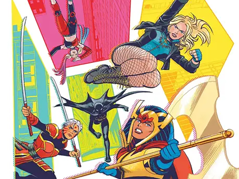
A giant part of that fun is the choice that was made artistically. Romero and Bellaire are delivering something that confidently straddles the line between modern and classic. All the depth and detail that are common to this era are there, really pushing what the medium can do further, with an atheistic that feels evocative of an earlier era. All the somewhat sharp neon-like colors that Bellaire employs ramp this up even more.
I’d almost say it has a sort of 3D effect with the color choices. In the sense of what 3D sort of looks like when you’re not wearing the glasses. Without the blurriness, of course, cause it’s all crisp and clear.
Overall, it’s very toned-down but also vibrant and in your face at the same time. One would think that such differing things would not be possible at the same time, but they are of course wrong. Just look at the pages and you’ll see.

Personally, I’m a huge fan of this for one chief reason, it’s unique. Okay, it’s also fun but the first reason still stands.
I’m a big fan of comics that have dense realistic art with grounded color palettes. Just as much as I loved ones that go with expressive often exaggerated art and color schemes. Here we have one that creates a fusion of those two schools of thought. Comic books, especially those of a superhero or fantasy or sci-fi variety, are a wild expressive fun medium. What we get on the page should match that as often as possible in any way that works best for the story.
Just look at those panel choices going on here. I mean there is a page where characters cross through a portal from one panel to another. Multiple times we see characters actually walk off the page into the negative space, with an x-ray effect on their bodies. Once they do that and enter a trap door to walk right into the overall next page of panels. How is that not the coolest thing you’ve seen lately in a superhero related book?

Characters have a lot to say, and they say it with their whole chest, emotion dripping from every word. Cowles is one of the best at making sure that not only does lettering carry every bit of emotion/personality possible but makes sure it’s fun in the process.
As noted, the paneling is top-notch and shifts around in ways that one doesn’t usually see in many books. It takes just as keen of an eye to make sure that the various bits of dialogue and other lettering match that flow without standing in the way. It flows so smoothly through these ever-shifting panels, helping keep the audience’s gaze moving through the pages.
All the SFX range from the big bold fun type to far more subtle but just as effective and stand-out types of lettering choices. Zealot’s nonchalant shove-related SFX is hilarious in the moment because it’s so fitting of her no-nonsense personality and the moment.

A last note on the story itself. I get the concerns that some have of Harley Quinn being here.
She’s a wild card character, and at times is stretched pretty darn thin (like another smart-mouthed fourth wall-breaking character at another company) exposure-wise. Yet, I share none of them because she’s also a competent character who brings some different tools and outlooks to the table. As Barda says early in the issue, I agree with the clown.
Also, she brought us King Shark in this book. Case closed really. She stays.
Birds Of Prey #2 is now available from DC Comics.