
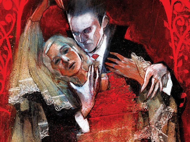
An Interview With ‘Universal Monsters: Dracula’ Artist Martin Simmonds
by Rachel Bellwoar
Vampires and Halloween are like milk and cookies – you can’t have one without the other, and when it comes to vampires, there’s no bigger name than Dracula. For fans of Universal’s monster movies, that name is also synonymous with Bela Legosi (even though he only played the Count twice). For their new series, Universal Monsters: Dracula, writer James Tynion IV and artist Martin Simmonds are reimagining the story for comics and if you prefer your horror scary, Renfield’s face is a guaranteed fright. To learn more about the series and how he came up with Renfield’s luminous look, check out this interview with Simmonds below:

Rachel Bellwoar: There’ve been so many different interpretations of Dracula in art and film. What do you think sets Universal’s Dracula apart from other adaptations of Bram Stoker’s novel?
Martin Simmonds: I’m most familiar with the original novel, so the first time I watched the Universal movie, I was rather surprised as to how different it was. The film is based on the Hamilton Deane theatre production from 1924, which in turn is based on the original novel, so the story had already gone through some changes before it was made for the silver screen. For me, the most significant element to take away from the movie is Lugosi’s Dracula and how his now iconic image has become synonymous with not only Dracula, but vampires in general.
Bellwoar: When coming up with the character designs, how closely did you want to make them resemble the original cast from the Bela Legosi movies?
Simmonds: Despite the comic being a Universal-approved project, and them working closely with us, we still had to avoid any direct likenesses to the actors in the film. However, every main character in our version has most certainly been influenced by the actors in the movie in one way or another. Also, given that our version is set in the same time period as the movie, it was essential that the costumes, in particular Dracula’s, stayed faithful to the film.

Bellwoar: More than Dracula, it’s Renfield who really comes across as the MVP of the first issue. Where did the idea to have his face glow come from?
Simmonds: I’m pleased you noticed the glow! Renfield’s character is somewhat inspired by Dwight Frye, who played him in the movie, but I really wanted to push his appearance to an extreme in order to illustrate how he is infected with the blood of Dracula and under his supernatural powers. The Dracula filmmakers used eye makeup to show Renfield’s condition as a visual cue, but I wanted to push that further, in a similar way to a couple of older movies – The Cabinet of Dr. Caligari, and The Man Who Laughs – in particular, the characters played by Conrad Veidt. It seems to me that Renfield is trapped in a kind of half-life, stretched thin by the control he is under, as if his human side is being worn away. I wanted to visualise this somehow, and that’s why his face looks over-exposed and his features reduced to just his eyes and mouth. The eyes play a significant part in the visuals throughout the comic for both Dracula and Renfield – the addition of red in or around their eyes is used to show a connection between the two characters, or more specifically, the influence Dracula holds over Renfield.
Bellwoar: Being as it’s the color of blood, red tends to play a prominent role in vampire stories. Did you always want to be very deliberate about the use of red in the first issue?
Simmonds: Absolutely. I mean, if you’re creating a vampire comic that has colour in it, then it’s very hard to avoid it. In addition to using red to show blood, we use it to show Dracula’s mist form, and when we want to subtly begin to introduce Dracula’s influence/powers. When Lucy is drawn to the window and sees Dracula looking back at her from the abbey, we introduce a small amount of red, then after the page turn, the reader is met with a full colour splash page, showing the full extent of Dracula’s hold over Lucy. It’s a really useful visual cue.

Bellwoar: That red also seems to coincide with the introduction of Mina and Lucy doesn’t feel like a coincidence. Assuming they haven’t crossed paths with Dracula yet, what made you decide to have them start out already washed out in complexion?
Simmonds: We use full colour as a way of illustrating Dracula’s intangible powers, in contrast to the very limited palette used in other scenes. The film is, after all, a black and white film, so it made sense to keep some of the the visuals in the same vein, and then use colour selectively for greater impact. One of the major themes is the contrast between the scientific mind of Dr Seward and the world in which he lives in, and the supernatural powers of Dracula that have begun to consume Renfield and Seward’s loved ones, so having that contrast between a limited palette and full-on colour goes a long way to illustrate that theme.
Bellwoar: While it’s not unusual to see vampires transform into bats, here Dracula seems more closely associated with wolves. Why do you feel that imagery was a better fit?
Simmonds: We use both, and that’s something you’ll see as the story moves forward. The original novel features Dracula’s wolf form quite heavily, and we really wanted to focus in on Dracula’s animalistic elements, so it’s essential to our version of the story that we use that.

Bellwoar: One of my favorite sequences in Dracula is the crewless ship. Where did the idea to have those events play out in the shadows behind Mina and Lucy come from?
Simmonds: Sometimes it’s a challenge to illustrate conversation scenes without falling into the trap of it becoming just talking heads, but given the subject matter they are discussing, it was a good opportunity to use stills from the movie as a backdrop to the panels. It’s simply a way of adding atmosphere and context to the scene.
Bellwoar: How did you go about creating so much texture on every page, and is the text that you occasionally incorporate into your art from a particular story?
Simmonds: I work with traditional media, predominantly acrylic paints, so the texture builds naturally as I layer up the paint. Being that the movie is an old black and white film, my approach was to emulate that grainy, scratchy appearance. It’s always fun to try and find analog solutions to achieving effects that would have been easy to digitally add in post-production, and in the case of the text overlays, the most effective approach was to collage the text on top of the painted art using text printed onto clear acetate sheets. In the case of the text, I used old royalty-free Victorian medical journals. I used the same approach for the flies that surround Renfield – I photographed some dead flies, then printed them out onto clear acetate. And that’s the beauty of working with traditional media – even the glue that is used to stick down the acetate reacts with the paint and shows through. I love that you can see the edges of the acetate set against the painted work, and all those kind of things add to the texture you see on the page. Although it’s possible to achieve those kind of effects digitally, it’ll probably take longer to do and wouldn’t benefit from the random reactions that develop on the page. Other than a few level tweaks in post-production, the art you see on the printed page is how it appears on the physical page.
Bellwoar: Thanks for agreeing to this interview, Martin!
With letters by Rus Wooton, Universal Monsters: Dracula #1 goes on sale today from Skybound.
